(Archive) Advertising District / Dump-Place
-
 19-April 07
-
 Jaguar
Offline
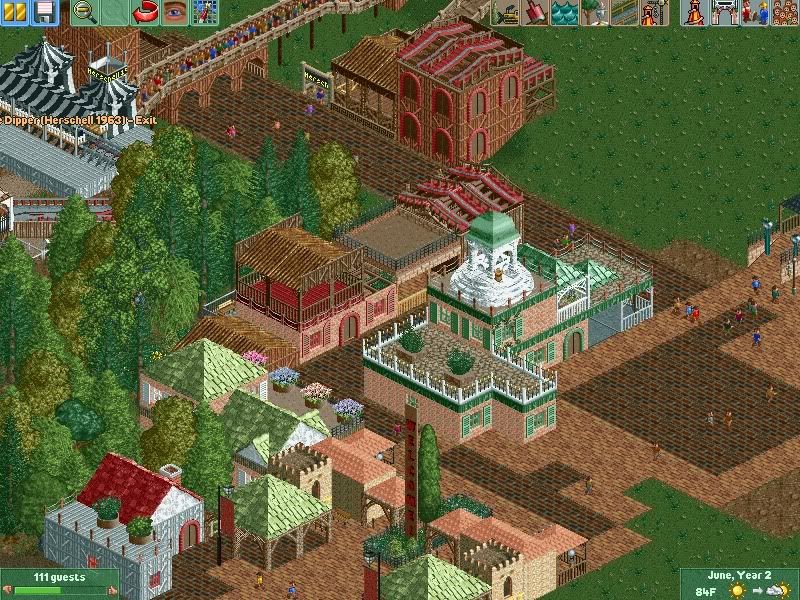
The funny thing is, I used to build like this, quarter tiles always make me overkill scenery. Would anyone car if this park is peep compatible?
 -

 Jaguar
Offline
Do what you enjoy more
and I agree that screen is an improvement
Really? Oak Valley was of the same style but better quality, yet it was a pretty bad park. -

 gir
Offline
Whoa, that's a pretty nice layout wildroller. My only immediate suggestion is to tilt the half-loops outward instead of inward, if you know what I mean.
 -

 Ruben
Offline
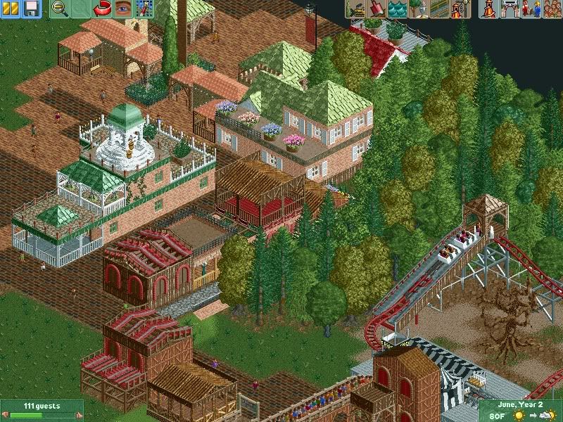
It feels like I'm looking at the work of two builders instead of one. The entrance building (with the green walls and castle roofs) is really nice. The rest, to me, is not. It doesn't give a natural feel, and it's kind of depressing to look at. The dark tile path is way too dark, and there's no logic in the buildings. When building, try to think whý a building has a certain shapes and features. Compare this with reallife and you should get buildings that look a lot more natural, and thus a lot nicer. Once again, the entrance building is really nice, the rest just doesn't feel good.
Btw. please don't crop your screens like you did last time... It really downgrades the screen. -

 FK+Coastermind
Offline
The problem is you have no coherence. Even parks where every building is different like El Encierno, they still have common features and binding characteristics that keep it all together. IMO, this looks like one of those parks someone really new does where they are trying to find their style, because essentially there is just abit of everything there. You have trackitexture you have paths and rooves you have LL styled buildings, you have big blocky buildings. You have western style, roman style, common theme park entrance area style, and it just doesn't work together.
the problem is it just doesn't look planned at all. the building locations and the layouts and the actual buildings themselves, it just looks like you put down the first thing that came to your head and immediatly clicked save game. the most important part of parkmaking is planning, execution is the crucial step, but without planning.... -
 Chocotopian
Offline
I really like the style of the little coaster in the bottom right. I don't know if those cars are a specific download or a hack of an original design, but the choice of three cars per train, the tight corners etc. give a nice kiddie-coaster feel. My only request would be that the station was developed a bit.
 -

 Jaguar
Offline
The station isn't finished, and I had to do that screen 3 times because I kept on getting an error trapper.
 -

 Dotrobot
Offline
Well where it's not neccesarily a "perfect" screen in all of your eyes.
This to me is the greatest thing he's shown. -

 BelgianGuy
Offline
I think you need more detailed work to shape things up, add more theme to it and above all improve on foliage because that is your weak spot and it really affects your work, also archy wise don't get stuck in repetition, also a little more shape wouldn't hurt the screen atm its all on one line, try to avoid that and make it look more refined and interesting
 -

 SSSammy
Offline
also archy wise don't get stuck in repetition,
actually, i think repitition is just what the doctor ordered. -

 rK_
Offline
I'm just starting over, like K0NG said. I'm going to stop trying to be innovative.
how about quit showing screens expecting praise every time and just build for yourself? -

 rK_
Offline
change the station type to wooden or castle. Looks really odd against everything to me as is, overall though this is looking great!, keep it going!Some more work...
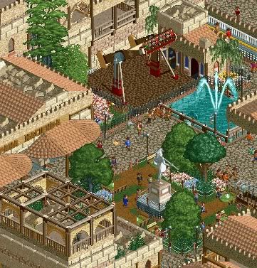
Feel the Revolucion! -

 Splitvision
Offline
Nice, I'm really liking the placement of the top spin, and overall the atmosphere is really pleasant. As rK said, keep it going!
 Tags
Tags
- No Tags

