(Archive) Advertising District / Dump-Place
-
 19-April 07
-
 Jaguar
Offline
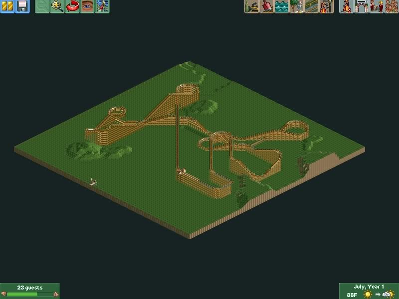
A layout for my newest design. Hopefully this won't be a failure like my last submission.
-
 JoeZia
Offline
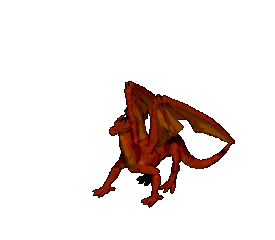
I converted an animated gif of a dragon I found on the web into an animated ride object with the purpose of animated large scenery. It gives me an error trapper when I put it in the object folder however. anyone that would like to help me fix this problem is more then welcome to help, just pm me and I'll send you that dat.
Here's the gif preview-
EDIT: @jag
I really like the coaster you have going on there. However I'm not crazy about the amount of diagnal track you used, not that diagnal is a bad thing. It's just to me it looks weird especially at the angle you screened it- vertical. It looks better horizontal with diagnal track, but all views can still be seen ingame anyway.
@Cocoa- I like the clothes hanging--very creative! I also like the sand roof especially since not many people do that. It's always good to stand out with creativity.
@That guy- Love it! Did you use my night palette? ;-) At least someone is using my palettes. I can't imagine why not especially the night and vibrant ones.
@Coupon- That vertical launch is just too sexy! love that support looks especially neat. -

 Jaguar
Offline
Lol. That palette would be very useful though if there were actual light sources in RCT, even COA's version doesn't have any real light sources, just yellow and red are brighter.
 -

 BelgianGuy
Offline
Sry jag can't say I like anything about that layout....
seems to have decent flow at all and as stated above the diagonals aren't doing the aesthetics any good... -

 Dotrobot
Offline
@Coupon- That vertical launch is just too sexy! love that support looks especially neat.
It's not a launch. -

 Jaguar
Offline
Sry jag can't say I like anything about that layout....
seems to have decent flow at all and as stated above the diagonals aren't doing the aesthetics any good...
Oh what the fuck, if this game weren't isometric, then it wouldn't look the way it did, and aesthetics for a coaster layout? I guess I should delete this crappy design right now, before I waste my time. -

 BelgianGuy
Offline
Look at SPQR, there you'll find what I mean with aesthetics in coaster design, try it and I think you'll see what I mean,
 -

 Jaguar
Offline
^Please stop posting whiny shit like that. Stop wasting everyone's time.
I was being sarcastic, I agree with Belgian Guy actually, but I think that if I posted the screen at a different angle, then it would look better. I'm experimenting with a wooden coaster, something I'm not very good at. -

 BelgianGuy
Offline
ONE site you'll have to check out for the problem you're having...
www.rcdb.com
just take a look into wich type you'd like to do, I think ideas for themes aren't your problem since you have an idea overload, just sit down and work on a layout for a decent time till its bang on and get that layout solid before you do anything else perhaps... -

 Jaguar
Offline
I will do, it sucks that I can't do anything right other than getting ideas. I know I am better at steel coasters, rather than wooden ones, and I built this to see if I am doing any better, because every good park needs a good wooden coaster, and layouts seem to be one thing I lack at.
 -

 Turtle
Offline
Take your time man. Most people build thousands of coasters in RCT before they start building good ones. Take your time. I cannot stress this enough.
This goes for everyone relatively new to the game who wants to improve and gain recognition at NE. It takes time. -

 K0NG
Offline
^ But, you spent a year just adding more and more chaotic, messy stuff to an already chaotic, messy park. Taking your time means experiment, get rid of things that don't work and try again. If something isn't right...don't add to it, get rid of it and replace it with something that does.
 -

 Jaguar
Offline
True, but I don't get why some people would like it. My MM entry was very chaotic and you voted it ahead of Austin55 and Peeee, and their entry was clean and neat. Also, I received good complements from the ride "oil derrick" in my newest park. I actually think I was a very neat park maker at one time, if you look at oak valley and some of my other older screens.
 -

 wildroller
Offline
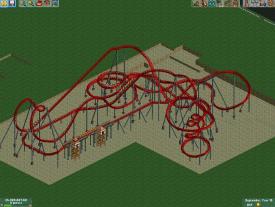
Hey, 95% finished supporting this B&M I posted a couple pages back. Part of the immellann still needs to be supported and I have some special plans for the lift, so I left it unsupported. First time adding custom supports to a coaster in the world of RCT, overall I am pleased at how it turned out!
 -

 Dotrobot
Offline
Although the footers would've been better all gery. It's really good. As for the break run. I don't like the way it's supported. Add cat walks and maybe support it more simply.
 Tags
Tags
- No Tags


