(Archive) Advertising District / Dump-Place
-
 19-April 07
-

 Dotrobot
Offline
The layout is really not working for me.
It looks way too big to be an interior roller coaster for me.
It'd be better if only parts of the roller coaster were interior.
If you're a beginner supporter that layout is not the way to go.
P.S. Not big fan of the layout.
Great archictecture though. -

 wildroller
Offline
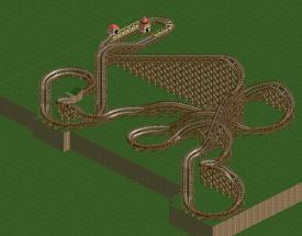
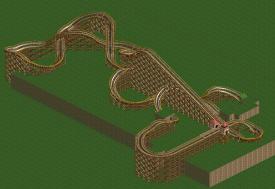
Any particular parts of the layout you don't like? I am trying to rework the layout into a more traditional B&M layout while still keeping the possibility of having a mostly interior ride. Most likely parts of it will stick out of the building for peep interaction.
As for the supports, I'll be able to figure it out I think, I've learned a lot already supporting the corkscrews and that turn around.
Thanks for the reply
-

 Wolfman
Offline
What's going to hinder you the most when it comes to creating the supports is that you have a lot of track passing over a lot of track. Basically, you want the area beneath the track to be clear of obstruction. As you can see, you have a lot of over & under elements that are going to create a nightmare scenario when it comes to the building of the supports.
The best thing to do is to spread the design out so that the track goes from one area and inversion, and backtracks to a central point, turns and heads in a new direction and to the next new inversion element. Or the design might make a large circular layout, as the train visits each inversion.
Most of the time, the inversion elements are usually experienced in a set series. This is dependant on the speed and momentum. As the speed and momentum deminish, the inversions and other track elements get simpler and easier for the trains to pass through them. Usually, this is the lineup...
Vertical loop, Cobra Roll, Bow Tie or Pretzel Loop, (these three are generally interchangeable.) An inline twist, (depends on the height of the inversion.) Corkscrews, (also depends on height,) helix. Also, be sure to add a few hills between elements. This will knock down the nausea factor fairly well.
I don't want to "advertise" my project here, but it's a pretty good example of a decent layout that allows for an easy job of creating supports. Locust is only 85 ft. tall (considerably shorter than your design)and has a good assortment of track elements.
You might notice that I kept the track from actually laying on top of the ground. Keeping the lowest level to 5 ft. so that "shorty" supports can still be used throughout the circuit. This brings up the realisim a bit more. And that I used the connector used at the bottom of the support (used to connect to the concrete footer/anchor) and used it as a connector at the top (pained to match the track) as another connector to connect the support to the track.
But for an interior coaster, you may want to consider a very short, yet jam packed with inversions type of attraction. Just try to make sure that the layout doesn't have that much in the way of "over & under" track elements. And check out the example. I provided an updated DL of the saved game in the 1st. post. You can pick apart the supports and the coaster if you want.
The original DL is in post #4. Don't forget that Zero Clearance was used in a lot of places, and you'll need a support blocker to delete the default supports. Use that after you create the custom supports. It's just easier. Good luck with the project. I can't wait to see how it turns out. -

 Turtle
Offline
Mate, that layout is fine! Really nice and compact, which is what an indoor coaster should be, and allows for sections that fly outside for the guests to see.
Just go ahead and support it, it will be a challenge, but that's what this game is all about. No point in building a nice and spread out B&M that we've seen a thousand times just so that it's easy to support. -
 Dark_Horse
Offline
I completely disagree Wolfman. If it's going to be indoors, or partially enclosed, the layout should be compact. Look at Rock n' Roller Coaster. Plus, with a compact layout, it challenges you to create unique support structures. Although, it's true most B&M's have a set order of inversions, but I would like to see something that resembles a B&M that isn't cookie cutter style. If you want good examples of layouts, check out the designs here. I like the layout except for the low turns after the Immelman and before the cobra roll.
 -

 Magnus
Offline
Why use a layout you are not happy with?
If you want to go realstic, I would suggest to study GG and GCI more before working on further layouts. -

 RRP
Offline
The idea is good,looks like a B&M built by SchwarzkopfHi, this is the first time I've posted anything on NE. Just started playing RCT2 again recently. Working on an indoor B&M floorless and would like feedback on the layout before I go too far to change anything! Currently I am working on figuring out how to make supports that look reasonably realistic.
The ride is 120ft high and consists of 6 inversions (Immelmann, barrel roll, cobra roll, interlocking corkscrews). Colors of the coaster and building might change, I dunno. Any and all feedback would be appreciated!
I'd tweak the layout a bit though so you dont have too much meandering around or bumps in the track. Maybe take some more inspiration from compact Schwarzkopf coasters -

 wildroller
Offline
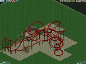
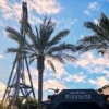
Hey everyone, thanks for the feedback on the original layout, I have modified it a little bit and I think it's a lot better. I put the cobra roll element right after the immelann and moved the MCBR around a little bit. You can also see a few custom supports getting added around the corkscrews
 . This is the last shot you guys will get of the layout until at least the supports are added!
-
 coasterfreak101
Offline
John, those rings seem way too big for the ride - the ones on both real-life Bizarro's are more the size of the art deco trims than what you've got. But aside from that, it looks absolutely fantastic!
 -

 Wolfman
Offline
I completely disagree Wolfman. If it's going to be indoors, or partially enclosed, the layout should be compact. Look at Rock n' Roller Coaster.
IF Rockin Rollercoaster was a B&M. Sadly, it didn't have much more than three inversions. And what's the goal here? five, six or more?
But something just hit me. IF this is going to be an indoor attraction, then how would you see it inside the structure? You would use the invisible scenery mode, correct?
So what happens when you use the invisible scenery mode? Well, all scenery sort of disappears, right?
So the encloseure would dissappear, Right?
And wouldn't that include any custom supports? So, you really wouldn't be able to see the custom supports anyway. So why add them?
Just sayin'. -

 nin
Offline
^ simply open up the ceiling a bit, always does the trick.
wildroller, I actually really like that. some minor flaws to fix would be adding in a pre-drop found on nearly every B&M coaster, and maybe space out the corkscrews by a tile, just so it's not too compact. They tend to look better a tile apart imo.
John, that's just awesome. There's nothing truly amazing about it, but still it's quite good. I love seeing different Bizarro interpretations, and this one's looking great, but like said above maybe shrink the size of the shields, they're a bit on the large side of things. -

 That Guy
Offline
Hey guys. I just took a quick trip out to Iola Amusements for their Harvest event...it ends in a couple of weeks so they can start haunt so I figured I would get their while it lasts. (The crowds were practically not existent as well)
I only took a few pics from the observation tower so I didn't really feel the need to start a separate topic for this.
Here's the corn maze (and a little bit of Outlaw in the background), they change it annually and I heard it's a little too easy this year, probably not worth the extra couple dollars...but if you want to try it out, there's only a few more weeks left till they change it for haunt, so hurry up.
Here's the lake around just by the Outlaw Queue.
Anyway, that was all I took while I was there, hope you enjoyed! -

 nin
Offline
What an improvement! Good to see you drop ncso for a bit, this is looking great. Can't say too much about the first screen, other than the foliage is really nice and I love the corn maze, but maybe a better name would suit it? Though, I'm assuming this is a more generic park so generic names for some attractions seem fit as well.
I'm really liking the second screen however, nice dark colors, really work well. Seems like there could be a better shade of green for the grass, that object makes it look really bright, but at the same time I'm liking the contrast it gives off compared to the other colors. The splash effect in the water does need to be the same as the fountain itself though, gray (?) isn't working too well.
Great stuff though, really excited for this. -

 robbie92
Offline
OMG, so, so good! You've jumped up my "best" list. Some ideas, like the pumpkins, are insane!
 -

 tdub96
Offline
Wow, thats so good
And john, really nice, just those Bizarro logo outline/rings shouldnt be so big and thick. Everything else, really good.
 Tags
Tags
- No Tags

