(Archive) Advertising District / Dump-Place
-
 19-April 07
-
 Camcorder22
Offline
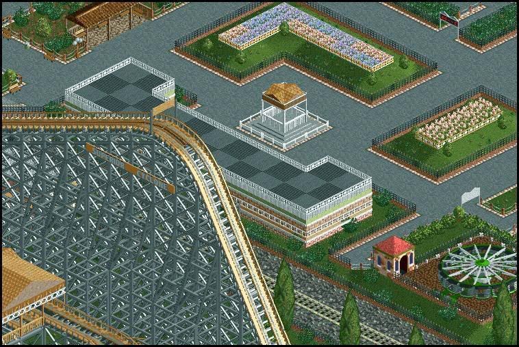
Looks like most of the other stuff you have built but different colors. Probably the reason why you cant get any parks done is that your building such small buildings with so much detail. It looks good in small amounts, but in a large park, you would need to vary it. Something that might look good I think would be to have a detailed bottom area like that then a larger multistoried building above that.
 -

 Cocoa
Offline
I have AIM. zacdayak.
Good idea, Camcorder22.Edited by RaPiPo, 02 January 2008 - 02:50 PM.
-
Xcoaster Offline
Oh man, I'm not amused. You clearly have skill, but to just rip off what I did is kind of annoying. Especially since you mostly saved the crappier parts of the layout (i.e., my ending) and didn't even bother to change the color scheme. And I'm curious if you even rebuilt that coaster, or if you just built over some of what I made.Updating again. Sorry for not starting my own thread but it's just one area that I have done. Look at some more pictures.
Rodeo
Skyhawk Railroad
Skyhawk Saloon transfer into Fantasyland
Story Time
Skyhawk Mountain Overview
-Noob
Anyways, aside from all that, the Rodeo and chuck wagon are pretty nice. But you definitely need more buildings. And originality (*grumble*).
---
And I'm just getting caught up, but I like rather like that stone building you made, Liampie. -
![][ntamin22%s's Photo](https://www.nedesigns.com/uploads/profile/photo-thumb-221.png?_r=1520300638)
 ][ntamin22
Offline
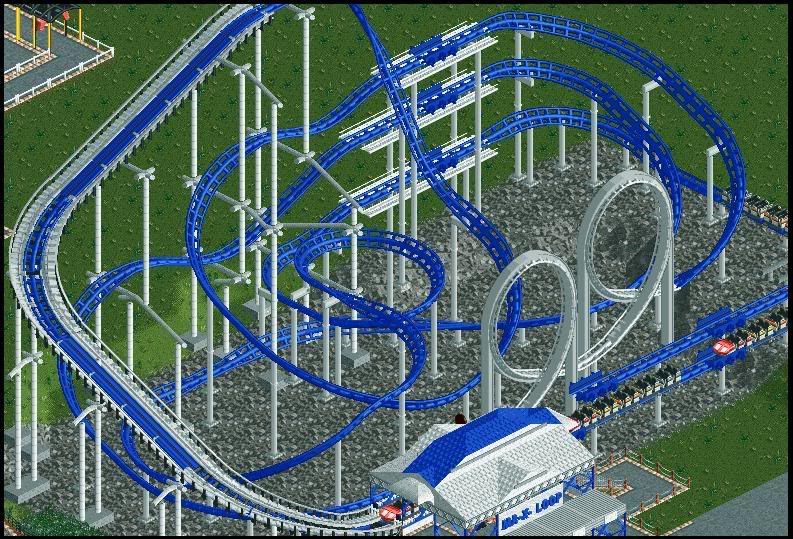
tastes like schwarzkopf. I'm not too sure about your supporting there, but the layout is classic schwarzy.
I'm not terribly okay with the bare rock underneath, though. just because that's the way it usually is doesn't mean that's the way it should be. -

 snas
Offline
i like it RaPiPo.
only i don't like the vines and the woodenwall you use by the castle window's (second floor) -
![][ntamin22%s's Photo](https://www.nedesigns.com/uploads/profile/photo-thumb-221.png?_r=1520300638)
 ][ntamin22
Offline
@gwazi..
its a .. shark?
whatever it is [woodie with cobra roll?!] it's kind of drab-looking. the foliage selection is kind of mleh in this tiny little screen, but it might work on a larger scale.
get better supports on the cobra roll plox. -

 Carl
Offline
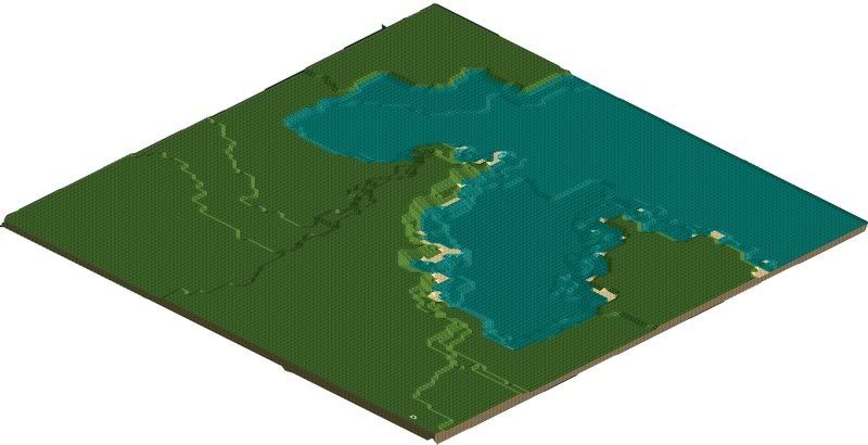
Pineapple, your landscape doesn't quite flow at the shorelines, try to smooth out those sharp turns.
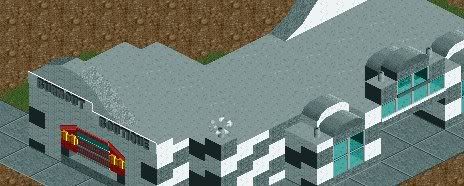
nin, you need more color and some little details on the roof to break it up.
 Tags
Tags
- No Tags


