(Archive) Advertising District / Dump-Place
-
 19-April 07
-

 Dotrobot
Offline
Dotrobot, I'm flattered that you are inspired by my work.

I knew it was real obvious Dont worry. My park isn't worthy of yours anyday
-

 J K
Offline
I think it's the shear scale of that tree and it actually looks really good in rct. Also in a forest other trees actually can blend around it and make something look really special.
Ok Cocoa, if your gonna post a screen this small I'm gonna analyse what I see. The main tree isn't connected to the ground, the dirt path isn't connected to the barn door, the roof is glitching on the coaster. After that foliage is delightful. -

 Imi
Offline
yes, but i don't have the right roof pieces. i didn't even know about workbenches when i started this scenario, basically.
 -

 Jaguar
Offline
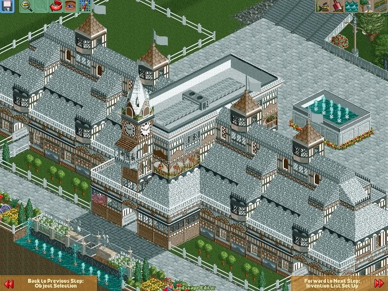
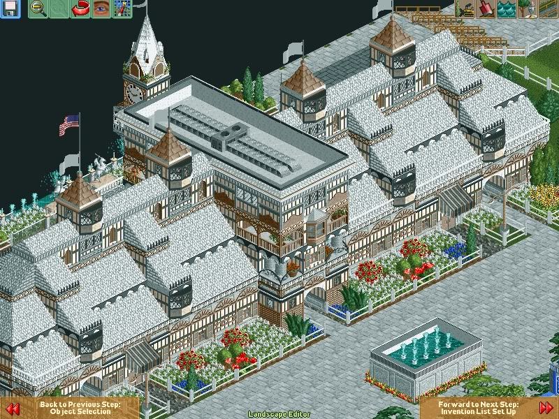
I first thought you were a real noob coming oof of your first submission, but what you have built is actually really good.
 -

 Imi
Offline
thanks, you don't know how much that means after all the critisism
 ive played quite a while, just never joined this forum.
-

 J K
Offline
Cj8 it needs tweaking here and there and the path and overall colour of the structure is too samey so I think thats why It's slightly lacking but I like how you're trying new objects out to see how they look. Keep going with this because it will pay off.
rK_ Massive beauty in the screen yet again. So simple yet so effective. -

 djbrcace1234
Offline
Cj8- I feel the white roofs do not help with the screen because the depth is lost because of the in game texture.
Have you tried colors other than white? Just curious to see how that would change the look, too, because you have a nice foundation for a building there.
rK_ I agree with J K. -

 yocoaster
Offline
Highly unfinished. And fizzix dammit get on TPR chat.
 EDIT.. Paint fails doesn't it?EDIT.. Djbr left TPR chat. I hate you.EDIT.. Better get back on Djbr :l
HMM...I like the atmosphere and LOVE the archy, but the supports are meh.... -

 nin
Offline
rK_, that project is continuously looking awesome, I can't wait to check it out. One suggestion I have is to maybe make your stations more open-air as they all to be entirely enclosed. No that it's a bad thing, it's just a bit repetitive. Otherwise, it's looking awesome. If you ever need a guest spot, I know someone with a bit of experience with ncso.
 Tags
Tags
- No Tags


