(Archive) Advertising District / Dump-Place
-
 19-April 07
-

tdub96 Offline
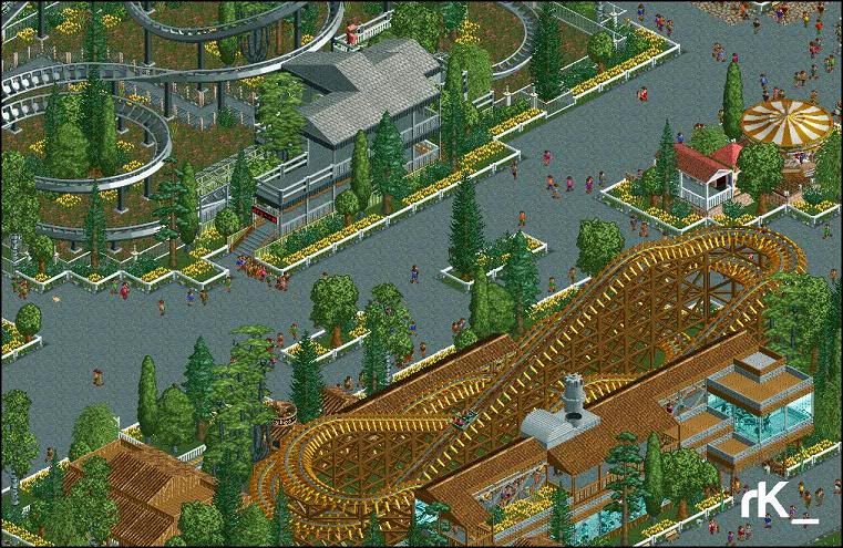
The architecture is great, but the coaster layout is waaay out of proportion. It looks about 10 times too big for a realistic park. Most B&Ms in RCT proportions are only just above 100 ft high, this looks like yours is about 150-175, which is waaay to big for everything. Just look at your interlocking screws, theyre about 50 rct feet high. All I'm saying is scale it down. The rest appears fine to me
-

tdub96 Offline
Pretty sick there kumba, reminds me of AT&T and Target Fields, which is definetly a good thing
EDIT: haha, just looked at the FFL topic, now i see
-

 panther33
Offline
Hey guys, I just wanted to know which layout you guys liked best...
Uploaded with ImageShack.us
Layout 1
This one is inspired by Chang/Green Lantern, and also a bit of Riddler's Revenge.
Uploaded with ImageShack.us
Layout 2
This one is inspired mainly by Riddler's Revenge.
Thanks guys!
~Chris~ -

 Fizzix
Offline
Kumba, awesome work, it looks real...
panther, I personally like the first one more. The only thing I really don't like on either is the double dive loops. It just seems a bit repetitive to me. -
 coasterfreak101
Offline
First layout, definitely.
I'd say the double dive loops are repetitive, but they were actually pretty fun on Riddler's when I rode it over the summer. I like that you can definitely see the inspiration from Riddler's/Chang in the first layout - I think you did a great job mixing the two of them! -

RMM Offline
the first one is quite nice actually. and i like how it's a little 'unconventional' with the consecutive dive loops. -

 CedarPoint6
Offline
It's just like Riddler's Revenge... there's no problem in 2 dive loops one after another. I like the first layout better although honestly I think the second is pretty strong as well.
 Tags
Tags
- No Tags


