(Archive) Advertising District / Dump-Place
-
 19-April 07
-

 Wolfman
Offline
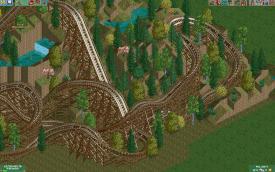
Optically confusing and whispy thin. I agree with Fizzix. This doesn't look like hurricane strength supports. What bothers me is that you don't really see the vertical layers of supports built in layers next to the track. The only clue is the diagonal supports, and the anchors at the ground. But even that isn't much of a visual clue about how wide the support structure actually is.
My offer still stands on sending you the 43 piece wooden support structure collection. (Much of it is probably stuff you already have.) PM your email address and I'll send them out in a WinRAR/zip for you. -

 F0ndue
Offline
Dang,I'm building a Terrain Woodie too!
Anyway looks nice,whatcha think of mine?
http://www.coastercr...396&whichpage=2 -

 xJur
Offline
Looks nice, were you inspired by Joris en de Draak (Joris and the dragon) from the Efteling?
 -
 coasterfreak101
Offline
Definite Joris en de Draak (note: I love the word 'Draak' a lot!) inspiration - it looks great! Maybe give the gyro-drop a different color though? I don't know if it'll screw with the theme, but I think that giving that a different, maybe brighter, color would really make it stand out and not look so bland. Just a thought!
 -

 Splitvision
Offline
^A tip is to actually post the screens, not just the link to it. I clicked it, arrived at another forum and had to look around for a while to find the screens. That is not good marketing, and the reason noone has responded to it (many probably didn't even notice the link, they look for screens). As for the project, I kinda like the landscaping, only it's way too smooth, try roughen it up a bit. Also the waterfalls/streams are way too straight. The coaster though, is shit. It's ugly and simply too much. Sorry.
 -

 magmoormaster
Offline
I like what I see, but the 3 buildings I see don't look like they go together, ya know?
 -
 Ride6
Offline
I'll continue the woodie meme.
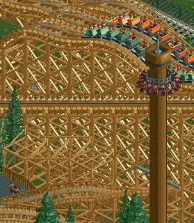
The supports look really good. I like the splash of color in the trains and the whole screen feel very very well composed. Very nice.
Ride6 -

 nin
Offline
Hey, something worth commenting on!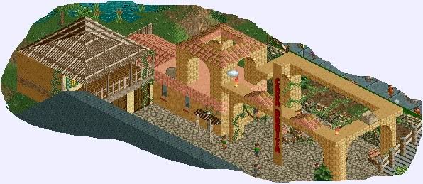
Like said above though, there's not too much of a connection between the buildings though. While the Spanish one does it job pretty well, the thatched roof has no connection, nothing that completes the area. Keep the theme consistent.
Also, someone needs to go ahead and make a "RCT Photography" topic, cropping screens and subject quality is at an all time low.
-

 magmoormaster
Offline
I think the theatre is the best looking building there.
The colors are soooooo bright... -

 Wolfman
Offline
In most cases, a hometown theater is a couple stories tall. (Think about the size of the screen inside.) You can then create a taller retro style marquee for it, and create a small bit of "park office spaces" at the front of the structure. "Six Flags Theater" doesn't sound imaginative enough. You might want to rename it to something like "Hometown Square Cinema", perhaps reflecting the name of the area of the park that it's actually in.
I'm not one to let a large structure like that go to waste without making it work for me. The current structure seems wide & deep enough, place a couple motion simulators underground there so that peeps actually walk in and out of the structure that has two "screens". The paths can be the entrance & exit, with steps down to the attractions within. (Usually, I would combine the exit paths at the level of the attractions, so that only one exit path is brought to the surface.) This would look a lot more convincing than an empty box structure that guests ignore. -

 highroll3r
Offline
i agree with wolf the theatre needs to be higher. check mine out it even has popcorn. heres just a screen to show the layout of batman. its still vey unfinished scenery wise. what u all think
 -

 J K
Offline
You have great architecture. You're getting better from the last screens you have shown.
 Tags
Tags
- No Tags

