(Archive) Advertising District / Dump-Place
-
 19-April 07
-

 Dotrobot
Offline
Cocoa: Are you paradise coaster
 ?
?
MCI: Thx I love your screen as well..
SSSammy: When do we get to see another project from you? and Thx -

 Fizzix
Offline
Boom goes the dynamite. Awesome screen, robbie. So I guess it's fair to say NCSO is the trend at the moment?
 -

 BelgianGuy
Offline
ok is this going to be a battle of the best ncso? cuz I don't know who'll win that one haha^^
 -

 Ruben
Offline
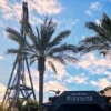
@Robbie: the contrast between your avatar and this screen is the very thing that shows why I prefer rct2. The avatar looks beautiful, the screen looks awful. Ugly glitches, not very coherent and more like a toy factory. Sorry, I usually really like your work, but this is not my cup of tea.
 -

 Dimi
Offline
^ Then I guess you just don't like ncso because the entrance is actually pretty impressing. I don't like the white fences around the planters though.
 -

 Splitvision
Offline
I really like that, robbie, minus the glitches.
EDIT: Gotta add that there is something about your screen Coasterfreak101 that I find awesome. I agree with others that the custom supports are too blocky, but the colours and the hugeness of the woodie next to the road caught my attention, and liking. -

 Fizzix
Offline
I do like them, but now they look kinda flimsy, especially for Hurricane strength bracing.. Looks good, though!
 -

 FK+Coastermind
Offline
simply too flimsy....wooden are nice because you don't and shouldn't need to take away the orinigal supports...just add on what is necessary to complete...
FK -

 Ruben
Offline
@Dimi: Some ncso is pretty cool, just don't like this screen. And indeed, I prefer cso.
@coasterfreak 101: Quite nice actually, though it might look a bit chaotic if the whole coaster is supported like that. -

 SSSammy
Offline
just go along and add the thin fence posts and some cross pieces to the middle, and jobs a good'en! if you don't know whhat i mean, check out Spectre on my page.
yaay for plugging. -

 coasterfreak101
Offline
^Hahaha. I actually had cross pieces along the outsides, but got rid of them to see what it would look like. I'll play around with placement and such. But we're all in agreement that they aren't as bad as the others, so that's good
-

 F0ndue
Offline
I really like the supports,coasterfreak101!
They look great,but I'm sure this takes forever to support a whole woodie with that.
 Tags
Tags
- No Tags


