(Archive) Advertising District / Dump-Place
-
 19-April 07
-
 Timothy Cross
Offline
^I finished that I wonder if I actually have it anywhere
It seems to be quite good. Pardon my ignorance, but I'd like to know what park that is so I can download. -

 Comet
Offline
I'm guessing the download doesn't still work, but here's an overview to show you you're not missing anything at least
http://www.nedesigns...er&fromsearch=1 -

 Timothy Cross
Offline
The download doesn't work. But I looked at the overview. It's got this simplicity that I just adore in earlier parks. Not missing much? You're wrong. I'm missing out on a park I would love to have in my collection. Never look down on past work, NE. If it weren't for past work, we wouldn't be here today. And if I may say so myself, the very current is not the very best.
 -

 Fizzix
Offline
I love the classic feel the carousel cover has. I think the path could use a fence, but just my opinion.
 -

 That Guy
Offline
Yeah, we need some good hybrid supports that won't waste about a thousand object spaces.
 -
 coasterfreak101
Offline
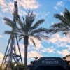
^Good thing about not being all crazy-detailed like some of the (amazing, to say the least) players on here - I don't plan on hitting an object limit, even with all these supports!
 -

 rK_
Offline
very nice, doing away with the entrance/exit would make it look even better imo. either way its solid.
Sorry.. Paint is FAIL -

 Dotrobot
Offline

Paint mega fail.. The green on celing is actually grey.
old screen
rK_: Thx a lot it means a lot to me when somebody comments on my work.. good or bad -

 Cocoa
Offline
dotrobot- I saw those on tpr too. nice job with the carousel. you make me not even mind seeing the actual entrances.
coasterfreak- those supports just kill the screen, and the flowers only under the supports dont really make sense. nice sign though. -

 Wolfman
Offline
@ Coasterfreak101: "RCT-Guide Supports Wood" are pretty good with blending in with the default wooden coaster supports. The color is good and there are a lot more parts to create angled supports for curves. That along with a few Fisherman support objects and a handfull of assorted others. If I got the time, I'll send you an assortment of support files. I have like 40 objects. Let me know if you want them.
 -

 SSSammy
Offline
some lovely upcoming players on this page, well done guys!
coasterfreak, i tried that kind of think in Elk (check my page) and i don't think i pulled it off very well either. i think you will benifit greatly from using thinner objects to maximise a sense of flow. imagine tiers or layers of increasingly taller supports as it approaches the tracks.
dot: nice dude!
mci: that's looking very pleasant
-

 RRP
Offline
The fences like i used here ( http://www.nedesigns...747&hl=rrp&st=0 ) work fine i thinkYeah, we need some good hybrid supports that won't waste about a thousand object spaces.
-

 coasterfreak101
Offline
SSSammy - Elk was actually the reason I finally settled on these objects for my supports; I actually enjoyed them a lot in your UQFTB entry. They showed a lot of effort and I think that they really added to your design. Buuut I guess I'm in the minority!
RRP, I'll check that out for sure when I'm back on my own computer! I was looking to use the art-deco pieces, but I almost like the thicker ones more. I'll play around with some options and check your supports out when I can!
And if it makes it any better, it is a roller coaster located on the Gulf. Think hurricanes - extra bracing!
 Tags
Tags
- No Tags


