(Archive) Advertising District / Dump-Place
-
 19-April 07
-

 deanosrs
Offline
I don't get the use of two track types. It looks like you've done it because all the track is the kiddie coaster type IRL but then you have to use the B&M stuff for the inversions... it's just way too big compared to the kiddie coaster track.
I really like the lift hill and first drop, and the support job is good, but apart from that I think you should have another shot. -

 J K
Offline
See I'm not a massive fan of the supports, I think they could be more aesthetically pleasing.
 -

 Dimi
Offline
I agree with J K. I'd also add some more details to the station and refine the foliage a bit more.
 -

 Wolfman
Offline
I wouldn't waste the 20 minutes actually, I'd probably keep walking like I did when Deja Vu was at SFGA.
It doesn't look safe. The junior coaster track makes it look "flimsy". Why would the track need to be so beefy in the first half, then need to change to something so lightweight for the remainder? You could make it so much better if you just kept using the B&M track throughout. It would make the design look "consistant".
It also looks bumpy in spots with small abrupt/sudden changes in elevation that would impede a smooth ride. I don't even want to know why some B&M track sections are floating around. It just seems like it's nearly totally unfinished, and that might as well include the design. It needs more track because it looks like a very short ride.
Nice alteration to the generic cobra roll though. And the vertical lift tower is a cool feature. But I don't understand a few other track elements that seem unneeded. Like the dip just before the lift and the sudden dip before the hammerhead. And the twisty curve and slight bump before the brake run all make it look mishapen.
You would be saving yourself double work if you didn't add the supports until the track design was finalized. Unfortunatly, this one still needs work. -

 tdub96
Offline
I dont have a problem with the change in track and the use of junior track. Its a Eurofighter. Realistically its ok, albeit short. Very short. If you look at Eurofighters in reality, ie: Speed, they use track similar to that of Intamin, and near the end of the ride, change track types to something comparable to the mini track of RCT. Eurofighters also include a vertical lift, which with RCT, is impossible to do with giga track. So the usage of VD track is fine. The inversions, also unable to do with giga track, so thats fine.
I do see where you guys are coming from with the size difference in the BM track to the mini coaster track, so maybe merge it to intamin track first. And, definetly, increase the size of the layout. Maybe add an inline twist and a helix near the end.
Just throwing my realism sense into the discussion. I think the track type usage is fine. I also agree with everyone else, increase the layout size. Other than that, well done on the Eurofighter and nice start to this new park.
-Taylor -

 djbrcace1234
Offline
^
No, you're completley right.
It's just the transition from BM track to the Intamin type track is too close to make a pleasing shot of the ride.
Also coupon, Not all Eurofighters are that condenesd, you know.
However, I don't mind it being a short ride
-

 rK_
Offline
It's intriguing^^
A new project...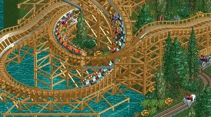
great screen, really like your supports over the water. -
 Timothy Cross
Offline
Coupon,
I take back "It is good for what it is".
BUT,
Your on the verge of a breakthrough, just see your way through it. Capitalize. Take everything you've learned and apply the basic principal of these things to everything else in your work. And study more layouts. Research. You're about to shatter the glass. Increase your effort. It's fun. -

 tdub96
Offline
Wow, Dimi, I love that. Its brilliant. Bringing back flashes of Robbie's Comet, which is a good thing
-

 Dotrobot
Offline
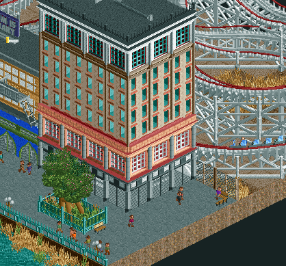
I'm loving that custom tree and the footers on that woodie. The building is nice to me but.. it's.. offputting to me. also
 -

 Wolfman
Offline
I was just thinking about how the second floor and the top floor should match, color-wise. Odd looking tree out front.
 -

 Comet
Offline
Interesting custom tree. I think you pulled it off close to perfect, yet a normal tree would still be better
 -

 robbie92
Offline
Although I like it, the building seems disproportionate w/ the rest of the area, as in its scale is much smaller than the coaster or even the building next to it. I'd also rather see a normal tree in place of the custom.
 -

 Timothy Cross
Offline
I think the custom tree sucks. How many times do I have to say this about custom trees in path: Use an actual tree as the trunk then ZC bushes around it.
Timothy Cross
Offline
I think the custom tree sucks. How many times do I have to say this about custom trees in path: Use an actual tree as the trunk then ZC bushes around it.This is the station for my track, Thrasher, which can also be seen in my sig:

Comments greatly appreciated.
Just thought I would quote the very first pic posted in the dump.
 Tags
Tags
- No Tags

