(Archive) Advertising District / Dump-Place
-
 19-April 07
-

 Fizzix
Offline
Excellent screen, nin. How are you not interested in this game anymore?!? You've definitely got my interest.
 -

 Wolfman
Offline
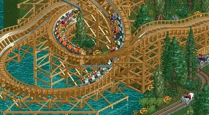
Yellow or maybe orange trim & accents would work well with this blue and purple palette. I like the creative mix of objects and textures. Landscaping looks thick & lush, but looks baren off to the right edge. Might want to swap out the red queue TV for this blue version to keep up with the color motif.
-

 magmoormaster
Offline
I think the stair case up to the lift is a bit pointless, since woodies has catwalks along the whole length of track.
@Nin; holy crap that's bright. Makes me want to do some more NCS stuff again. -

 Cocoa
Offline
what you do with ncs, nin, beats what most people can do with scenery, especially atmosphere wise.
on an unrelated note, i would love a fiesta soon. haven't had one for ages. -

 RamSam12
Offline
Nin, great work with Bizarro! Is this from your SFMM?
Coupon, looks like a good start, but the roof supports on the station seem a bit thin to support it. I'd suggest using the custom fence base that you used on those stairs instead. -
 tdub96
Offline
^I believe its his SFOT with the NCSO bench. He's been dropping screens of that every now and then and i dont see any CSO here.
Looks fantastic nin, as all your work does to me. That is really detailed and realistic for NCSO. -
 MF72
Offline

I'd just like some thoughts on the station and the cafe. I'm contemplating changing the station, but I'm not too sure. Thoughts? (Sorry about the rain, didn't realize it until now.) -

 Wolfman
Offline
The structures and stuff look pretty good, but I wouldn't build so close to the edge of the map. It just ruins the look with a black background. Most pro builders will leave a wide empty swathe of forest, so the black area isn't even in the picture when you view the parks close up like this.
If you think about it, it's sort of like how Walt Disney said that he hated the area outside of the Disneyland park, as it's signs & advertising encroached upon the fantasy world that he and his crews worked so hard to create. And how it forced people back into the real world. In The Magic Kingdom, they have the "blessing of space" to control what is seen outside the parks. It's all about being immersed into a world that you have created. It's too late to do anything about it now, but keep that in mind when creating parks in the future. It'll really improve the look of your work.
I'd change the boomerang station to log cabin and it'll blend in better than the default look. I've always made a boomerang with at least a series of flat track sections (enough for the entire train to lay flat upon) between the station and the cobra roll. And I always left the same sort of flat track between the station and the reverse lift hill. This reduces the nausea factor like nobody's buisness. But the latter has another motive as well...
This is because the station has to stop the train and combat the force of gravity at the same time as the train drops durring the return run and finally stop in the station. I discovered that if the train had no force impeading the brake system in the station to stop the train, (such as gravity pulling it down the reverse lift hill) breakdowns were significantly reduced if the train was just coasting along a flat track without gravity trying to make it go faster.
This may defeat the idea of creating a compact track, but it would be less nausea inducing, and suffer less breakdowns in the long run. In turn this increases ridership and increases money coming in. So it's really a "Win/Win" situation.
I'd lose those cartoony round windows. It just looks so "Mario Brothers". One other thing... Windows are rarely covered by a roof on the outside, (as you do at the peak of the structure that faces the carousel.) It's really best to have no window at all, or raise the roof to make clearance for the entire window.
I'd also put some sort of cover over the carousel queue, like canvas awnings and poles. Peeps will fill that queue and the ride cycle is pretty long, so adding a cover to the queue makes sense and affords another opportunity to create some additional detail to something that would otherwise be boring and run of the mill.
The boomerang in green just seems to blend into the background. I'd go with yellow myself, just to make it pop. If you know what I mean. The midway needs just a few more trees as it looks sort of baren in that area. The blank property between the spikes of the boomerang could use some trees, if sparsly placed.
If you use the trainers? use them to control the weather. Rainy screen shots are uncool. Otherwise, pretty nice work. Looking forward to more. -

 robbie92
Offline
I really like that. If your next park has this level of thought and execution throughout, I see an accolade in your future.
 -

 nin
Offline
Was wondering when we'd get to see Dare Devil. Even I'm thinking of making a rec once more pics, and more than likely the ride itself, is out.
 -
 Timothy Cross
Offline
I do not find it very
Timothy Cross
Offline
I do not find it very~~~~~~~~~~~~~~~~~~~~~~~~~~~~~~~~~~~~~~~~~~~~~~~~~~~~~~~~~~~~~~~~~~~~~~~~~~~~~~~~~~~~~~~~~~~~~~~~~~~~~~~~~~~~~~intriguing~~~~~~~~~~~~~~~~~~~~~~~~~~~~~~~~~~~~~~~~~~~~~~~~~~~~~~~~~~~~~~~~~~~~~~~~~~~~~~~~~~~~~~~~~~~~~~~~~~~~~~~~~~~~~~
-

 tdub96
Offline
I actually find it somewhat~~~~~~~intriguing~~~~~~. I have to note how realistic that is looking. If you took your time and put more time into this park, I'm with robbie, youll be on the front page very soon.
As for Fizzix, woooww That looks excellent, great work so far.
-

 Timothy Cross
Offline
^ You do not understand what I mean by
Timothy Cross
Offline
^ You do not understand what I mean by~~~~~~~~~~~~~~~~~~~~~~~~~~~~~~~~~~~~~~~~~~~~~~~~~~~~~~~~~~~~~~~~~~~~~~~~~~~~~~~~~~~~~~~~~~~~~~~~~~~~~~~~~~~~~~intriguing~~~~~~~~~~~~~~~~~~~~~~~~~~~~~~~~~~~~~~~~~~~~~~~~~~~~~~~~~~~~~~~~~~~~~~~~~~~~~~~~~~~~~~~~~~~~~~~~~~~~~~~~~~~~~~
But nevermind. It is good for what it is.
 Tags
Tags
- No Tags
