(Archive) Advertising District / Dump-Place
-
 19-April 07
-

 Liampie
Offline
I like it (a lot) except for the coaster's colours. Why is it camouflaged?
Het riet zou mooier staan als je het wat vloeiender maakt met ook lagere stengels enzo. Nu staat het nog niet echt natuurlijk... -

 BelgianGuy
Offline
@ruben, your coaster wouldn't survive a train passing there, you'll need more supports and try to make them actually connect because they don't look too good if I might add, the rest is pretty solid but nothing eye-popping for me sorry, its a good base to start with but try to give it that little extra to make it special.
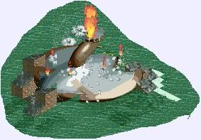
@stanman, the first screen is pretty cool although I'm not sure what I'm looking at
Second screen really has a nice old skool feel to it and I like the support structure on the flume, just a little more details here and there would make it even better, also try not to overuse the trackitecture, or it'll start to become a little gimmicky -

 Ruben
Offline
Thanks for the comments!
@Liam: Just thought this would look better with the theme (robin hood) than pink or red Btw haven't got the lower version, so that will remain a flaw of this park.... not into editing it in.
@SSSammy: Why? Because the lay-out looks standard? It's meant realistic, that's the most important point.
@Belgianguy: What point(s) do you mean? I know i should probably put one more between the zero g and the building, but other than that there are just as many as not more in a real B&M? I know the supporting doesn't look perfect, but I only have some 15 parts or so to use, so that is a major mistake I made before even starting this park, and found out after 100yrs of playing. You're right though.
Then, @Stanman: the first screen is a bit standard, but the second one looks really great and innovative for NCSO! Nice how you supported that spillwater. -

 SSSammy
Offline
cause the loop cobra zerog has no flow.
awesome, awesome screen stanman. i always laugh at your avatar, tickles me every time. -

 zburns999
Offline
Haha, stanman, I was about to say how much the first screen reminded me of Parc Guell until I realized that's what it was supposed to be. Guess that shows you did a good job with it.
 -

 Fizzix
Offline
I think you have a great concept going there, but I think you're scenery is killing it. Try using less cartoony scenery, and I think you'll be much better.
 -
 Jaguar
Offline
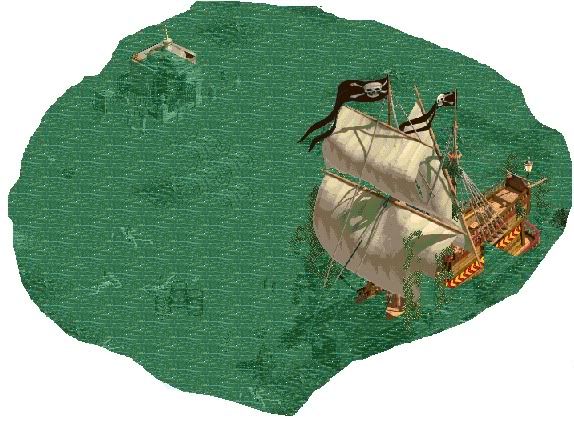
Yeah, my scenery choices are bad, but doesn't that pirate ship look less cartoony than the RCT one?
Here's more of my newest project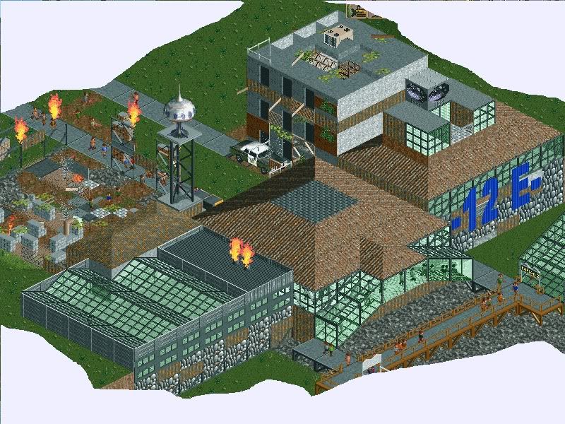
My attempt at a duel station, it is easier than I thought.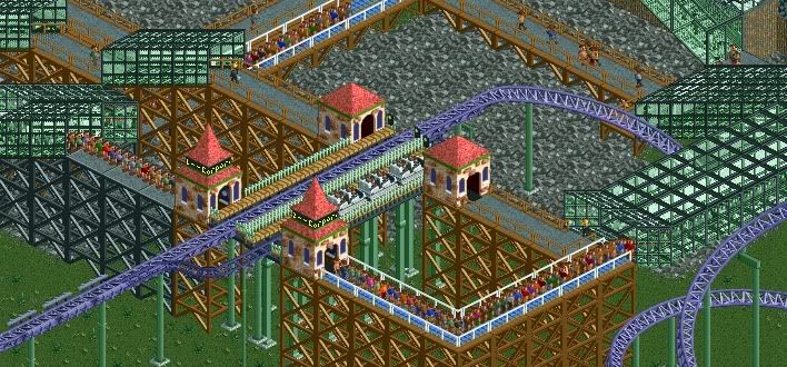
-

 Wolfman
Offline
@jaguarkid140:
Looks great. I always liked ruins of one sort or another. But the station looks a little bare. Maybe something that has roof sections missing to continue the ruins theme?
I like the concrete path with the black supports rather than the brown supports. Try using raised support blockers to create a lofted "ironwork" under the path, like a bridge, (rather than allowing all the supports to reach all the way to the ground) and only allow a few support "towers". I think that would add a bit more intrest, and reduce the massive gridlock wall pattern the supports create.
I have no idea how I would go about modifying a glass object. I understand that it's complex at best. So I hope an object maker stumbles upon the following suggestion and is inspired by this idea.
I think it's odd that while the walls and surroundings stand in ruin, yet every pane of glass remains intact. Wouldn't it look a bit more realistic if a random selection of panes were missing or broken? or if parts of the framework looked damaged? I know Jaguarkid140 has no control over the scenery available.
I wish someone could modify a set of roofs and walls so that some look broken or missing. Like a set of 3 or 4 walls that has a different set of missing and broken panes, and a set of 3 or 4 roof pieces that have different missing and broken panes, (rotating the roof section may reveal a different set of busted panes.) This is so that a pattern doesn't emurge so a builder can mix up the walls and roofs, to create a more random and realistic scene. -

 Jaguar
Offline
The ruins are present day buildings of our cities hundreds of years in the future, all of the glass and stuff are part of military buildings run by an evil corporation. Of course the station is bare because I was just demonstrating the double station I have made in a short period of time with only 8-cars.
 -
 RCTCA
Offline
Robbie: Wow, that looks awesome - I can't wait to check it out.
5dave: That looks great. How big is this park anyways?! It's been going on foreverrrrrr.
 Tags
Tags
- No Tags


