(Archive) Advertising District / Dump-Place
-
 19-April 07
-

RMM Offline
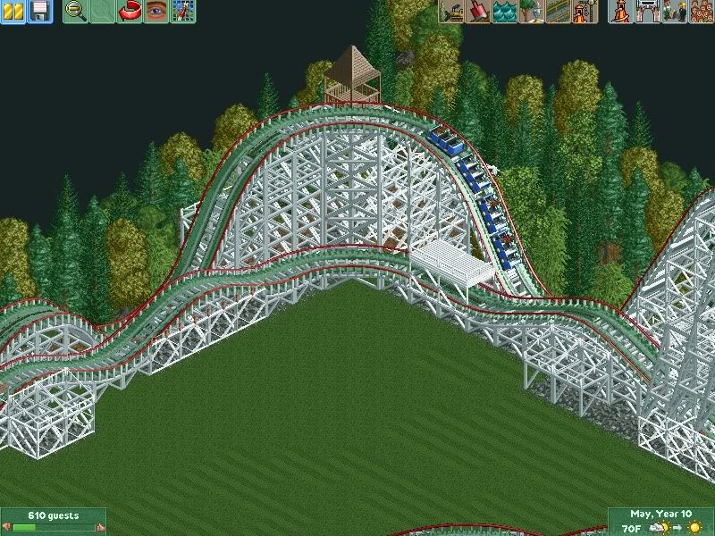
try taking a left turn after the final corkscrew and wrap it around into the brake run/station. -

 magmoormaster
Offline
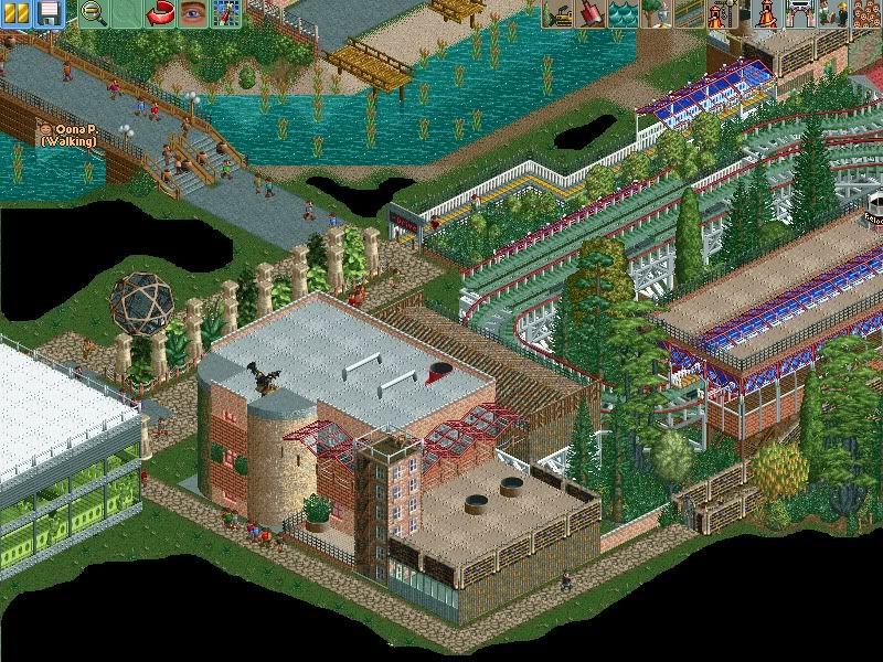
The path looks a little narrow. The building looks like you just spazzed out and placed random stuff on it. And I don't like the idea of the ride going down and into a flat turn. It doesn't seem realistic to me.
 -

 Dark_Horse
Offline
jag, you have way too many trims on that woodie, and the transfer is still unrealistic. I can some potential, but it's just not there right now.
 -
 Jaguar
Offline
The path looks a little narrow. The building looks like you just spazzed out and placed random stuff on it. And I don't like the idea of the ride going down and into a flat turn. It doesn't seem realistic to me.
I know, though these are tenements in the 1930's Chicago.jag, you have way too many trims on that woodie, and the transfer is still unrealistic. I can some potential, but it's just not there right now.
I don't really care too much about the transfer, I'll do it later, and the supports are steel, kinda like the cyclone. -

 nin
Offline
jag, why black out random portions of grass? it just makes the screen look messy.
I see improvement Coupon. -

 Austin55
Offline
Holy crap coupon, thats awesome! Is that first turn around a partial helix? you could get rid of that hitch if it isnt.
 -

 Dotrobot
Offline
Jag even if it is. it looks like you're using way too bold colors on your glass work. Especially that red and green. And there's too much plants on the river. They don't exist ON the water.
P.S. - South Korea -

 Dark_Horse
Offline
I never mentioned anything about the supports...but I still find there's nothing really exciting about that screen, but that's just my opinion.
 -

 Roomie
Offline
Delphic Shores - Unlike Portal this is my passion project. It's an update after 8 years.

Nothing much. Just finishing up.
The extra's are almost done too
-

 RCTCA
Offline
Roomie & nin: Great work - really, really, nice stuff. How'd you make that volleyball court, roomie?
K0ng: ...
~RCTCA -

 hulkpower25
Offline
here is another look at Mythos
http://kumba.parkmakers.com/Mythos.bmp
here is something i am working on, what do you guys think with the excention of the extreme use of the boxy shape objects by jz
http://kumba.parkmakers.com/2-hulk.bmp -

 Cocoa
Offline
^the first one is fairly nice, add more of that pink I see in the corner throughout the whole structure. the second one is cool, but it looks better from the bottom angle than the top one.
here is some more unfinished architecture of mine from my new project. figured I'd revisit New Orleans. the purple building is the entrance to a dark ride, and there's fog but you can't see it here.
-

 hulkpower25
Offline
nice job on the building, and it will be a good theme for horror like attraction.
 Tags
Tags
- No Tags
