(Archive) Advertising District / Dump-Place
-
 19-April 07
-
 coasterfreak101
Offline
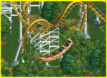
Fizzix, it looks damn good. And I'd say that even if I wasn't part of the project.
-

 nin
Offline
thanks everyone, and yes this is just the SFoT scenario. Hopefully you'll see something more serious soon.
that's really nice too Fizzix, ever going to show the SF parks? -

inVersed Offline
nin you've just posted two of the most inspiring screens i have seen in a very long time. Even though I can hardly find time to play because of college I really want to build now that I have seen those picture
any chance I can get and advanced screening?
-
 tdub96
Offline
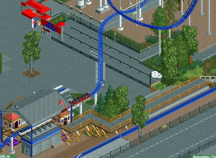
A couple of blast off, this is unfinished to say the least. Comments and suggestions welcome, enjoy! :
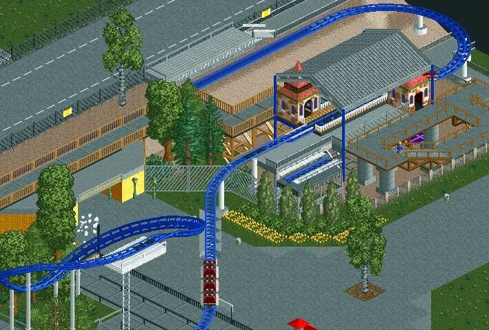
-Taylor
PS, could anyone make entrances invisible for me, I tried the hack and nothing happened, I followed the tutorial exactly. anyway, please comment on the screens! -

 K0NG
Offline
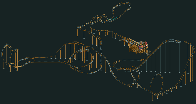
I was browsing some older topics last night and came across the "X-Raptor" thread...which reminded me of a project I'd started a few months back. So, needing a break from K0NGENSTEIN, I decided to pick up on this and finished the layout for "Vulture". Up front, I'll say that after much tweaking of both the track itself and the terrain, I'm completely satisfied with the layout so any 'advice' along that line most likely will be ignored.
-

 K0NG
Offline
^It involves navigating the terrain...it makes sense when you see it. You know how I am, I like landscaping as much as anything else, so this will also feature a lot of it
-

 tdub96
Offline
@Brent- Thanks for the comment, its recreation, and the paths in that area of the park are a bit bare. I'm not re-creating the entire park, just the one coaster. The project started about a month ago and is about 90%, I just need someone to help make huts invisible and to finish custom supports.
I hate to bug, but any more comments for me? -

 Fizzix
Offline
Thanks for the comments guys.
nin, sooner or later, probably later...
tdub, it looks good, and is that Sky Rocket at Kennywood? If so nice choice.
*EDIT* Just read the sign, lol. -

 Evil WME
Offline
Layout's "not bad" seems to be the right phrase. Doesn't seem to really catch my attention anywhere.
I'm guessing you have theming planned for some of the diagonal sections? I don't really understand the extra length otherwise, but maybe if there is a tunnel it will all magically make sense! -

 deanosrs
Offline
@Kong... why post a layout then say you'll ignore anything anyone says about it? Because there isn't anything else to comment on! And I for one would say there could be improvements made. If I saw that in game the word "cliche" would come to mind. Unless it's some kind of ultra realistic park, in which case, good job.
 -

 posix
Offline
I think he was just proud of it and wanted some appraisal. I do agree with your point though, deano.
 -

 Dark_Horse
Offline
I had the exact same thought as deanosrs, though I'm guilty of posting similar screens. As others have said, there isn't much to comment on and there isn't anything that really grabs my attention. Maybe if you showed how the coaster acted with the terrain, you would get more appraisal.
 -

 Phatage
Offline
I was browsing some older topics last night and came across the "X-Raptor" thread...which reminded me of a project I'd started a few months back. So, needing a break from K0NGENSTEIN, I decided to pick up on this and finished the layout for "Vulture". Up front, I'll say that after much tweaking of both the track itself and the terrain, I'm completely satisfied with the layout so any 'advice' along that line most likely will be ignored.

While trying to make a better version of Wildfire, all you actually did was conform it to the pacing that most flat-ground B&M's share. Congratulations, you turned something unique into something standard and because you like how it looks from the one view depicted, you're unwilling to listen to any advice to make it better even though listening doesn't necessarily imply compliance. The diagonal lift-hill especially seems unnecessary for it appears as though you had it initially come straight out of the station seeing as they share a grid coordinate, but it looked too standard for you so you added all that pre-lift track (unless you had something like a skyscraper there that a 60 degree lift hill couldn't overcome). I would rather see a designer strive to stay away from standard ride experience (unless that's what is desired) rather than standard bird's-eye appearance. -

 deanosrs
Offline
So this is the dump place, which I guess is appropriate to show case a building that's been deleted. Mostly it didn't fit with the scale of the park or area, and I couldn't find anything to go with it. It just seems to me not theme parkish enough and looks empty because of all the arches.
First it was a carribean eatery...
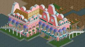
I then thought changing the colours might save it, and adding a reggae reggae sauce theme (put some music in yer food!) but it was still out of place.
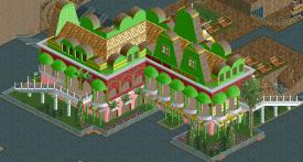
Why post something that's been deleted? To prove I am actually playing rct of course! I'll stick to my word of not advertising the park until it's at least 75% of course. -

 Roomie
Offline
Deanosrs I really like it. But without seeing the context of how it fits into the park its hard to say weather it fits or not but if the rest of the park conforms to that standard then it should be cracking

Work in Progress on the Portal Ride
 Tags
Tags
- No Tags
