(Archive) Advertising District / Dump-Place
-
 19-April 07
-

 Jaguar
Offline
i'm not usually a fan of NCSO, but old chicago looks pretty interesting jag
Thank you, I wish the roaring 20's scenery wasn't from TT, that would make it much easierJag looking interesting. The show seems a bit random though
Thank you. That area is somewhat small so I couldn't get a good full sized well placed show in there.On a side note, old Chicago is looking very interesting, see if you can build up to and even in the river, some thats basically how the real city is. Is that supposed to be the Chicago fire going on there?
I will try. No, that isn't the chicago fire, it isn't that old, it is the 20's-40's and that stadium is themed after the rust belt, when many factories and mills in Michigan, Illinois, and Indiana were derelict and left to break down.Jaguardkid140, that's looking real nice. My only thing is that giant support for the chairlift queue. I wouldn't wanna run into that thing rushing down the stairs to some attraction cause I didn't see the pole.
It is actually a stadium light on the top of the stage
As for Jag: Your work has been improving so much lately. That looks pretty good but pretty bare in some places. By the way is that water mill ferris wheel working? I'd love to see a water mill that works. you could just zero clearence scenery on the ferris wheel entrances
Yes, it is bare because it is unfinished. The water wheel does work.
Like I have said before, if anyone wants to have a quick guest spot on this park, they are welcome to help. -

 Dark_Horse
Offline
Sorry about that jag, I was being blind again. I meant the pole for the carousel queue. Other than that, nice work and I might be interested in a guest spot :-D.
 -

 djbrcace1234
Offline
Some really good NCSO is going on jag and robbie.
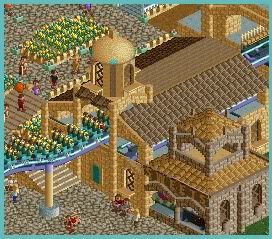
Since when did you start this!?
Some hand rails on the paths and that extra seem to be needed, otherwise you'll see a law suit coming.
Other than that, I can't complain one bit. -

 Tolsimir
Offline
That looks really good Fizzix. Maybe add one or two colorful details as this is a bit too brown.
 -
 Timothy Cross
Offline
Nice screen, Fizzix, but work on your textures. Right now, I feel you're using too much of the brick.
 -
 JoeZia
Offline
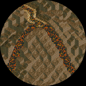
Since no one seemed interested in my story half of it, here's just the screen..

There's gonna be a lot of jagged rocks but I feel there has to be some more varierty in my landscaping. Any suggestions much apreciated. Also if anyone would like to help with this project you're more than welcome. I wanted this to basically be a volcano in the middle of a sea of molten rock. I don't want to give away the main details but I'll tell whoever wants to help. -

 JoeZia
Offline
yes- it's the 'demonic' palette I had for download. So it's to dark?
Edit: I can easily fix that but it i'll have to use my lava palette because otherwise I'd have to make another 'duplicate' object. -

 Fizzix
Offline
If I were you, I would vary the angles of rock in there more. Thanks guys for the feedback, I'll see what I can do.
-

 JoeZia
Offline
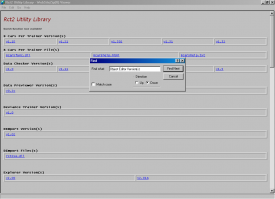
Just something else I thought to advertise in the district:
I'm updating my Rct2 Utility page. It has an easy-to-use search function, organized by name downloads of every trainer, version, readme, & tutorial I currently have listed. It's not quite finnished but I'll just post in here again to confirm when it is, and when I have the new link in my signature. -

 rK_
Offline
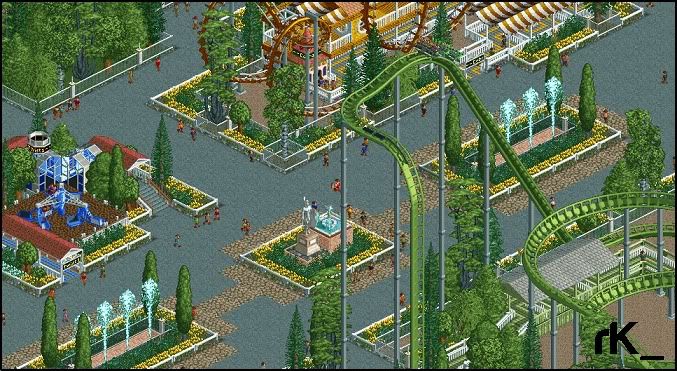
i got bored yesterday and filled up about a quater of a 120x map, first time ive touched rct2 in about 3 years, ncso.
-

 Jaguar
Offline
Looks very classic, as if it were a rct scenario that was completed or one of chris sawyer's recreations.
 -

 rK_
Offline
its very basic and minimal, getting back to having fun with the game again, i miss my peeps!
 -

 Jaguar
Offline
^hmm maybe, I really wish I made the park bigger, it's just that I have a fear of the object/banner limit.
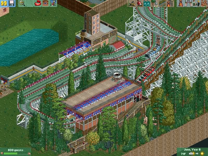
NCSO is extremely easy.
 Tags
Tags
- No Tags

