(Archive) Advertising District / Dump-Place
-
 19-April 07
-

 Splitvision
Offline
Awesome. Some more details on the path, such as lamps, benches etc, and also maybe some road lines, and it'll be perfect.
 -

 Jaguar
Offline
That looks great Goliath, I don't like the purple windows though.
More NCSO
Old Chicago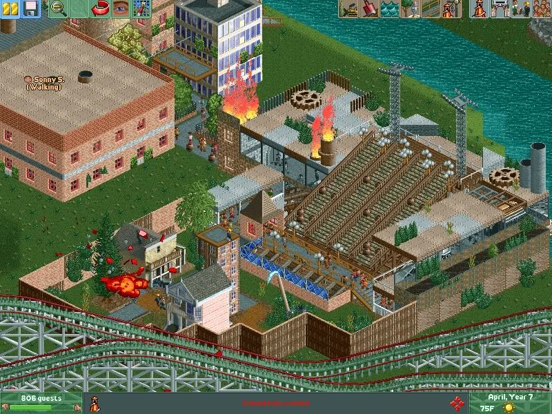
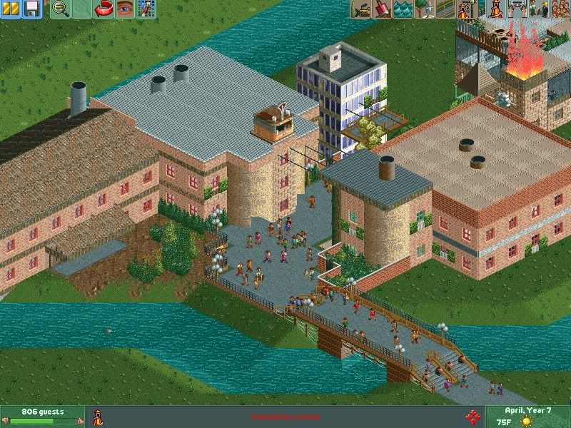
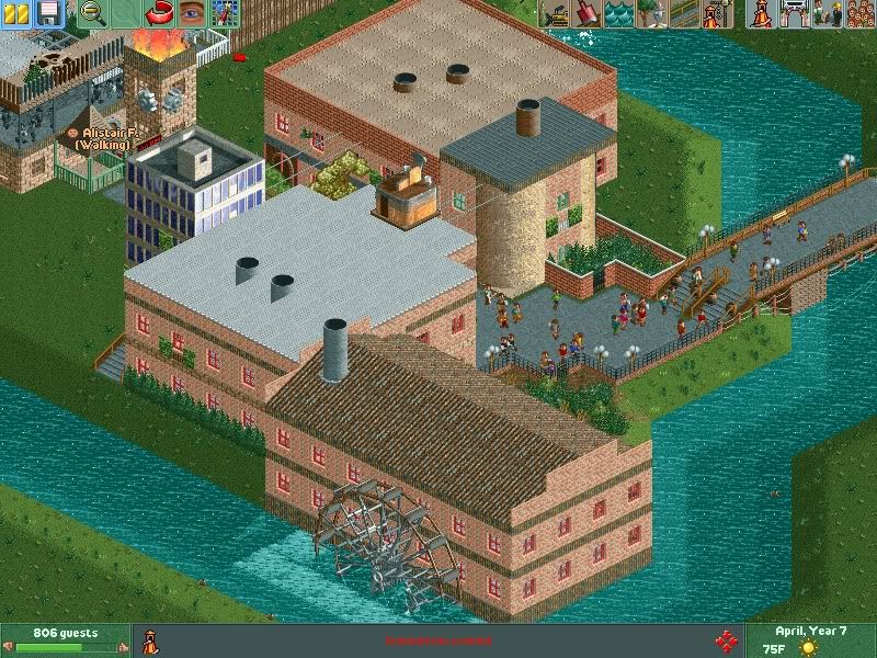
Sector Epsilon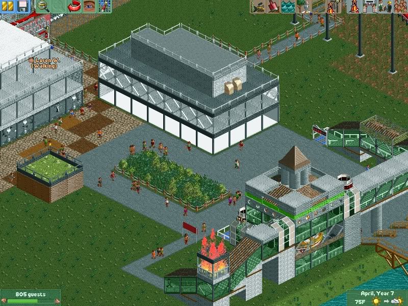
-
 JoeZia
Offline
Looking great coupon, maybe add some color
@Goliath123
I'm aroused. Love that fucking structure. -

 Wolfman
Offline
The twisted track for the roof doesn't do anything for it. You already used track for roofing on an adjacent structure. So this becomes a redundancy when used so close to the same tick you saw right next door.
Also, the same diamond fencing used in the yellow structure's windows is used as a facade on the next structure, also, overused.
It just seems like so much stuff was thrown at a small structure that's only a 2x6. That it got totally lost under it all.
Try to bring both structures together as one large structure. Make it so that the roof fits, and doesn't "overhang on one corner." Build the walls with the same materials. Rather than try to fool everyone by changing the look & style in the wrong places.
For instance, delete that inside corner walls of the yellow building, and rebuild it to an outside corner under the roof proper. (Delete one section of footpath. That will leave two sections of path for peeps to maneuver around after the steps well enough.) This will say... "OK, this building ends here, and this red structure is built right next to it."
Relocate the lamp to the steps. Replace it with a bench and add a trash can. -

 Jaguar
Offline
My guess is that isn't the Old Chicago that was torn down in Bollingbrook, IL.
It is called "Old Chicago" as in Chicago from the roaring 20's and great depression. -

 Stanman
Offline
How would you realize asian roofing then?The twisted track for the roof doesn't do anything for it. You already used track for roofing on an adjacent structure. So this becomes a redundancy when used so close to the same tick you saw right next door.
but it looks good imoAlso, the same diamond fencing used in the yellow structure's windows is used as a facade on the next structure, also, overused.
no, that´s called detailIt just seems like so much stuff was thrown at a small structure that's only a 2x6. That it got totally lost under it all.
no i won`t, the overhang is on purposeTry to bring both structures together as one large structure. Make it so that the roof fits, and doesn't "overhang on one corner." Build the walls with the same materials. Rather than try to fool everyone by changing the look & style in the wrong places.
there´s an overhang on the other side of the yellow building, tooFor instance, delete that inside corner walls of the yellow building, and rebuild it to an outside corner under the roof proper. (Delete one section of footpath. That will leave two sections of path for peeps to maneuver around after the steps well enough.) This will say... "OK, this building ends here, and this red structure is built right next to it."
yeah...Relocate the lamp to the steps. Replace it with a bench and add a trash can.
just a question: your so detailed crticizing other´s work, but you seem to fail seeing what are the weak points on your own stuff. why? -

 Wolfman
Offline
I'm not going to get into a juvinile bubble gum conflict over bullshit.
I gave you an opinion. Take it or leave it. I don't care. My life does not revolve around you or anyone else here at NE. But don't fucking bring MY work into your little tantrum. I know you're just trying to change the focus from your crap and place it on mine. I'll make my choices no matter what others think or say. Right or wrong. I stand by my choices. Everyone else can go get fucked if they don't like it. -

Airtime Offline
Stanman looking nice. Try a different land texture under the path, the rock gives it a dark feel. The roof on the right looks a bit off as well. Aslo I find it best to not bother reading Wolfie's posts
Jag looking interesting. The show seems a bit random though -

 Austin55
Offline
Thank you posix.
On a side note, old Chicago is looking very interesting, see if you can build up to and even in the river, some thats basically how the real city is. Is that supposed to be the Chicago fire going on there? -

 Dark_Horse
Offline
Jaguardkid140, that's looking real nice. My only thing is that giant support for the chairlift queue. I wouldn't wanna run into that thing rushing down the stairs to some attraction cause I didn't see the pole.
 -

 Splitvision
Offline
^^Try not to copy stuff from the screenshots, like selecting an area of it and then cut & paste it into a new paint document or w/e, it results in a pretty horrible loss of colours/quality. The building looks nice, simple but effective (minus the glitching entrance hut), I'm sure though it'd look better in "true" colour.
 -

 Dotrobot
Offline
I have suspended Wolfman's account for 10 days. Enough of this bullshit.
D:
As for Jag: Your work has been improving so much lately. That looks pretty good but pretty bare in some places. By the way is that water mill ferris wheel working? I'd love to see a water mill that works. you could just zero clearence scenery on the ferris wheel entrances
 Tags
Tags
- No Tags


