(Archive) Advertising District / Dump-Place
-
 19-April 07
-

 Wolfman
Offline
Its probably not really the amount of chimneys. As homes back then didn't have the invention if central heat & air conditioning But fire boxes did share the same flue,to save materials.
Seriously though, the selection of materials has been narrowed down to the point that each chimney looks identical from one to the next.
Try sorting through your objects and add to the variety of objects that are used in the construction. How about developing a few different styles instead of repeating the same style consistently? -

 Wolfman
Offline
@ Jaguarkid:
I don't know. As far as foliage inside the park, all I see is the one Silver Birch, (and barely anyone likes those 'cept me I guess) and a remarkable lack of gardens or other natural scenery.
A lot of paved area that is barely noticable, as it blends into a neutral background of beige & gray scenery, if it were not the stark contrast of red. Lots of walls moved right up to the footpath. It's like a dense maze. I don't know if this was intentional... But if I were walking around this park, I'd feel congested, trapped, claustrophobic.It needs S P A C E to sprawl out a bit.
@ nin:
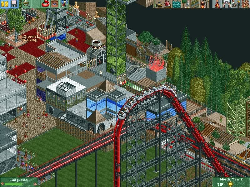
I like this plenty. But I wonder if the opportunity for some themed structures has slipped past you? A good place to start would be over the queue. Other than that, consider using shorter fences/walls between the queue and the track. You want to allow some visual contact between the queue & track to make the queue more exciting for those who are waiting.
Maybe try to conseal it at first to get that... "What's that rumbling noise?"... feeling. Then as the queue bends, you get that... "There's something behind this fence!" feeling. Then allow the wall to become shorter and shorter for that... "I can almost make it out"... feeling. For more eye contact and full exposure to the queue you give the full view... "Wow! I din't know it was right here!" effect.
To be honest, it's too small a image to base much of an opinion on. But it looks like a pleasant area. -
 Jaguar
Offline
@ Jaguarkid:
I don't know. As far as foliage inside the park, all I see is the one Silver Birch, (and barely anyone likes those 'cept me I guess) and a remarkable lack of gardens or other natural scenery.
A lot of paved area that is barely noticable, as it blends into a neutral background of beige & gray scenery, if it were not the stark contrast of red. Lots of walls moved right up to the footpath. It's like a dense maze. I don't know if this was intentional... But if I were walking around this park, I'd feel congested, trapped, claustrophobic.
It is intentionally claustrophobic, and that screen shows no gardens because that city is a futuristic industrial zone run by an evil corporation. Also, if anyone wants a guest spot in the park, please contact me. -
![][ntamin22%s's Photo](https://www.nedesigns.com/uploads/profile/photo-thumb-221.png?_r=1520300638)
 ][ntamin22
Offline
Barrel Chimneys to me are like brown to Kumba or Gold to Turbin3...

you sir need to be introduced to the wonders of tombstone chimneys -

Airtime Offline
Nin that's beautiful. Don't like that long turn into the lift though. Try the smaller turn? -

 Austin55
Offline
I'm excited for your park coupon, I'm just wondering what that superman looking ride is supposed to be.
 -

 djbrcace1234
Offline
I'm excited for your park coupon, I'm just wondering what that superman looking ride is supposed to be.
Over from TPR he said it was an Intamin Blitz type ride.
Over by the wave swinger seems bare over there. Maybe a few shurbs, or a planter would do there.
-

 Dark_Horse
Offline
That's looking nice, Coupon. With that many midway stalls, I'd try to vary the games booth a bit though.
 Tags
Tags
- No Tags


