(Archive) Advertising District / Dump-Place
-
 19-April 07
-

 Lowenaldo
Offline
i bet if you joined the army you could play the most realistic version of air soft.
 -

 Jaguar
Offline
I have faced off with a few real marines before, and it is exactly as you'd expect, and the military does use stuff like systema guns which are more than $1,500, but that would be funny going into the middle east with nothing but a plastic pellet gun. I have played speed ball before and it hurts a lot, but I prefer the realism of airsoft scenarios and woodsball. It is like the difference between Rainbow 6 and Halo 3, they can't truly be compared. I did find something on the internet that most MilSim fans would find funny:
-

 AvanineCommuter
Offline
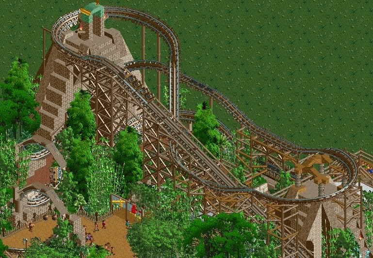
thanks for the replies guys. I'm going for a fantasy style in the wild, so that's why I'm going to be using a lot of glass with that building style. I've got some more time to work these next few days before classes start so hopefully I can pump out some more screens soon.
 -

 magmoormaster
Offline
I personally think that paintball would be better for realism. a T9 with first strike rounds will shoot farther than any airsoft gun ever made, period. Plus they are clip-fed, run off 12grams. Everything contained.
But I don't play paintball because it can be viewed as realistic. Really, neither paintball or airsoft is realistic. You can do things in both that would be impossible in real war. For example, I could hide behind a bush, or plywood and be safe in paintball. Real guns can shoot right through those. There's a huge list I could go through, but I'll spare you all. -

 Cocoa
Offline
ooh thats pretty cool. i'm not sure i like the trees though, although they do give it a good atmosphere, but I'm sure you could do that with non ww/tt trees.
 -

 deanosrs
Offline
I like the trees. They make it all come alive a little even if they do hurt the eyes a touch.
Really like the last screen with the pyramids. The corkscrew arch supports look too thin but other than that it's all pretty sweet. Liking the glimpse of the queue line on the right hand side as well! -

 BelgianGuy
Offline
I hope you go into detail of the ruins more than just covering up woth those trees, they do look nice for this setting of theme but I think they contrast in style of object too much with the rest of the screen, cuz your buildings are very good but the texture contrast with the trees is kinda off-putting for me,you could do a better job just using the as accents rather than filling it up with those trees, I'd remove all trees, make a good ruined section and then add those trees, cuz then you'll see they aren't needed that much because you'll be hiding a lot of the ruins, and I think those are the main part of the theming not the jungle trees...
 -

 Louis!
Offline
To me, it looks a giant mess. I can't really focus on anything, or pick out anything that is actually decent in there.
 -

 J K
Offline
Ok so the new supports you've done to the right of the screen make them all the medium colour brown to separate from the dull brown in the architecture. Change the supports from the left hand side to the style you have on the right and yet again make it all medium brown in colour.
The trees are what is killing it for me even though I really like the screen. Make your tree selection more visually appealing whilst hacking some rct bushes into the composition and I think it will be really nice. I love the supported cork screws like that and I love how everything is small and compact. The dual-track works for me so please keep that. -

 Fisch
Offline
Any better my friends?

Unfinished of course
A LOT better. Now if you add a few more structures and a kind of big station in the same style it's gonna be perfect.
@hulkpower:
I agree with Turbin3 and Wicksteed.
 Tags
Tags
- No Tags


