(Archive) Advertising District / Dump-Place
-
 19-April 07
-

 djbrcace1234
Offline
I don't see why you don't like them. They're some of my favorite trees in the game.
I think it has to do with it just being part of the expansion pack.
I love the trees as well. They add the best ambience for a good jungle, unlike the in game kind, I think at least. -

 StormRunnerFan
Offline
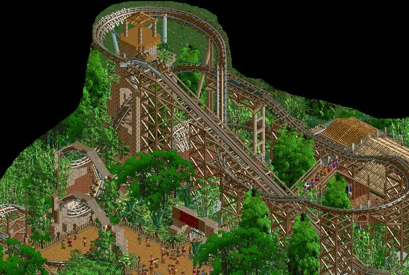
I do agree. The trees provide a great way to cover ground and, in my opinion, they look nice. For all of you who guessed, DisneySea is correct. It is my own take on it, so it's not exact. I've been looking at the past DisneySeas, and I think the trees worked quite nicely there. Thank you all!
-Storm -

 rK_
Offline
that bridge is beautiful SRF, looks similar to what i just put into my solo but the giga rack looks so much better then mine. great work again sir
 -

 In:Cities
Offline
i think the trees look great.
non-typical, and capture the jungle atmosphere perfectly.
nice work srf. i always love your projects. -

 K0NG
Offline
Personally, I've always liked those trees. As long as you kind of keep 'em with each other and don't mix 'em up with other trees that don't really jive with 'em, they're pretty sweet. Nice screens SRF.
 -

 Cena
Offline
That gives me a huge smile on my face Robbie, and you know why. Now keep building!
(Catch me on msn tonight for the 8cars problem). -

 Louis!
Offline
Just a sneak peak of what I'm currently working on. It's far from ready for it's own thread though... but let me know what you guys think!

This seems to have gotten lost in the mass discussion over trees.
This is truly awesome AC, fantastic work. -

 chapelz
Offline
the brick wall used on the roof just doesn't make sense, i like the look just pick a different texture.
 -

 Sey
Offline
I like it robbie! Looks similar to "a Southport style".
Btw, can you send me those indigo roofing objects with the laser-lights? -

Airtime Offline
Wow, Lowenaldo, I know you was improving but that shows huge improvment! Nice one! Although other than the orange I can't see much texture especially on the back wall, add some texture to that wall like stone? and its pretty much perfect
-

 magmoormaster
Offline
Damn you, robbie!!! You're too good.
Avanine: I'm not sure the glass matches with the style of the building, but it looks fantastic.
Lowenaldo: looks pretty good so far. As was mentioned, the back wall could use a bit more... well, more.
 Tags
Tags
- No Tags


