(Archive) Advertising District / Dump-Place
-
 19-April 07
-

 Splitvision
Offline
Yes, it looks very cartoonish and blocky right now. Also I think the buildings could be considerably higher, more skyscraper-like. Also that custom object above the entrance to Oscorp does not look like it belongs in rct. You can do better.
 -

 hulkpower25
Offline
all the objects i got on the scenario are those you see, if i can i would do what you guys say, thank
Sssammy, and Splitvision -

 StormRunnerFan
Offline
Some Jazz again:
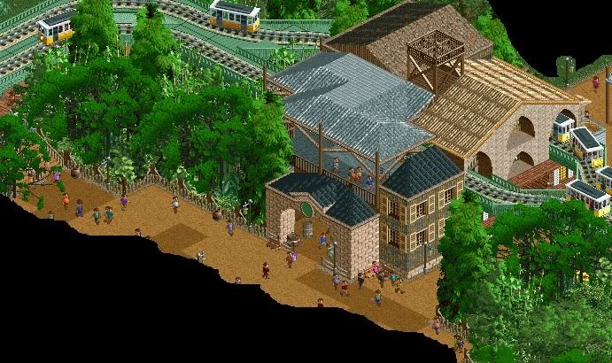
-Adventure Outpost Electric Railway stop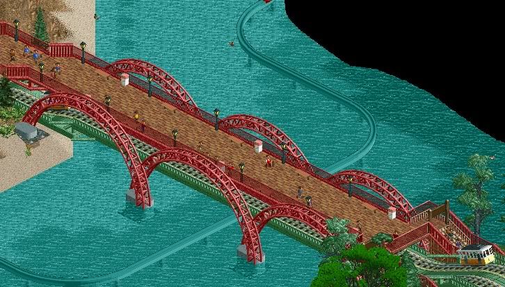
-Bridge from Adventure Outpost to Mystery Island
Thanks all,
Storm -

 RamSam12
Offline
Not a big fan of the different shades of brown path in the first screen, but everything else looks great.
 -

 magmoormaster
Offline
Hold on, I have to go find my jaw...
That first screen is beautiful. Like, really fantastic. -

 djbrcace1234
Offline
DisneySea?
You know, after seeing a few of these screens, I have to agree with you, nin. It really does have that Disney sea esque now that it was mentioned.
Kind of curious why the trams go under the path, though. Still rather nice I must say! -

 John
Offline
Adventure Outpost (a take on Lost River Delta, perhaps?) and Mysterious Island = DisneySea, for sure.
I really like it except for the atrocious trees. -

 verti
Offline
Turn down the saturation on those trees and you're golden.
Also; the end of that bridge looks like a peepjam waiting to happen. -

 AvanineCommuter
Offline
Just a sneak peak of what I'm currently working on. It's far from ready for it's own thread though... but let me know what you guys think!
-

 Dotrobot
Offline
Avanine That's fucking win! But i think the green floor on the second floor is eh... I'd suggest trying wood baseblocks for something more natrual
 -

 StormRunnerFan
Offline
Turn down the saturation on those trees and you're golden.
Also; the end of that bridge looks like a peepjam waiting to happen.
Just wondering, because I have never made custom scenery or edited it before, how could I go about doing that?
-Storm -

 Dotrobot
Offline
can't you change the colors on those trees? I think this is what verti said.. I'm not sure. If you can't change it.. We all really dislike it but it's your park
 -

 verti
Offline
Just wondering, because I have never made custom scenery or edited it before, how could I go about doing that?
-Storm
I'm afraid I'm not of much help there. I'd assume the easiest way, if they're preset images, is to manually lower the saturation of the green in an image editing program, then packing it back up as an rct2 object. As for the specifics of extracting and repacking the images, someone with more (read: any) experience could probably tell you. -

 StormRunnerFan
Offline
Dotrobot,
I do understand what he and you all are asking. Sadly, those are the colors I am stuck with unless I can figure out how to edit the actual object file. If someone would kindly be able to guide me in the right direction it would be much obliged.
-Storm -

 verti
Offline
A little Googling brings up: http://gaia.pandoras...robj_basic.html
Website is hideous, but it looks basic enough. -

 John
Offline
Couldn't you accomplish a similar look with regular RCT trees and zero-clearancing multiple trees/shrubs onto one tile?
 -

 magmoormaster
Offline
I don't see why you don't like them. They're some of my favorite trees in the game.
 Tags
Tags
- No Tags

