(Archive) Advertising District / Dump-Place
-
 19-April 07
-

 nin
Offline
Looking at this screen makes me understand why many had a problem with my past screens. There's no major texture differences here. Sure, there's the land and different path types, but most of the screen is that weird, plastic-looking deco blocks, even down to the diagonal bridges (?) scattered around. Now, like me, you're not really able to go around this, but just some sort of new texture, whether it be a block type or foliage or something, would help out a lot.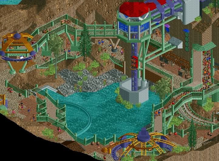
-

 Roomie
Offline
I actually really like it
 Reminds me of Myst and Riven
Fizzix: its nice. Not a massive fan of the black fences though (u also have the best screenmame )
)
-

 Wolfman
Offline
Nice drop into a helix. Good job on the supports but a few of them don't meet up with the spine very well. Raise a few vertical supports with the flange directly under the spine (using Zero Clearance) so that they really "connect". I even paint them the same color of the track. It makes it look like the part "belongs" to the track, while the supports are a different type of part simply by color. Here's an example... (Sorry for it's size.)I design I'm working on. It's about 85% finished.
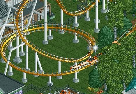

The area looks too congested... Like structures or fences are too close or too many trees. I usually try not to totally conseal the track behind trees. Space the trees just so, so that you can still catch a glimmer of track or the flash of the train between branches or trees. This makes it a lot more interesting than the track disappearing into a thickly packed forest where you can't see any of the action. -

 SGT BLOOPER
Offline
Oooooooooh so many goood screens on this page.
 Here's something I started working on towards the final stages of the experiment:


Hopefully I'll get enough done to start a topic for this. Any comments/suggestions? -

 Dark_Horse
Offline
Fizzix: that is awesome, it's simplistic and realistic without being overdetailed and cluttered.
SGT Blooper: The colors work really well in your screen. I like the planter too. -

 gir
Offline
SGT, the face is awesome! In the other screens I see too much 2x2. Don't be afraid to explore with alternative angles either--not everything needs to be aligned and at right angles.
 -

 SSSammy
Offline
I design I'm working on. It's about 85% finished.

excellent acreen, don't change a thing. -

 rK_
Offline
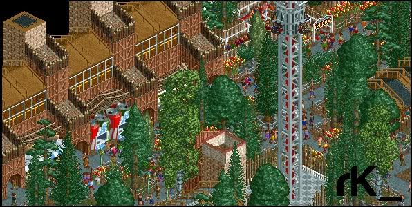
Oooooooooh so many goood screens on this page.
 Here's something I started working on towards the final stages of the experiment:


Hopefully I'll get enough done to start a topic for this. Any comments/suggestions?
wow, this reminds me of some early metro work just a little more vibrant, if theres more id like to see that =D.
one tip, change the land type under your paths. -

 nin
Offline
Oh, looking good rk_, I'm excited for this. Any chance we'll ever see a full solo though?
 -

 djbrcace1234
Offline
^^
A part of me likes this, but it just seems to crowded in that area. It must be the angle, or something of that matter.
Overall though, it's nice. -

 rK_
Offline
Oh, looking good rk_, I'm excited for this. Any chance we'll ever see a full solo though?
not for awhile, things are hectic but it gets worked on at least 3-4 times a week, only for a half hour or so but yes, its in progress. -

 SSSammy
Offline
there's too little texture, hulkpower. you need more different types of walls and blocks.
 Tags
Tags
- No Tags
