(Archive) Advertising District / Dump-Place
-
 19-April 07
-

 Turtle
Offline
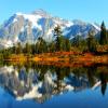
Man, that is what I wanted Myst to look like. You've bloody nailed it. It's fantastic.
 -

 SSSammy
Offline
Another little bit of todays work:
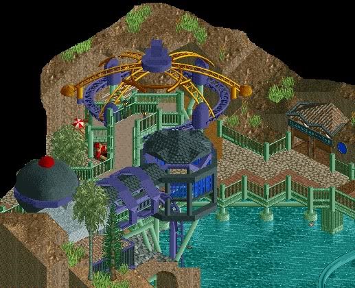
Now time for bed...
-Storm
dude that's fucking sweet. -

 verti
Offline
I think it could use some more warm colours to pull it all together, it looks a bit distant and clinical as is.
 -

 Wolfman
Offline
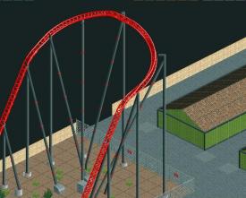
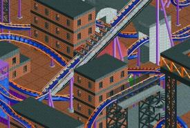
Archy to die for. Love the use of B&M supports. Sadly, there's too much black & purple. It looks like a nasty bruise.
 -

 Midnight Aurora
Offline
Liked the old colours better, SRF.
@Posix, it's not supposed to be harmonious. The colours are supposed to jump out and be jarring against the landscape.
That being said, though, I think the landscape could use some work to look a bit more natural so there's a contrast between the modern buildings and the landscape. -

 StormRunnerFan
Offline
More of me having toooooooooo much time.
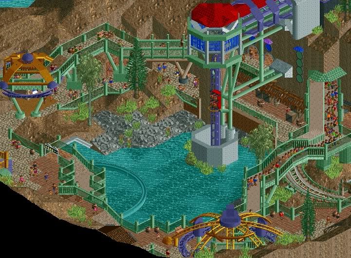
Thanks for the comments everyone
-Storm -

 J K
Offline
Get rid of the louvre style windows on the land as it's too random. Other aspects of this are lovely.
 -
 tdub96
Offline
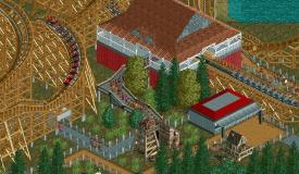
for the coaster, it seems to be a classic woody, correct-me-if-I'm-wrong...but for that I would use the 6-seater trains. Station looks good btw.
The splashdown supports are odd, but I like em, and I like the little splash zone you incorperated for the peeps -

 Turtle
Offline
SRF, it gets better and better. I'd listen to what MA said about the landscape, and i'd redo the foliage, I think you need more of a vision with both.
Actually the lanscape itself is fine. Just use different trees and more interesting foliage. -

 magmoormaster
Offline
SRF, your work continues to impress me. This looks absolutely great.
Coupon, your work always looks really good. I agree with tdub; 6-seater cars would look better. -

 Midnight Aurora
Offline
I like what you've got going on djbrsdfkjasglk, but I'd like to see more of it. As in, it's a good start. I love the colours in your third screen, though.
 -

 Dotrobot
Offline
Djbr your screens look small. And opening them is slow. You can use photobucket then use the insert image button to paste the photos from your photobucket account.
 -
 Splitvision
Offline
I like the look of that! Some work on the ground texture, like on the right side where you go from dirt to grass without any grass/dirt squares in between, and you'll be set.
 Tags
Tags
- No Tags

