(Archive) Advertising District / Dump-Place
-
 19-April 07
-

 rK_
Offline
everytime i start playing LL roomie posts these insane screens with some much originality i have go play. that soccer field is nice, are those just chair lift lines sunk?
 -

 Wanted
Offline
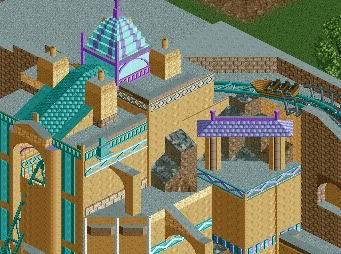
I seriously think that is an awesome idea dh. I think you pulled off the track part well but the rooves are ugly as hell. Also the walls connecting the lower level rooves to the upper level rooves is hideous.
 -

 Austin55
Offline
I agree, the part the track is going through is really nice, the rooves are terrible and really ruin it
Heavily based of something else

and a little unfinished. -

 BelgianGuy
Offline
^hell yeah this makes me want to finish seaworld so badly... Austin we REALLY need to talk about doing something together
D_H is that ncso? otherwise if its cs try using the diagonal rooves and make a rising roof like sorry to say austing did in his screen, I think that would improve your screen immensely. -

 Liampie
Offline
^hell yeah this makes me want to finish seaworld so badly... Austin we REALLY need to talk about doing something together
Your styles would work well together. -

 Louis!
Offline
DH - the idea is there, the execution is what is lacking.
Austin - it seems very textureless. -

 Dark_Horse
Offline
Thanks for the support, guys. BelgianGuy, yeah this is ncso. I'm just playing around with the SFoT scenario when I don't feel like working on TSP. Is there a specific roof that would work better, while keeping the mine feeling? The flat roof covering the rest of the ride should be getting some extra detail soon too.
 -

 Faas
Offline
I'm back from my holiday and I started building again. It's obviously unfinished but I just wanted to know what you guys think so far.
Thanks in advance. -

 verti
Offline
Very cute. I'd give some of the windows a different color of flowerbucket in front of them though, break it up a little.
 -

 Roomie
Offline
Hey all
RCT 2 certainly is not my forte as you may know.
But i try and do a little work in it each year.
The backstory behind this explains the crazy supports made of the steel girders
But the general theme is of an eccentric greek civilisation which tries to build a transport to the home of the gods.

As always constructive critasism welcome.
Cheers
Dave -

 wheres_walto
Offline
Faas, I really like the rising windows; I really don't like the paths
Roomie, woooahh that is gorgeous! Keep it coming
 Tags
Tags
- No Tags


