(Archive) Advertising District / Dump-Place
-
 19-April 07
-

 Timothy Cross
Offline
those acreens are looking even better fatastico, i like the gold color but you got to put some detail into the roof, some central air units and a ledge or somthing trimming it would set it off even more.
Thanks. I actually did take your advise about the trim and air units. I won't show a screen but I think it looks better now.i hate how you use the land tool.
Care to explain? I'm unsure what you mean. If you're talking about the landscaping it's nowhere near finished... -

 In:Cities
Offline
^ yeah sammy, remember that this is the same guy who did that one huge landscape park thing.
i think he knows how to use the tool:]
i'm sure that he knows what he's doing, and he's got the landscape thought out to how he wants it to be. -

inVersed Offline
"For LL..." My least favorite saying on the site... Ugh
I hate that one, and "For NCSO..."
Great screen rK_... has a nostalgic feel to it. -

 RCTCA
Offline
"For LL..." My least favorite saying on the site... Ugh
Agreed.
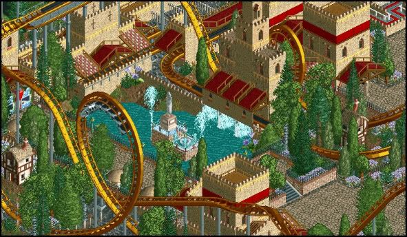
rK, It looks great. Only thing I suggest is make your paths connect with the rapids stairs. It's a little detail, but it looks much better.
-

 Splitvision
Offline
That LL screen just sprawls with life. Really vibrant and nice.
EDIT:
Unfinished, but it won't be for very long -

 Splitvision
Offline
Oops a few floating bushes here and there. But I know that's not what you mean when you say the foliage doesn't work. When finished it'll be denser, with a few "foliage-free" sections, so it won't look as random/haphazard. I'll check out the wooden awning idea, thanks for that one J K. This project has a very "hit or miss" style, for me it's certainly hit but I can understand, and know, that many don't/won't like it.
EDIT: Plus, I think it looks nicer when you can see the full picture. A bit of the atmosphere gets lost when you cut away the surroundings.
 Tags
Tags
- No Tags


