(Archive) Advertising District / Dump-Place
-
 19-April 07
-

 REspawn
Offline
*img here*
Crikey. I can't even fathom how long that took you. Good colour choices. Something bugs me about those 3 palms in a line, but it's nothing unbearable. -

inVersed Offline
Loopy and nin those screens are brillant. Although nin, I think 6 seaters would work better there. -

 Jaguar
Offline
Lowenaldo: Change the colors of the invert and the railing of the bridge, that bright tan doesn't look that good
Weizenfieber: For NCSO, that looks great. -

 SSSammy
Offline
oh my god never use brown like that again! please change the flanges to grey and choose a more suitiable colour for the rails. ofhterwise, nice.
 -

 J K
Offline
Loopy that is the best LL screen I think I have ever seen. I love it. I hope you don't mean you're getting rid of all the custom supports.
 -
 Splitvision
Offline
Nin, nice screen, although I think the track could use some colour to break off the white. Just a slight accent on the trims could work well I think.
Lowenaldo, it looks great but that's no surprise to me I'm with sam on the brown though.
-

 turbin3
Offline
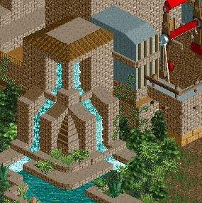
I don't know why, but I really like the foliage.
Try to add some more details to your buildings. At the moment the blank walls doesnt look that good.
Nice otherwise.
-

 Liampie
Offline
The foliage works really well here indeed.
I don't think the walls necessarily need more detail... Try the roof instead. At least use different colours for the roof and the walls to seperate them visually. -

 verti
Offline
The part above the waterfally thing is basically unfinished. Waiting to complete the main part of the building so I can more effectively connect the theme throughout.. But the main part is pretty humongous.
-

 verti
Offline
Still looking for a colorable 1/4 diagonal brick tile that actually lines up.
(same with roof tiles with brick sides, come to think of it. Especially because the object list doesn't let me register >.>) -
 Timothy Cross
Offline
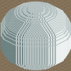
 Spaceport Omega

(Obviously very unfinished)
Just to show what I'm currently working on. It appears this will progress further than my recent, previous projects and I may even finish as everything is flowing well and the process and ideas excite me so far. More so though, I am executing this (order of building and planning/ timing of ad campaign (which won't come for a while)) correctly this time.
Just as a brief overview: the park's concept (which, keep in mind this is indeed a theme park rather than actual spaceport) will be a NASA/ FantastiCo joint project and is to entail a large, realistic, yet futuristic, spaceport (Spaceport Omega) (based on NASA) which offers "commercial spaceflight" to three different planets within the "FantastiCo Universe" (Based on the company who built "Fantastic Wonders"; 'FantastiCo'). The spaceport will utilize a more or less realistic approach to communicate it's Earthly/ reality tone and the FantastiCo Universe will utilize a more fantasy approach to communicate the planets more imaginative and alien/ otherworldly tones. Traveling to the planets can be done via craft from the spaceport or simply by foot via heavily treed pathways in between the planets (for those wishing not to use the craft). I think exploring the realistic/ Earthly spaceport then traveling from it to throughout the more fantasy/ imaginative FantastiCo Universe will be neat.
All in all, the park will be more of an artistic statement about how 'an imagination is an entire universe of possibilities' as the FantastiCo Universe will represent the imaginations and artistic abilities of the company and world of 'FantastiCo' (with it's Disney-like attributes) . The message is to encourage the imaginations of guests, as they too have their own universe of possibilities. The park's slogan is "Blastoff to Imagination".
I'll start a topic, but probably not very soon. I want this done right this time, rather than jumping the gun like my last two ads. Hope you'll enjoy it when the time comes, and I'm truly sorry for past advertising mistakes. I hope you'll have faith in me this time.
 Tags
Tags
- No Tags


