(Archive) Advertising District / Dump-Place
-
 19-April 07
-

 Dark_Horse
Offline
I think I'm with ^^ on this one. It's nice, Louis, but it's just not doing anything for me. I think part of the reason is it is becoming overdone, and they all pretty much look the same to me. The supports seem to thin, and the footers should be colored grey.
 -
 coasterfreak101
Offline
I don't get this whole 'the supports are too thin' thing. The real ones look pretty damn thin to me:
http://rcdb.com/43.htm?p=23497
The first time I rode SFGAdv's B:TR, I thought it was weird how thin and unconventional the lift supports are. But the dude's got it perfect. And it looks absolutely fantastic. The only thing I don't like is the use of the flanged supports for every vertical piece, rather than as 'joints' as they're meant to be used.
*Edit: I keep looking at it, and I can't decide whether you used those supports for every piece, or whether it's just my computer displaying them weird. They definitely look striped, but I'm sorry if I criticized something that isn't actually there. -

 John
Offline
Those do not look to be normal Toon supports at all but rather some other vertical pole object that is more slender (which is what I think people were talking about?). There are at least three different types of supports: tiki/wood-looking vertical supports, deco block ones on the lift, and regular Toon supports. It does look a little sloppy because of that. Otherwise I like it a lot.
 -

 Phatage
Offline
The one under the zero g roll should be cylindrical but the lift supports look great. Why not use those rope fences for the part of the line that goes around on the grass? I think they look better/the wooden quatertile fences are very overbearing in such a small space. I'm really interested in how you did the spaghetti bowl part of the track.
 -

 Louis!
Offline
Definately your best work, as far as I can tell. My only complaint is the glitches everywhere...
Yeah I only just noticed them after posting the screen. They'll get fixed
Louis-the catwalk and supports for the lifthill are brilliant. love the gate and the winding line(a certain obsession of mine) Is this a design or part of a larger park? because while awesome, a design of one of the most overused coaster layouts wouldn't excite me on a whole. the surroundings are brilliant, but ive seen this coaster layout so many times it just woudln't wow me as a coaster....
FK
Its part of a park. However knowing me it wont stay as one lol. But I'm more determined with this to complete it.at sfstl there's no water there or foilage mostly just rock, don't forget the broke down police car too! that's important. but holy shit, thats' good!
oh and i love how you added the like 10 miles of que too, very realistic. but there's also another building you pass through before you exit that you should add, but it still looks great without it
Yeah I know, but then I thought it looked to plain and boring so I jazzed it up a bit. Yeh I need to add something like that in there, just don't know how yet. Yeah see I changed it around. That is actually the entrance path continued round to the front, purely because I thought it was stupid how at the park the exit line is soooo long. So the exit actually is on the other side and you go through under the station to come out.
Glad you picked up on the mile of queue though and glad it's giving off a st.louis feel.
wow louis, breakthrough to new skill level ?!
just amazing screen.
cena, i loled
Hahah, maybe. I hope so.That queue line is seriously awesome, Louis. Although I feel like the pole object you used for the supports seems a little thin. Just stick the Toon supports?
Yeah, see in real life they are thinner supports where i've used the pole object. I wanted to make them more square which is why I asked for an object to be made, but I don't think they look too bad.Don't get me wrong, but I'm not a big fan of this screen.
First I dislike the three types of supports, one type would be best imo.
Why aren't there footer on each supports?
Moreover I think the que is too 'thin'.
As said above, dont get me wrong, the screen is nice, I just think your older stuff was better.
Yeh, but I need the difference in thickness to aim for a more realistic supporting system. Plus some of the supports are more square in real-life so again, that is why the different supports.I think I'm with ^^ on this one. It's nice, Louis, but it's just not doing anything for me. I think part of the reason is it is becoming overdone, and they all pretty much look the same to me. The supports seem to thin, and the footers should be colored grey.
Yeah it's overdone. But I wanted to do it better than anyone else plus it's based on a real park so it needs to be in here. Don't worry there is a lot of differences in this park to every other SF park that is currently being built. I don't think there is any real reason why the footers can't be black. When they are grey they stick out too much, whereas black (or darker grey) blends in nicer.
I don't get this whole 'the supports are too thin' thing. The real ones look pretty damn thin to me:
The first time I rode SFGAdv's B:TR, I thought it was weird how thin and unconventional the lift supports are. But the dude's got it perfect. And it looks absolutely fantastic. The only thing I don't like is the use of the flanged supports for every vertical piece, rather than as 'joints' as they're meant to be used.
*Edit: I keep looking at it, and I can't decide whether you used those supports for every piece, or whether it's just my computer displaying them weird. They definitely look striped, but I'm sorry if I criticized something that isn't actually there.
Yeh they are striped, because they are meant to give a wooden/tiki feel, which unfortunately I dont want, but there isnt any other object I can find that will give me what I want, without the stripes. Thanks for picking up on the supports though.Those do not look to be normal Toon supports at all but rather some other vertical pole object that is more slender (which is what I think people were talking about?). There are at least three different types of supports: tiki/wood-looking vertical supports, deco block ones on the lift, and regular Toon supports. It does look a little sloppy because of that. Otherwise I like it a lot.
I wouldn't say it was sloppy. I mean I put a lot of thought into how it would look. And unfortunately I can't help it. If there was a different object that would do the same thing but look more like the toon supports I would have used it. But sacrifices have to be made.The one under the zero g roll should be cylindrical but the lift supports look great. Why not use those rope fences for the part of the line that goes around on the grass? I think they look better/the wooden quatertile fences are very overbearing in such a small space. I'm really interested in how you did the spaghetti bowl part of the track.
Hmmm, looking at the picture it looked more square to me, but i'll change that then. I havent used those fences in the winding queue because I dont have the diagonal version of the chain link fence. So I used this fencing instead. With the other end of the coaster, I've tried to get it realistic, but had to make sacrifices. I wanted to pick up more on the fact that the coaster is compact in that section so I've had to put the first corkscrew going the wrong way (like in robbie's version). Also the high turn after the loop in mine is above the brake-run slightly, again it's not like that IRL, but it's a sacrifice I've had to make. I think I have got it as realistic looking as possible within the games limits. But we shall see when it comes to what people make of it.
Cheers for all the great feedback guys. -

 robbie92
Offline
I hate nin, Loopy, and Louis right now for making me wanna build so bad. I hate Louis for another reason that he should know about, as there's stuff he SHOULD be building on...
-

 Roomie
Offline
Right. Well im busy for the next 10 days while on land so not going to get much time to work
heres some highlights of the last 4 weeks of work for me

Power Cables and a block of flats
Library
Burning Building
Orbital Shuttle Landing Pad
Obviously not all from the same projects
-

 Fizzix
Offline
Hello. I'm new here, although I'm not new to RCT2. Just a few screens of what I'm working on.
This one is NCSO.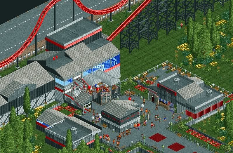
This one isn't.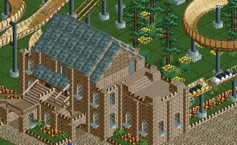
-

 Ruben
Offline
@Fizzix: Great work on that castle on the 2nd screen! I don't like the 1st screen though, it looks very unfinished, though that might be caused by the fact there's no custom scenery in it.
If I were you I would change your foliage, because it looks somewhat simple and randomly done.
Now.... someone, lets call him ''eipmaiL'' once said to me all my bigger buildings were like big square blocks. When I made this ride I thought about this, and tried to do something else:
How do you guys like it?
-

 SSSammy
Offline
wow fizzix, this is exciting! welcome to new element!
great screen Ruben!
forgot to mention...
fuck you roomie. you know i love both your screens and you. -

 verti
Offline
Roomie; I love that powerline, it's exactly as it should be!
Ruben; try to leave some larger non-jagged area's in the rocks, it'll make it look more random. Right now it has an obvious pattern, some more actual slopes and less jagged edges could go a long way to fix that. -

 rK_
Offline

This is SO awesome!
god damn... that is the most original LL screen i have seen in years.
+1,000,000 xp. -

 Dotrobot
Offline
Hello. I'm new here, although I'm not new to RCT2. Just a few screens of what I'm working on.
This one is NCSO.
This one isn't.
lol mastersax. Sometimes it helps when you use same names although at diffrent websites -

 Coupon
Offline

A arrow multi-looper in my park which i built without using 8-cars.
Its still a WIP though.
~Coupon
 Tags
Tags
- No Tags
