(Archive) Advertising District / Dump-Place
-
 19-April 07
-

 In:Cities
Offline
holy crap louis, both of your new screens are incredible.
and same goes for you loopy.
it takes so much for me to really get into a LL project, and both of you have without a doubt captured my attention.
[its not that i dont like the game, or find it aesthetically pleasing, i just dont have the game anymore lol] -

 verti
Offline
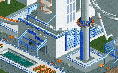
John, try using regular baseblocks for the straights, the castle ones have the color difference.
-

 Louis!
Offline
if you need any piccys, let me know i've got tons.
I should be alright for the time being. I have quite a lot. But i'll come to you if I need some more It's not a rec, it's just based on it.
And thanks for all the great comments guys, makes me even more inspired. -

 Maverick
Offline
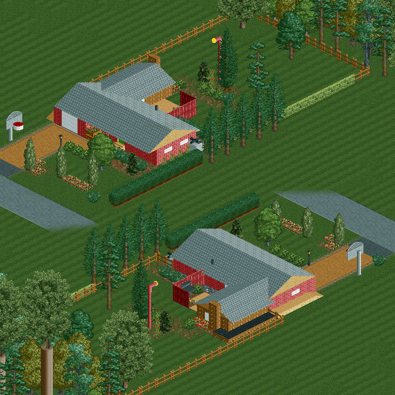
Easiest way for me to do a tall lamp with the objects on the bench I was using.^You had a periscope in your backyard?


-

 rK_
Offline
thats pretty cool mav, the little details are doing it, loving the grill in the backyard, nice!
 -

 Liampie
Offline
Definately your best work, as far as I can tell. My only complaint is the glitches everywhere...
 -

 verti
Offline
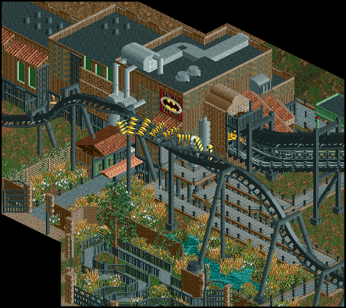
Holy heck, Louis, that is pure epic. I'm loving the catwalk details, and the entrance path - it's all incredibly atmospheric.
Also, that totally killed my screen - thanks though JZ! -

 FK+Coastermind
Offline
Louis-the catwalk and supports for the lifthill are brilliant. love the gate and the winding line(a certain obsession of mine) Is this a design or part of a larger park? because while awesome, a design of one of the most overused coaster layouts wouldn't excite me on a whole. the surroundings are brilliant, but ive seen this coaster layout so many times it just woudln't wow me as a coaster....
FK -

 Nokia
Offline
at sfstl there's no water there or foilage mostly just rock, don't forget the broke down police car too! that's important. but holy shit, thats' good!
oh and i love how you added the like 10 miles of que too, very realistic. but there's also another building you pass through before you exit that you should add, but it still looks great without it
-
 tdub96
Offline
Ho. Lee. Shit.
Louis you just comnpletely nailed the BTR feel. The atmosphere, the archy, the theme, 100% spot on. I wouldnt change a thing. -

 Steve
Offline
That queue line is seriously awesome, Louis. Although I feel like the pole object you used for the supports seems a little thin. Just stick the Toon supports?
 -

 turbin3
Offline
Don't get me wrong, but I'm not a big fan of this screen.
First I dislike the three types of supports, one type would be best imo.
Why aren't there footer on each supports?
Moreover I think the que is too 'thin'.
As said above, dont get me wrong, the screen is nice, I just think your older stuff was better.
 Tags
Tags
- No Tags
