(Archive) Advertising District / Dump-Place
-
 19-April 07
-

 posix
Offline
loopy, that screen just interrupted my breathing ...
that is one hell of a space theme you've got going there. can't wait for more. -

 Ripsaw
Offline
when i saw that loopy it made me think of when i went to kennedy space centre, well done. =]
Heres somthing ive been trying out after my trip to Florida.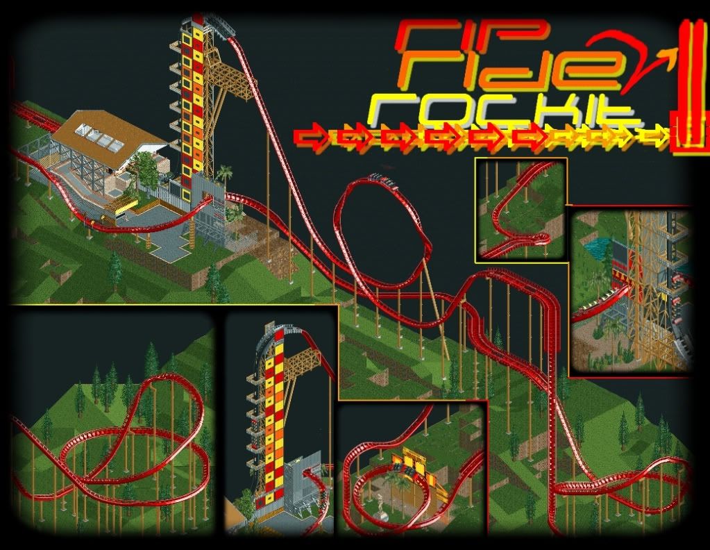
-

 Louis!
Offline
I've wanted to play around with a Rip Ride n Rockit coaster for a while but never gotten around to it.
I like it, but the theming & supports could be better.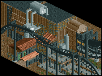
na na na na na na na na na na na na na na na na bat-mannnn -

 Liampie
Offline
It's hard to comment on such an unfinished screen, but I predict this will be your best RCT2 work yet.
 -

 SSSammy
Offline
oh fuck you thorpe, now everyone's going to think i copied off you
i'm kidding, i know it's copied from real life, but you never see it in rct, do you?
it looks fantastic, and so does your screen louis. -

 Nokia
Offline
^fantastic. that is exactly the park i am going for

if you need any piccys, let me know i've got tons. -

 K0NG
Offline
The coolness of loopy's screen is almost indescribable and Ripsaw's and Louis' RCT2 screen are both fantastic too. The dump is seemingly rising to a new level lately.
 -

 Casimir
Offline
Austin: That was actually quite a good one xD
Rip: Looks interesting! What is the train's speed in this first... inversion-like... thing? xD -

 Cena
Offline
And Cena didn't even have to start posting again!
Can you imagine how it would have looked like if I did? -

 Wolfman
Offline
I've wanted to play around with a Rip Ride n Rockit coaster for a while but never gotten around to it.
I like it, but the theming & supports could be better.
na na na na na na na na na na na na na na na na bat-mannnn
I'll take Five B&Ms, one mirrored track, paint one track yellow, and one with yellow rails. And one made by Vekoma. That should about do it.

Looks cool Louis! You're getting good at that industrial look. (Needs chainlink fences.) -

 wheres_walto
Offline
That looks sweet john, you too louis. I think the flat roof texture pieces would be helpful for the diagonal parts though.
 -

 Austin55
Offline
Thats cool John, just dont like the benches and lamps being righ on it, just use invisible path so guests can walk on it.
 -

 Wolfman
Offline
I like it very much John. But it looks like the number two, rather than the backwards letter S. Cool use of blocks, and I'd set up some walls around it, (just at the corners,)so that you don't get a large area covered with footpath and lost wandering peeps. Once the walls are set up to reduce the chance of lost peeps, go ahead with the invisible path. Then delete the walls. The gaps will remain between footpaths and should keep the lost peep traffic low.
 -

 hulkpower25
Offline
when i saw that loopy it made me think of when i went to kennedy space centre, well done. =]
Heres somthing ive been trying out after my trip to Florida.
amazing work on the loop for rip ride coaster, if you want i can finish it, or help you with it
 Tags
Tags
- No Tags


