(Archive) Advertising District / Dump-Place
-
 19-April 07
-

 Cocoa
Offline
Cocoa.....it's kind of scattered and makes no sense but, on the other hand....it's also kind of scattered and makes no sense. Cohesiveness is your friend.
hmm, kong, I don't really understand what you mean. There's not much sense to be made- its just a small maintenance shed. and what is scattered? its just a building and a couple shrubs on a brown landscape. cohesiveness, that could be a valid criticism but imo it works fine.
loopy- beautiful. thats the best looking hacked building I've ever seen in LL. except for maybe the ones in silver whateveryourspotlightwas -

 John
Offline
Loopy, it's amazing.
Just finished the trackwork and supports on something a little bizarre.
-

 Splitvision
Offline
Wow, bold colours. I think they're working, maybe the train could use another shade though. Also the land beneath the coaster is too plain IMO, some patches of dirt/grass and a few small bushes/grassy patches would be nice.
 -

 Ruben
Offline
Wow, bold colours. I think they're working, maybe the train could use another shade though. Also the land beneath the coaster is too plain IMO, some patches of dirt/grass and a few small bushes/grassy patches would be nice.
I could not agree more. Good luck with it! -

 verti
Offline
Wow, Louis, you're probably the first person to post a screen with trackitecture supports that I actually think look good.
 -
 Loopy
Offline
Giovanola invert? It looks great. Always love how you do your custom supports.
Thanks for all the replies too guys Hoping to have a topic for it sometime in the coming weeks.
-

 Midnight Aurora
Offline
There's waaaaay too much going on in that, Louis. I'm counting 5 coasters for just the track and the catwalk, not including the supports.
 -
 RCTCA
Offline

Experimenting with rapids track buildings.
Love it Loopy - is that a new solo perhaps? Only one can dream...
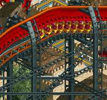
Gotta agree with MA here. It looks way to cluttered and over supported - maybe try a little less of the wild mouse track? I do enjoy the colors however and I'm still looking forward to it.
LLLL <3 -

 ACEfanatic02
Offline
Louis, too many colors, I think. Change the train colors, color that steel part black or just delete it, and get the chain return the same color as the track, and it'll look a lot cleaner.
-ACE
 Tags
Tags
- No Tags


