(Archive) Advertising District / Dump-Place
-
 19-April 07
-

 Nokia
Offline
reminds me a lot of silver dollar city. haven't been in a couple years though. good job!
 -

 Wolfman
Offline
You? Bore us with details? Nah. How could anyone be bored after all the time and effort you go through in an attempt to discredit every single word that isn't in full agreement with you? Besides....with all the screenshots, you're the fraroc of RCT2! Go Wolfly!!!
Don't be upset. I was only giving you the update on the design, since it's sort of obvious that you haven't kept up with the suggestions and consequential updates. But I don't blame you for that. You can't be everywhere 24/7.
Look at it as doing you a favor. You got a total update complete with information I usually hold back, even though it might be compared to a novel. Now if I could build an enclosure that's not the usual generic spanish or medieval style, I might be able to put this puppy to bed and start a new project. -

 ACEfanatic02
Offline
Fuck me, that architecture on the theater is awesome.Okay, worked on this for a bit, somewhat recreating "El Capitan Theater". Added in some much needed texture. This is the last screen for a while until a topic is made, if it even is. To the right is Stitch, Live! with his space ship parked so elegantly.

Somewhat unfinished, just missing some small road work.
Cocoa, that looks pretty damn good, but I don't know if that shed is really big enough to house a transfer track... (and it looks like the part where the transfer itself should be is blocked.) Go look at some pics of RL transfer tracks.
-ACE -

 K0NG
Offline
^Agreed...I got caught up in other shit and forgot to mention that I love that theater nin. And Roomie....if I only knew what the fuck that was I'd like it even more.
 -

 K0NG
Offline
Cocoa.....it's kind of scattered and makes no sense but, on the other hand....it's also kind of scattered and makes no sense. Cohesiveness is your friend.
-

 J K
Offline
I love it Cocoa. Only thing that irks me slightly are the coaster colours. I know what kind of style you're going for but it just seems slightly dull. I'll hold judgement till we see a bigger screen.
 -

 Wolfman
Offline
I have to agree. Too many textures are ruining a pretty cool looking structure.Cocoa.....it's kind of scattered and makes no sense but, on the other hand....it's also kind of scattered and makes no sense. Cohesiveness is your friend.
-
Airtime Offline
^Can you try and tone down the double posts plz? You can edit your post you know?
Roomie that looks awesome! I thought it was a pinball machine but I dunno
Cocoa that's a lovely little station you have there! Not to keen on the coaster colours tho
Nin still looking amazing! Maybe try and fill the inside of the brown building because you can see in.
Lowenaldo. That's a huge improvement man!
Ruben nice to see a new face over here! I like it! Make yourself at home
BelgianGuy. Everything in that screen is awesome apart from the white building in the bottom left. I love the colours in the screen
Dr Dirt. Looks interesting!
Sammy. Good spot man! Sorted that. thank you
-

 Phatage
Offline
I don't think you should fill the inside of the building nin, unless the peeps have any way of seeing inside of it, the building is perfect as it serves its purpose of being a (very nice) facade while not an actual building, saving the park some money while building it as well as allowing for the building's interior to be used in a shape that isn't fully defined by the exterior (also with the sky backdrop), something that great theme parks do all the time. The Stich building right next to it is great because the actual building (without the spaceship) would fit right in and yet the spaceship itself is well detailed but cartoonish enough to look like theming in a park rather than an "actual spaceship". I really like the mindset of creating a real, themed park that I see in this screen and I'm eager to see where this project takes you.
 -

 nin
Offline
I don't think you should fill the inside of the building nin, unless the peeps have any way of seeing inside of it, the building is perfect as it serves its purpose of being a (very nice) facade while not an actual building, saving the park some money while building it as well as allowing for the building's interior to be used in a shape that isn't fully defined by the exterior (also with the sky backdrop), something that great theme parks do all the time. The Stich building right next to it is great because the actual building (without the spaceship) would fit right in and yet the spaceship itself is well detailed but cartoonish enough to look like theming in a park rather than an "actual spaceship". I really like the mindset of creating a real, themed park that I see in this screen and I'm eager to see where this project takes you.
Glad to see someone really understanding my views on the project, thanks for the comment Phatage. And to everyone else, glad you guys like it so much. -

 Maverick
Offline
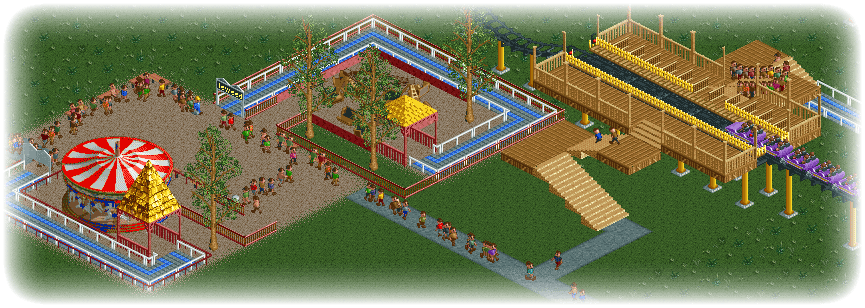
Trying my hand at this invisible entrance thing. Also lowered the flat rides 1 clearance to hide the base. I think I'm finally joining the 21st century.

-

 Dark_Horse
Offline
Maverick, nice job on invisilizing (yes I made up a word, so sue me) entrances. The coaster station looks like it is off to a nice start.
Stand-Up layout:
 Tags
Tags
- No Tags

