(Archive) Advertising District / Dump-Place
-
 19-April 07
-
 MF72
Offline
I really like that Ruben. It's simplistic and quaint, but it's still enjoyable to look at.
 -

 Maverick
Offline
Hopefully to get constructive feedback?i don't know why you showed that screen, jag.
-

 Splitvision
Offline
wow, classy stuff ruben, definately my cup of tea. The picninc area in the first pic could maybe use some fencing around it, though it gives off a pretty nice unrestricted and spacious feel as it is now without the fencing.
 -

 Liampie
Offline
First screen: You can do better.
Second screen: Great.
Third screen: I liked the old entrance more, but this one is good as well and I understand the other one was too small. -

Wicksteed Offline
I actually like the first screen the most, i like how you worked with the map edge. -

 Wolfman
Offline
Nice wolfy. The only thing that I'm not completely sold on is the helix part after the twist... Have you tried to have a large downward turn first after the twist, and then the helix closer to the ground? Sort of just switching the elements that makes up the twist around.
Yes. I just tried that. (Even put in interlocking corkscrews too.) But it forces the chain block further down the track and the trains following get stopped and can't complete the circuit as intended.Though, if you keep it the way it is, it's still really nice. BUT, the old colours were better

This is a differnt train type (Stand-Up)so I chose different colors. This layout is somewhat duplicated for Sit-Down, Stand-Up and Floorless train types. Each train type has a different colored track. It just makes it easier to make each different somehow, even though it's all the same layout. It's nice to have a choice of different train types. -

 Splitvision
Offline
^Well for me, the aesthetics of a coaster makes up for 90 %, the remaining 10 for how it operates. So if I were you I'd have it whichever way looked the best. Which is probably why coaster designing isn't my strongest point
 Though as I said I like it the way it is.
-

 posix
Offline
lovely stuff ruben. it has this typical dutch style tranquility to it that i really enjoy looking at. welcome to ne!
btw, you are the "ruben" that is credited as one of the creators of this park, right? http://www.nedesigns...79&park_id=1349
thanks for a confirmation and i'll update your member profile accordingly to show the park as one of your projects. -

 Wolfman
Offline
Splitvision:
I kept trying to take the suggestions and applying them to the layout. With exception of the S-bend approach to the lift hill all the way up to the inline twist, this is a whole new coaster layout. After the inline twist, it dives, but instead of just a couple corkscrews as before, I interlocked them instead. I created this interlocked corkscrew layout a couple days ago. (I have no idea if anyone else has the same configuration.) It has smooth transitions and both inversions are at the same height.
After that, it goes into one weird helix. It's starts off as a downhill, gaining blood draining G's, but then it spirals up and down then up again. It takes another dive, at an angle to the grid, and ends up retracing the track before the lift hill. Only headed in the opposite direction. A Small twisted curve uphill, and the trains are only moving at like 17 MPH before the station.
Oh, and the stations were also dropped 10 FT. But thats just enough for the track to pass beneath twice. I have an image that shows my interlocked corkscrews. The key is the half a small uphill helix. All others are medium curves. After the half helix, it flattens out, curves down, then twists to the right, using three individual track sections.
I'm glad I didn't give up on the track and the ideas people suggested. This turned out to be another great design for a small coaster. Now for the supports. At least I'm getting better at those.


-

 K0NG
Offline
Ok Wolf.....first of all, I realize that you aren't into the ultra-realistic style of parkmaking that some people strive for. That being said, I think that you, yourself can see a few obvious flaws in what you have here. First off...unless the foundation for your station is constructed of balsa or carbon fiber and has absolutely no mechanical devices which would be necessary to make it functional, there's no way the track can pass beneath the station like that in such close proximity. Also, with the magnitude of the ride itself (not that it's overwhelmingly large), having simplistic, canvas awnings for the station(s) like that just isn't convincing in any way. Most of your layout is ok...but, as mentioned before, you need to utilize a straight piece between the corkscrew parts of the cobra roll (look at the screen that you provided to imagine how painful that transition is without it) and you could probably benefit a good deal by eliminating the upwards curve after the second part of your interlocking corkscrews and running it at ground level (thereby giving riders a chance to catch their breath) before going into the helix. That way, the helix can provide the upwards transition needed there without cracking some ribs. Actually, I think you could rework everything from the on-ride photo piece after the second corkscrew through to the transition back to the station (which would eliminate the 'head-chopper' that the station itself provides) to not only make your layout more ride-able but also make it more aesthetically pleasing.
And...just my opinion....the whole 'block brake sections/dual station to allow one more train and prevent crashes while creating maximum passenger efficiency' thing really takes away from what you could potentially achieve with better aesthetics and add realism at the same time. -

 Ruben
Offline
@Posix: Yes I am that Ruben, thanks.
@ all others: Thanks for the positive and constructive feedback! -

 Roomie
Offline
I actually really like the track under the station, I'm assuming theres going to be some themeing here at a later date K0ng so to me the comments about canvas roofs and not being able to support it seem a little pre-emptive... I mean surely its entirely possible to build a configuration like that with a building made of bricks creating an arch over the two lower tracks?
 -

 BelgianGuy
Offline
Just wanted to show this...
I'm experimenting with peepable stuff since I finally got the entrance/exit huts out of the way and mastered the hack needed
Hope you all like it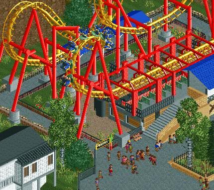
-

 Ruben
Offline
Looks great! I've tried the used hack over and over again but never figured it out. Seeing this reminds me I have to try it again sometime, one of the best hacks there is.
-

 BelgianGuy
Offline
yeah it is, it makes aesthetics possible while still having the lively atmosphere only peepable parks can have...
Glad I learned it finally
 Tags
Tags
- No Tags

