(Archive) Advertising District / Dump-Place
-
 19-April 07
-

 Austin55
Offline
Hey that looks really nice, I think some of the turns are to big and sloppy, atleast up untill the first airtime hill. Watching a pov it takes those pretty quick.
 -

 Bacchus
Offline
Lowenaldo, this video shows where the 3rd inversion is. at 1:20 you'll see a barrel roll
http://www.youtube.c...h?v=xDqCvwb6e2k -

 K0NG
Offline
To add to what John said about the supports...I've found that simply moving a quarter tile in any direction will dramatically improve/reduce the gaps between the support objects and the track itself. Also, alternating between the 1/4 tile, full tile (centered) and full tile (edge) can make a huge difference in the alignment, particularly on inverts. I've been fucking around with these bastards for a couple of years now and it still seems like the first time with every new ride so, I don't know if there's actually a 'standard' to them or not.
 -

 wheres_walto
Offline
Maverick's right.
D-H, only because it's not a hotel balcony with an overly large roof. Those screens look...okay, pretty dead though. -

 In:Cities
Offline
those look more interesting.
you have to understand, i wasnt trying to be a dick to you.
building a good park isnt all about tons of little details. i think you misinterpreted that part.
when i look at a screen, i look at its overall composition.
i tend to focus on how things relate to eachother, how the color tones compliment one another, how proportions of the rides and buildings are, and so forth.
for me personally, its not about a ton of little details.
while they are nice, they're not the most important thing.
i've never tried to be a complete dick to you, but i'm just trying to let you know what i personally look for in people's work.
yes, its my personal opinion and you can throw it out the door if you want. but i feel that there are others on this site who share this same opinion.
i want to see you do well and build awesome stuff dude. dont get discouraged when you hear stuff like this.
use it and let it drive you to be better at the game. -

 Dark_Horse
Offline
Thanks, In:Cities. Sorry I was being a douche. It was more Sammy's comment that pissed me off more than anything, but it's over with. I started working on something a bit different today. Still a resort, but a different kind of sorts.
EDIT: Forgot to add that I actually agree 100% with you wheres_walto. There's really nothing in my screens to draw you in. Oh well. -
 Jaguar
Offline
you have to understand, i wasnt trying to be a dick to you.
You can still be a real dick at times, and Darkhorse, you are pretty good at NCSO -

 zburns999
Offline
zburns, looks great! reminds me of one of the new maps on mw2, the one with all the buildings, and that swimming pool... i like it.
Haha, dude, I think that's subliminally what I was going for. I can totally see the connection.
And also regarding that screen, I changed the fence as you said nin, and also sorted out some foliage. It's looking a lot better, I think. -

 In:Cities
Offline
lol i think sometimes you guys misinterpret sarcasm as being a dick.
realize that this is the internets, and take nothing too seriously:]
holy crap louis, that looks so awesome.
new design? -

 Jaguar
Offline
being sarcastic is pretty mean, though I agree that no one should really take the internet seriously unless they are being constantly harassed.
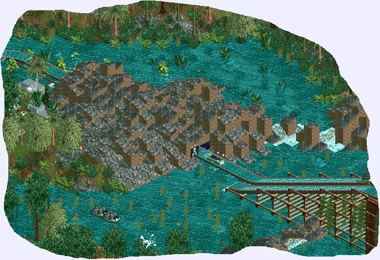
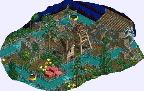
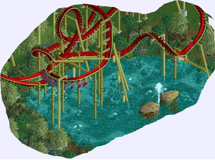
-

 magmoormaster
Offline
Well, we don't have the dodgy. It's hard to show our sarcasm without the dodgy!lol i think sometimes you guys misinterpret sarcasm as being a dick.
realize that this is the internets, and take nothing too seriously:]
Jag:
That first pic needs more jagged rocks. :dodgy: -

 Wolfman
Offline
Wolfy, I like that, it flows nicely and I love those colours. I'd just place a piece of track between the loop and the small cobra roll, right now they seem really crammed together in contrast to the rest of the layout. Also the station feels unecessarily long.
I think I took care of those pointers. Plus, a new POV. This one was jacked into the air five feet, so maybe I won't have to A. Stack more than four concrete anchor disks. B. Create pits to place concrete anchors.
Does anybody paint these anchors? Just curious.
Next:
Another set of supports for the altered track design.
BTW:
Had anyone noticed that any supports that used ZC to place them, does not get saved with the scenery saved with the track? Just thought I'd point that out.


-

 Splitvision
Offline
Nice wolfy. The only thing that I'm not completely sold on is the helix part after the twist... Have you tried to have a large downward turn first after the twist, and then the helix closer to the ground? Sort of just switching the elements that makes up the twist around. Though, if you keep it the way it is, it's still really nice. BUT, the old colours were better
-

 Austin55
Offline
Youre going to have a hell of a time trying to build a station on that thing with it being so high of the ground and the tracks being right underneath it. The layout is pretty meh, but I dont think your going for all out realism. If the corkscrew went the other direction it would be alot better.
 -

 Dark_Horse
Offline
Wolfman, I liked the old colors better. And that helix aftr the barrel roll just look awkward to me. Placing the helix part closer to the ground would look much better IMO. The corkscrews would look better going the other way too.
 -

 Ruben
Offline
Hey,
As Rct-guide is over, I decided to go to NE and go on showing my rct-work at this site. I am working on a project, called ''De Dwezelaar''. It is meant as a small dutch park, inspired by the style of De Efteling. (for those who know this Dutch themepark) I would like to show you some random screens to see how you guys at NE like my work.
A simple theatre, combined with a small gift shop
This is meant as the station for a viking-themed rapid river
And this is a small park entrance.
I hope you guys like it and have some tips and reactions for me!
 Tags
Tags
- No Tags
