(Archive) Advertising District / Dump-Place
-
 19-April 07
-

 Splitvision
Offline
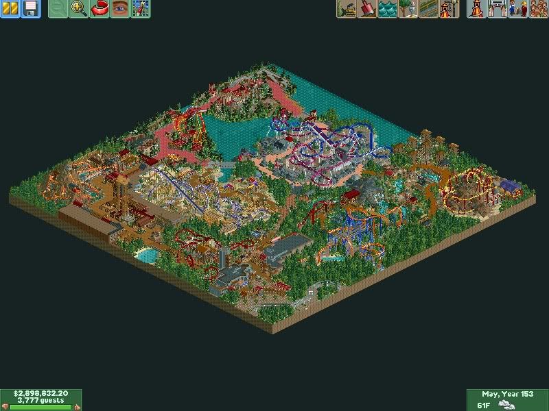
Sammy nailed it. Detail-wise it's top class but it just feels like too much in such a small space.
John, that's really nice. It seems the buildings are a bit brown though, I'd add some accent colours. -

 J K
Offline
Sammy nailed it. Detail-wise it's top class but it just feels like too much in such a small space.
I agree. I loved it till you posted the picture but you need clarity when going for such a big theme. This is because your details are always going to impress people but the composition isn't going to reach the potential of that theme park feeling. -

 posix
Offline
nin, i agree with sammy. i posted somewhere else that your recent stuff has no space to breath. in small tiny screens it looks great, but when opened in game using a high resolution, everything is just piled together and the effect is lost.
john, the submission manager will be back soon
-
 nathan_alexander
Offline
Casimir - It's the Neon Koala made by Fisheman. You can find it at Fisherman's Warf at RCT Mart.
 -

 Cocoa
Offline
nin: amazing. stop it. I do notice that you're just improving the Disney studios park though. I do think you would benefit from a solid color sky though, and it would make it look less cluttered.
john: also amazing. looking forward to it! -

 Splitvision
Offline
The structures are a bit too blocky for my taste, although the small slanted wooden supports with glass behind makes for a really neat effect, I think I'll have to steal that from you some time
-
 JoeZia
Offline
^you need better queues. Custom scenery, please. I hate how that building doesn't have doors. You overdid the cacti, and you should really put more buildings and less flat rides crammed together. Ever heard that you could make customized buildings that could cover that stupid stall? What about the platforms the flat rides have? And their huts? You really are good at this game I really can tell, but too lazy to put that skill in a park?
 -

 Dark_Horse
Offline
JZ, what the heck have you been smoking man? I hate calling out people, but your post just discredits you. Wolfie has custom scenery in there. It's pretty easy to spot. Why does a building need fake doors if it is peepable? Ever heard of midway games/stalls? Why does he need to cover the ride entrances/exits if he doesn't want to? You should take more time to actually look at the screens, JZ. Sorry, I sound like a douche, but come on man. It doesn't look that bad, Wolfman.
Lowenaldo: I like what I see so far. -

 Splitvision
Offline
Hm a tad bit too minimalistic for my likings, and the tiles on the bridge looks kinda random. Plus, it needs benches, bins and lamps.
Liam, what the hell is that? -

 Louis!
Offline
John, looks fab.
nin, I think you are gonna struggle by adapting the original entry. Like right now, everything is squished. I think it would have benefitted from a 'fresh' start. -
 Jaguar
Offline

Not RCT, only RCT graphics. Just dumping...
Yes, I'm in trouble.
Is that some sort of battle between two tracked rides? If so, you should put some of the rides from sagalax in it.
 Tags
Tags
- No Tags
