(Archive) Advertising District / Dump-Place
-
 19-April 07
-

 gir
Offline
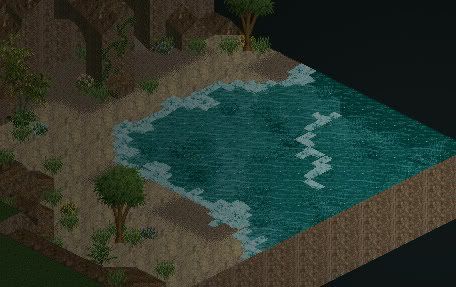
missing some key atmospheric elements like benches, trash cans, lamp posts, possibly outdoor restaurant seating, etc. i agree with austin, the beach is too small. still, the facades are nice and this is promising work so keep it up!
 -
![][ntamin22%s's Photo](https://www.nedesigns.com/uploads/profile/photo-thumb-221.png?_r=1520300638)
 ][ntamin22
Offline
lovely work John. It looks a bit like it was made of LEGO, but that's just because of the building blocks and small wall bits you're using.
 -

 Goliath123
Offline
You know guys, not all beaches are big, i can show you some without much sand at all if you like.
 -

 Peeee
Offline
^but the point is a bigger beach looks better. I mean I could recreate the local fair of my hometown, which biggest attraction is a scooter, but that wouldn't make any sense because it's so damn lousy.
Personally, I love the screens. Not a fan of the palm on the street, though. -

 Liampie
Offline
Big or not, it's too straight anyway. Make it flow! Awesome screen, walto.
John, I love it again. I predict a comeback of the year award for you... -

 trav
Offline
Walto, please please PLEASE stagger your buildings, your work will be gorgeous then.
John, that looks good apart from the wooden blocks, but that's more an issue I have with the object rather than your skill. -

 JoeZia
Offline
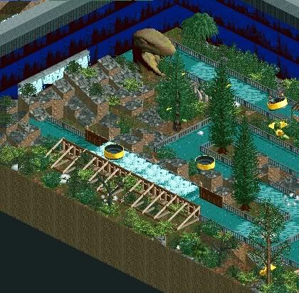
^That's actually a pretty cool ride idea. When you used 8cars, did the frames get messed up?
 -

 Jaguar
Offline
^It is supposed to be a Premier rides Junior rapids, and for JZ, it doesn't glitch up that much, the track isn't complex.
 -

 Cornshot
Offline

Bottom left corner is obviously unfinished
Any suggestions on improving the foliage would be appreciated. -

 Cocoa
Offline
Jag: Although I think the ride was a neat idea, it is composed really badly and the scenery is terrible. There are stone blocks jutting up everywhere with meager foliage, the background of trees/blue is stacked on itself so there are floating trees, the snake is a bad scenery piece, and the gray fences around the track just kill any atmosphere you could have had.
 Tags
Tags
- No Tags


