(Archive) Advertising District / Dump-Place
-
 19-April 07
-

 Maverick
Offline
I don't understand...@ mandradot: really dangerous, try something better g-force wise to do a 90 degree down
----
That Air screen and the carousel are looking good though. I do agree on the path for the latter, needs more texture. -

 magmoormaster
Offline
Thanks for the comments guys!
The thing with the path is that it lets me do a lot of diagonal stuff a lot better than the actual diagonal paths. I'll try to jazz it up a bit.
The building is actually 3 different shops. Two on the bttom level, and the restaurant up top. I'll keep working on the building a bit though; there's a few ideas that I just got.
And yes, the "sign" is going to change. I just haven't thought of a cool name fore the restaurant yet. -

 Kumba
Offline
Roomie's spaceship and that verticle wooden coaster drop might just be the two coolest things I have seen here. pg 400 ftw!
-

 Roomie
Offline
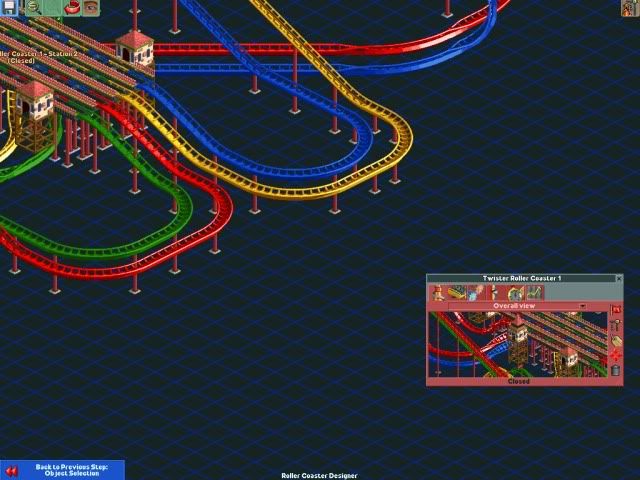
Not much to comment on their im afraid. Quad Duelers are a bitch to pull off. A good standard dueler is a challenge. Good luck with it though. I like the little touch of the coloured track segments in the station
 -

 Nokia
Offline
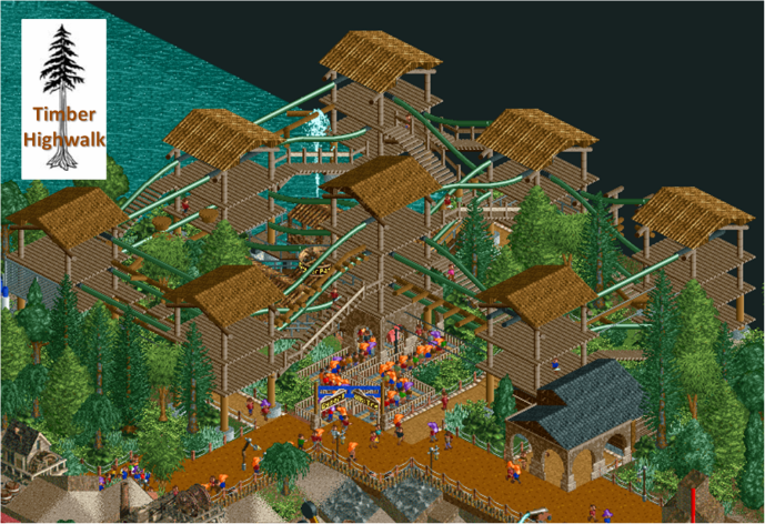
a lot of brown in that screen. first gold, now brown. tsk tsk. anyways. the screen is nice, but try a light orange for the flowers, and maybe try some non-palm tree foliage and i think that could be wonderful. also for the one building with steeps, make the railings black instead of brown, and the footers for the building supports grey. but yea, nice!
oh and try adding an accent colour to the buildings
-
![][ntamin22%s's Photo](https://www.nedesigns.com/uploads/profile/photo-thumb-221.png?_r=1520300638)
 ][ntamin22
Offline
I don't think the brown is an issue, really. The area around the fence needs something to spice it up though.
 -
 Goliath123
Offline
Turbin3, i agree with Nokia really but apart from that its ace!
Storm runner, love it! The idea to use the suspended coaster as rope is a good one. -

 Splitvision
Offline
Storm - Nice idea, and nice execution. Shouldn't there be some kind of fencing on the platforms though?
Turbin - I usually don't mind your use of mainly brown colours but here I really think a more vibrant colour would add so much to it. The main colours of the buildings can stay if they have to but the details could be a lot more colourful. Nice facades though, as always. -

 Fisch
Offline
I don't get how there's supposed to be too much brown in this screen? It seems people are going crazy about there only being 1 main color every time Turbin3 posts a screen!
 This is perfect Turbin3. Don't change a thing....
-

 Roomie
Offline

Yesterdays work: Work in Progress
too much red i know. Going to accent it a bit more today
 Tags
Tags
- No Tags
