(Archive) Advertising District / Dump-Place
-
 19-April 07
-

 Goliath123
Offline
Fisch: Love the interaction and the landscaping, im not to sold on the colours of the train though, maybe try a magenta combo?
Roomie: Thats pretty cool, dont change a thing. -

 Louis!
Offline
I think the mass of wooden coaster track ruins it, but I guess there is no other way of getting around that
The laser beams are awesome though
-

 MadraDot
Offline
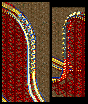
I used walls this time, instead of small scenery. There are a few downsides though.
-the back side is still see-through
-you need to use 6 objects instead of 3
-it doesn't line up perfectly (but I'll try to fix that.)
But I think it's a huge improvement nonetheless. Now I can actually use the third color.
(ps: it's just a test screen, I'd never make a woodie with these colors...) -

 FK+Coastermind
Offline
i'm interested trav...i consider Air the most succesful flying coaster. At least that i've been on, so it would be cool to see a really good recreation...if that's what you're going for.
Fk -

 Liampie
Offline
Fantastic trav! I love how you did those letters. Everyone can do the letters, but you even pulled off the font!
I can't wait to see your interpretation. I'm planning to do one too. Air is just too awesome. -

 FK+Coastermind
Offline
well, interpretation, recreation, in rct everything is interpretation due to the restrictions. either way, that is better. Interpretation's are much better as they allow us to see your creativity...
FK -
 JoeZia
Offline
@ mandradot: really dangerous, try something better g-force wise to do a 90 degree down
 -

 Dimi
Offline
I don't like the blue floor but the building looks great and I look forward to see the coaster!
 -

 verti
Offline
Fisch, don't forget to finish the bottom of that waterfall in the top let corner. Awesome work though!
 -
 Timothy Cross
Offline
I like the peep as the waiter to seat guests. I also kind of dig the building with the varying levels where guests can sit. There are some things which can be improved, such as the colors. Maybe also build the roof so a small portion of it hangs over the surrounding edges (and maybe get rid of the parts which reveal the sidings, plus add a trim). Also, the path is kind of bland. Custom paths can be cool but it needs something to make it look like actual path or tarmac. One more thing, on the portion of the building underneath the outside seating area, I would get rid of the gray quarter tile pieces and use full sized glass walls. I like the signs though, except "sign", try to think of a more clever and creative location and be sure to jazz it up.
 -

 Splitvision
Offline
My main problem is the path. I really don't feel that texture works well over large areas as path, or atleast not in this setting. I think ordinary tarmac would improve it a great deal.
 -

 Austin55
Offline
^Definatly. Im not to big of a fan of the yellow either, but I like the right side of the building. The size of the stairs kindoff bugs me but I dont know a way around that.
 Tags
Tags
- No Tags


