(Archive) Advertising District / Dump-Place
-
 19-April 07
-

 Fr3ak
Offline
Hmm .. don't know .. it looks weird.
I don't like that those rolls are on nearly the same height then the track before and after them.
Then ... why have you done 1 helix with the B&M Track and the other one with the spiral coaster track?
It looks like the choose of which track you gonna use were done randomly.
But with theming it would be way better ... if the theming is good .... and I hope so. -

 Loopy
Offline
I don't think you've pulled that off too great. First of all, for all the track thats not an inversion or a vertical drop/lift how come you didn't use the giga track or the spinning coaster track depending on which model your going for? It looks really strange right now switching between all those different track styles.
Also there appears to be a dip at the end of the brakerun to go up again into another brake. That seems a little strange to me.
It's a good idea I just don't think its been pulled off that well.Edited by Loopy, 25 November 2007 - 01:45 PM.
-

 DelLagos
Offline
Well, I looked a few more minutes on my coaster and I think, I will change the tracks!
And I decided to build in Asian-style, for improving building for my PT3 Entry.
I think I will finish it next weekend! -

 posix
Offline
have any of you actually ever seen a eurofighter?
i think it's pretty nicely done. i remember trying one myself back in the day and it didn't work out at all. the meanest thing is the spacing. but you've done it well.
would be more interesting though had you added the "more than 90degree" drop with hacks. -
![][ntamin22%s's Photo](https://www.nedesigns.com/uploads/profile/photo-thumb-221.png?_r=1520300638)
 ][ntamin22
Offline
looks pretty nice from what i see. landscaping and foliage are good (maybe smooth out your landscape some more), waterfalls look great, buildings are nice; simple but detailed enough to draw the eye. if I were going to be a dick i'd tell you that the straight section of the coaster and the turning climbs/drops immediately before/after it look terrible, and that just because you can do it in RCT2 doesn't mean all those sort of drops need to be banked. Also I would ask how people get to/from the houses, but that's less important. and i'm not going to be a dick and mention those things.
-

 Comet
Offline
I just want to say the bottom of that drop is way too tight.
Maybe make the top less rounded and round out the bottom a bit.
Everything else looks great though. -

 Drew
Offline

Just somethin' I'm playing with...
I thought this was cool, and I might incorporate it into a ride... -

 DelLagos
Offline
1.Screen - looks good so far!
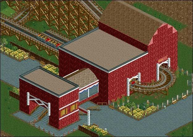
But you missed a few windows and more deco-things.
The roof isn´t that good!
A few more plants would be great, too!
2.Screen - a little bit crazy! With theming it would be look better, I think...
-

Wicksteed Offline
lol
well, I would change the rooves, they're too bare even for my taste. maybe try wood...hmm..but thats maybe too much cliché.
also I would try to hide/avoid the 1/4 wooden wall on top of the 1/2 wooden wall, it looks quite unharmonic here.
that's why its not my work.
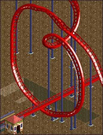
I wish that loop was my work, though.
oh and have you tried using the half loop instead of the "custom" small one, it might look better. -

 Magnus
Offline
Didn't nate do the 'more-than-90°-drop-hack' in his cancelled solo project already?
Anyways, the different track types look sort of strange ... and why did you have to show it right now.
-

 Fisch
Offline
1
2
it's one of those normal RCT scenarios and it's without CSOs and without the most useful normal objects so please excuse the quality.Edited by Fisch, 27 November 2007 - 07:46 AM.
-

 ChillerHockey33
Offline
Didn't nate do the 'more-than-90°-drop-hack' in his cancelled solo project already?
Does that mean no one else can do it? -

 Fisch
Offline
wtf? its brilliant!
so please excuse the quality.
Forget what I said!
thanks!
edit:
Oh, and Wick, the lower screen is inspired by your "Jungle Myth".Edited by Fisch, 27 November 2007 - 12:07 PM.
-

 Magnus
Offline
Does that mean no one else can do it?
Or course not. Everybody can do it. However nate is the one who deserves the credit for the more than 90° drop hack as far as I remember. (Not sure if someone else did it before nate.)
I just hate how the wrong people are getting credit for old hacks arround here at the moment as nobody knows the old parks anymore and everybody is saying it would be new.
Fisch, that is looking interesting. Reminds me of wicksteed's park without custom object. Does anybody have that one and can sent it?
 Tags
Tags
- No Tags
