(Archive) Advertising District / Dump-Place
-
 19-April 07
-

 trav
Offline
but it lowers my will to finish a park when someone does that to me.
Then why the fuck are you playing the game? Build for yourself, not anyone else. If people saying you're rubbish makes you want to quit, that obviously means that you're simply building so that people will go 'oh wow look at what you can build'.
And no, there really isn't much 'destructive' criticism around, and most of it comes from me anyway. But as I've already said, you should build your parks for you. Don't always listen to the comments people offer. Sure, it might make your work look better for that one screen, but the rest of the park wouldn't look the same and just wouldn't flow. If I just say what I dislike about a park, then that gives the builder a chance to look over it and change it within their own style.
Louis, yes, you might think it's brilliant, but I'm saying I still don't see it, even after you pointed a few things out. Each to their own. -

 Louis!
Offline
^exactly so I don't really get why you complained I the first place about mr finding it brilliant :S oh well
 -

 T.N.T.
Offline
... oh, what a wonderful community we are.
Well, if that screen nin posted was suppose to be a SF, then I might've made a fuss about that... if I actually cared about crap like that. It screamed Knott's or Cedar Fair/Point to me.
And poor FK. Posting a screen just to see a bunch of ladies argue over "textures" and "negativity".
-

 Dark_Horse
Offline
Just messing around with the SFOT scenario. Orignially was planning on doing a recreation, but Infogrames landscaping and stuff was horrible.
Edited by Dark_Horse, 23 June 2010 - 06:26 PM.
-

 In:Cities
Offline
I swer someone mentioned me acouple pages back, and that makes me happy.
because im happy....
FK
THIS is the exact kind of stuff i love!
once you add some foliage in there, its going to truly look amazing.
i adore the colors, and the concept itself is great.
i cant really give any criticism at this point other than adding foliage, which would greatly enhance it's overall composition.
please finish it!
-josh -

 Sey
Offline
I swer someone mentioned me acouple pages back, and that makes me happy.
because im happy....
FK
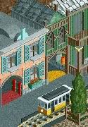
I don't really like it that much.
The gold/brown is so difficult to make it look good and well fitting in rct2. Try adding more colour like green, yellow or grey instead to liven up the atmosphere.
Apart from that it's pretty much unfinished to comment on, but the architecture in this screen is really nice!
I like the courtyard with its tiny fountain and the grey information desk? looks fine, too!
nin, apart from the green containers blocking the entrance to the building it's awesome! -

 magmoormaster
Offline
Yes. ^
It looks very nice. It is a little flat though. But that can be pretty tough to do, so... -

 Liampie
Offline
Looks a bit like Through the Ages.
It's not bad but it really needs some organisation and nothing seems to have a purpose. -

 ahank
Offline
^Just for the record, I haven't looked at Through the Ages before. Ever.
But yeah, I totally get what you mean. It's actually going to be housing for the queue pre-show, but well, yeah. -

 posix
Offline
i dunno, it looks completely planless and random. the coaster track is almost disturbing the building because it just so happend to you it went through it.
 Tags
Tags
- No Tags


