(Archive) Advertising District / Dump-Place
-
 19-April 07
-

disneylhand Offline
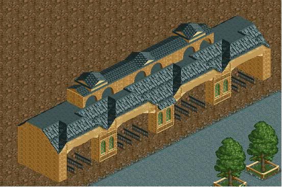
Trav, or whoever the guest parkmaker is, the form of that building is certainly uniquely attractive, but I think you could make it better by focusing more on what you're doing in terms of textures and objects. For example, you've used an unattractive amount of deco blocks. I personally use the slanted ones only when I find it pretty necessary, like when trying to cover up a sloppy texture clash like the ones you've left exposed between the walls and the roof pieces. Also, the roofs are mismatched and awkwardly pointed at the bottom, and the brick pieces holding them up look weak and out of scale.
This is definitely something that's peaked my interest.
-disneylhand -

 turbin3
Offline
Trust me, it's not me.
But I know who build it and I never would have expected something like that from him.
Looks great!
-

 Splitvision
Offline
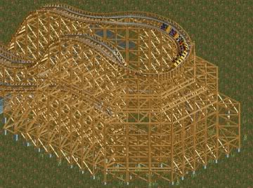
I find that to look very wierd. Maybe that amount of supports is close to reality but it looks just real messy IMO. Though, it might be much due to the small screen might, if viewed in full size it might look better. Also I find that small part of the layout you're showing here somewhat aestethically lacking, the unbanked diagonal turn and then the small banked turnaround and then the small hill doesn't combine well with each other or the rest in my eyes. Whilst (
 ) it might sound like I hate all of it I actually think it's pretty alright, it's just that I've come to expect such amazing screens from you and I certainy don't feel this is one of them.
-

 Splitvision
Offline
Looks fine to me. Like what Liampie said, you're about to get owned.
By owned, do you mean seeing people disagree with my opinion? You might consider that as ownage, I don't. -

 SMN
Offline
Hello, typical noob here posting a screen in progress:
Uploaded with ImageShack.us
It's nowhere near finished as you can see I'm just testing stuff out see what comes out. Is this of any taste? Am I on the right track to create something half good or have I ballsed this up?
Constructive critisism is greatfully recieved.Edited by SMN, 18 June 2010 - 05:41 PM.
-

 Austin55
Offline
Well since you dont have alot of scenery i focused on the coaster sooooo...
*enters JDP mode*
the first thing I notice is that you have so many huge turning elements right at the end, so I gotta wonder about pacing
*exits JDP mode*
keep it up. -

 robbie92
Offline
K0NG, you going for Ghostrider?
Oh, and it's fucking fantastic. First time in a while that I've truly loved your work. -

 SSSammy
Offline
Hello, typical noob here posting a screen in progress:

Uploaded with ImageShack.us
It's nowhere near finished as you can see I'm just testing stuff out see what comes out. Is this of any taste? Am I on the right track to create something half good or have I ballsed this up?
Constructive critisism is greatfully recieved.
ahh well done
that's got a really nice kind of aesthetic to it. just remember to make the floor muddy and muddy/grassy to avoid that sharp contrast you have there, unless you think you can pull it off.
-

 tdub96
Offline
@SMN-looks good, and i was also browsing thru some of your other pics on imageshack that were linked to this, and there was a screen of a sweet red intamin coaster that really caught me. Looks good dude.
@Freaky-i like the style and build, but not the colors
 Tags
Tags
- No Tags


