(Archive) Advertising District / Dump-Place
-
 19-April 07
-

 Cena
Offline
It's not on earth I am afraid.i dont know what on earth that is, but its freaking awesome
-

 Austin55
Offline
OOOOOHHH!
MM?
I like the way you actually have the support going through the glass roof, great thinking. -

inVersed Offline
Nice micro, nin. Finish something big and you have a guarenteed spotlight/parkmaker spot (assuming you keep up this quality). -

 AvanineCommuter
Offline
love the colors nin, but that building is a bit dull in comparison. It looks a lot like your aquarium from tahendo zoo too.
 -

 nin
Offline
Yeah it looks a lot like it because after trying numerous ideas this worked the best. Thanks for the comments everybody and Inversed, nice sig man.
 -

 Midnight Aurora
Offline
Regardless of however right you may or may not be, you still come off as an asshole. And that was before you you decided to take it personally and attempt to show how much bigger your dick was. Go you.I'm actually offended you called me out on my coaster knowledge... Let alone referencing a coaster in my home park. Oh, and here is my constructive response..
What I quoted from sammy I meant and it really isn't about a realistic factor here. Hydra is not an inverted coaster, that being said when going through the "Jojo Roll" guest can see the ground underneath them making the element a lot more exciting. Now. Can you do that on an inverted coaster? No right? See it doesn't make sense.
My main point is whether it's realistic or not, the element doesn't fit. There's a reason it hasn't been done in real life, let alone seen in rct.
-JDP -

 ACEfanatic02
Offline
Deserves to be brought over.
a little rough around the edges, but why not.
Drop needs supports. Otherwise...
-ACEEdited by ACEfanatic02, 08 June 2010 - 06:12 PM.
-

 Maverix
Offline

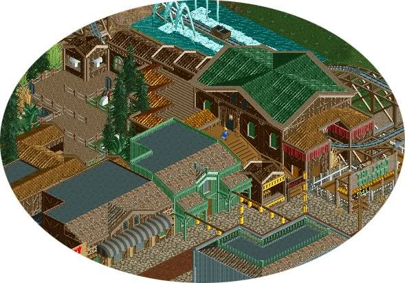
More of this, now with a haunted walk-through called Mystery Mine that give some background behind the story of the coaster.
Those White things are Skulls/Skeletons.Edited by Maverix, 08 June 2010 - 06:51 PM.
-

 In:Cities
Offline
not a big fan of the brown outline around the roof. its just too thick and unnecessary.
overall, this screen has way too much brown in my opinion.
for example, when an area is predominantly brown, dont make awnings brown as well. it just makes it a bit dull you know?
but as a whole, this is looking nice.
good job mav -

 Midnight Aurora
Offline
Too much brown wouldn't be a problem if it weren't all the same pale brown. It would really benefit from the dark brown path instead of the cobblestone or some tans.
 -

 geewhzz
Offline
Did anybody here ever consider that not everyone posting screens is looking for your expert "advice", but rather just posting to show what they're working on? Not everyone here is so insecure with their work that they need the advice of the entire community. So sometimes, chill, just sit back, relax, enjoy the screens, and if you don't, then just keep scrolling down to the next one...
 -

 posix
Offline
i concur.
most so called "advice" is actually like an attack or an accusation why someone would do the same "mistakes" over and over again. that's not helping someone, that's trying to make yourself feel better in a very pathetic way. -

 Louis!
Offline
nin - that's awesome. I was wondering how you had fit in the drop when you told me, now I know
-

 Liampie
Offline
The only complaint I can think of is the amount of tarmac, but I'm not sure on that. I like everything in that screen.
 Tags
Tags
- No Tags


