(Archive) Advertising District / Dump-Place
-
 19-April 07
-

 Luketh
Offline
Thanks, Austin, but I'm gonna have to disagree with YOU.
Pepsi is awesome.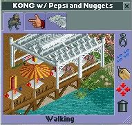
That better, guys? -

 zburns999
Offline
Thanks for the comments Louis, Peee, and MF72. It is a lot of fun to build like this every so often, especially when I find a lack of inspiration for more serious building.
And Peee, that is the shiniest looking screen shot I have ever seen. Did you edit it. It looks awesome.
And Luketh, the awning looks fantastic, really. Great idea! -

 posix
Offline
wow, seriously a lot of hot stuff being created while i was away. robbie, louis and ripsaw's screens, together with tpm's boat being my favs.
louis, i think what you have going there is nice but missing much organisation and "layout sense". paths, buildings and rides don't seem to follow enough logic somehow. makes it looks a bit messy. -
 Jaguar
Offline
This is so awesome. Been trying to play around with an LL scenario myself and this is just really inspiring.
It's rct2. -

 Louis!
Offline
^you actually thought I couldnt tell the difference between the two games when I've been playing RCT for over 10 years?
I was saying that I had been trying to do what zburns is doing but with one of the LL scenarios.
oh and posix thanks, I am trying to work on that it is a bit chaotic at the moment, thanks though
-

 JDP
Offline
Nah I was using km/h... figured you won't get it if I used mph. For next time though, try not to have it go any faster then 30 km/h since adding peeps increases the pacing speed.@JDP: I just checked it, its something around 41 km/h. Not sure if you're referring to mph, however think the pacing is pretty good.
-JDP -

inVersed Offline
John, you sense of color, aesthetics, atmosphere, and landscaping never ceases to amaze. -

 Splitvision
Offline
The only thing I'm not sure of is the flat rock textured land under the braking section, as I don't think that texture fits on flat land. Maybe just grass or some of the dirt textures would work better. Other than that I really like it.
 -

 trav
Offline
^Of what?
I think it looks nice. Although I don't like that awning, but that's just because of the object, never liked that type. -

tdub96 Offline
^Robbie's comet maybe? looks like a re-make of that
i really like it turbin3, and i absolutely love that john -

 Cocoa
Offline
It reminds me of something I'd see in real life (although your architecture will always be just a little strange imo) so I think that's a good thing.
 -

 zburns999
Offline
Maybe I'm being picky, but sandcastles must be built in wet sand, while volleyball courts must be constructed in dry sand (or else the lines would wash away). To have the two next to each other makes no sense.
Otherwise, very nice.
 Tags
Tags
- No Tags


