(Archive) Advertising District / Dump-Place
-
 19-April 07
-

 geewhzz
Offline
you have to understand the context sam and jdp mean, and to them, realistic means it isn't following something in real life closely, not the way you're thinking of it being realistic.
 -
 zburns999
Offline

I'm still working on this Dusty Greens Karts and Koasters park, if anybody cares/remembers. It's been a hell of a lot of fun to add to it whenever I get bored. Right now, there are six coasters, which are labeled. I'm sure I'll release a download soon. There is still one area I want to create first. -

 JDP
Offline
coasterfreak101, on Jun 5 2010, 11:42 PM, said:

I'm actually offended you called me out on my coaster knowledge... Let alone referencing a coaster in my home park. Oh, and here is my constructive response..What's unrealistic about this? I don't think I get it. I'm assuming you mean the roll before the lift, and that's been done in real-life before. See here.
I never understood why people make pointless comments like these instead of saying things that are actually constructive.
What I quoted from sammy I meant and it really isn't about a realistic factor here. Hydra is not an inverted coaster, that being said when going through the "Jojo Roll" guest can see the ground underneath them making the element a lot more exciting. Now. Can you do that on an inverted coaster? No right? See it doesn't make sense.
My main point is whether it's realistic or not, the element doesn't fit. There's a reason it hasn't been done in real life, let alone seen in rct.
-JDPEdited by JDP, 06 June 2010 - 12:56 AM.
-
 Peeee
Offline

So my project is making some good progress and it's turning out pretty nice.
Just realized there's something wrong with the tower in the front, going to fix that.
PeeeeEdited by Peeee, 06 June 2010 - 07:37 AM.
-

 JDP
Offline
peee that coasters pacing looks way off. what does it go through the immelmann, like 35 +?
-JDPEdited by JDP, 07 June 2010 - 05:48 PM.
-

 Austin55
Offline
Better yet us NE'ers should just start our own company!
Anyone here know how to weld? -

 MF72
Offline
^ One of my best friends knows how to weld really well. Maybe he could help?
Anyway, peeee: I really like that. Looks really sweet.
zburns: Looking sweet, especially that multi-story go-kart. Inspired me to try some RCT2 scenarios. Only wish I was better at them.
Luketh: It looks weird, but I like it. -

 Peeee
Offline
@Liampie: Thanks. It's a park, but rather small.
@JDP: I just checked it, its something around 41 km/h. Not sure if you're referring to mph, however think the pacing is pretty good.
@Luketh: I like that alot. You might go with what JK said but i like it anyway.
@burns: It looks like a park you had a lot of fun building. Geronimo looks great.
Peeee -

 K0NG
Offline
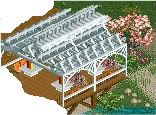
@ Wolfeth...it looks pretty cool but it seems seriously undersupported....like toothpicks holding a waffle iron. I wouldn't want to be sitting under it enjoying my chicken nuggets and Pepsi when a stiff breeze arose.
 -
 Luketh
Offline
Thanks guys, I was wondering what the general thought about it was, because I was just playing around when I made it and I thought "hey.. that looks pretty cool!" Looks like most other people do too. I agree with the undersupportedness (new word?), so I'll frame the track and make the supports thicker. Thanks, guys!
 -

 Austin55
Offline
I have to disagree with K0NG,
Pepsi is disgusting.
But yeah just add some little 1/8 (or 1/16?) peices or something.
 Tags
Tags
- No Tags


