(Archive) Advertising District / Dump-Place
-
 19-April 07
-

 nin
Offline
WAAAYYY out of scale, but nice attempt. I recommend you make the track invisble when it's at water level, and have some sort of 'trough' that it rides through, like the actual thing. Also work on the rock landscaping a bit, make it look more natural and not 'boxy' like it currently is.
 -

 hulkpower25
Offline
hey, nin
thanks, help me up with the ouuuut of scale thing, because i am not at the good with scales, and i will change the boxy landscaping. thanks -
 Jaguar
Offline
Yeah i liked that park. I think i gave it a 10.
thanks for the compliment inVersed, I am still kinda pissed at the results though. Hulkpower, that looks interesting, but the rocks are too block, they kinda look like Lego bricks.
Colorado Fan, I don't the grass by the tree, but the rest looks great. -

 nin
Offline
Okay, hulk, here goes...
clicky
Check out this screen. Look at the width of the track that the rafts will be riding down into in comparison to the actual building behind it and the sides of the pool area. You could fit 2, maybe 3 of those same tracks lined up, side-by-side- in that pool area to reach the viewing area to the rocky landscape, so that gives us an approximate space of say, 3-4 tiles. That's the width of the pool. Now, seeing that you have plenty of space to work with, you could expand that, but you must incorporate a larger cliffside opposite the viewing area to accommodate for the increase in pool side, just to keep everything in scale.
Now, look at the actual building in the back. Still basing off our scale of the trough = 1 tile's width, the building in the back has maybe a total width of 3 building on this side, that being of the side where the ride will exit, not the entrance side unseen. What you currently have is the exit side having a width of 8-10 tiles, making the entire building look huge. 3-4 maybe a bit small depending on how high you want it, so maybe 5 tiles width for the exit side of the building, and relatively the same for the entrance side, which in turn allows you to adjust the pool's width accordingly.
Or, rather than read/interpret that, simply base the width of the building to the size of the boats, track, and peeps. Imagine you were a peep at that park, that building would be as large as a skyscraper. Shrink it down to a size where the width, height, and volume all are at some sort of equilibrium to whatever you are basing your building off of, in this case the JP show building. -

 h3r3stheKrak3n.
Offline
@ jaguarkid:
i really like that, rct2 from the early days!
@ hulkpower:
have fun building all that.
-

 Jaguar
Offline
@ jaguarkid:
i really like that, rct2 from the early days!
you can download the park here:
http://forums.nedesi...showtopic=21579
you need TT, and I guess that might've costed me the accolade. -

 Jaguar
Offline
no, it didn't, trust me.
it was quite close. I wish 2 more people would've voted a 10 or higher, so I would've won. I really liked this park, and unlike everything else I have made, some people have actually liked this. -

 Luketh
Offline
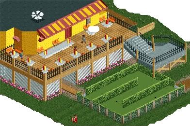
Time to warm up 'yer put-putting skills, its time for some Mini Golf.
EDIT: .... I freaking cropped the middle of the stupid screen. FML.Edited by Luketh, 05 June 2010 - 02:02 PM.
-

 In:Cities
Offline
i actually adore that screen luke.
its really simple. but yet so visually appealing to me.
please finish this, as i think it will turn out nicely:] -

 SSSammy
Offline
IT'S UNREALISTIC THEREFORE OBESELETE
it is however nicely supported and that tunnel is looking good
-

 K0NG
Offline
I really like where you're headed with that Lowenaldo. Kinda unsure about the roll before the lift but, everything looks nice.
 -

 Austin55
Offline
I really like that Lownealdo, I was thinking about a Jojo on a flyer the other day.
Yours is also really nice luketh just spice up the building itself because the eating area is really nice. -
 coasterfreak101
Offline
thanks, saved me the trouble
-JDP
What's unrealistic about this? I don't think I get it. I'm assuming you mean the roll before the lift, and that's been done in real-life before. See here.
I never understood why people make pointless comments like these instead of saying things that are actually constructive.
 Tags
Tags
- No Tags


