(Archive) Advertising District / Dump-Place
-
 19-April 07
-
 Luketh
Offline
*twitches and dies*
Jesus Tapdancing Christ, Jag.. please, no more!
Maverix, that looks great, but there's a bit too much brown on the buildings. Throw in some red or yellow.. -

 Casimir
Offline
jag: I think someone should create jagged rocks with THAT texture ;P
maverix: as luketh said, it's a bit too brown. spice it up a little bit with colors! -

 misterthom
Offline
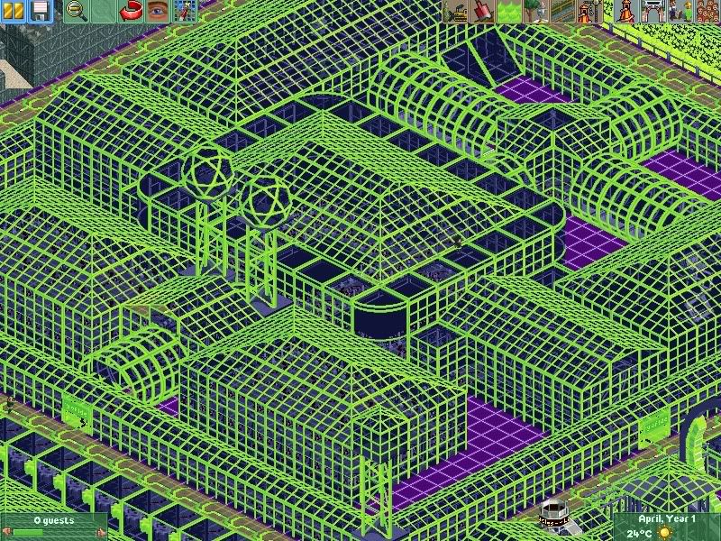
jaguar: how the hell did you built that without blinding yourself?
Maverick: great screen:p i like the shop and the que a lot. -

 Luketh
Offline
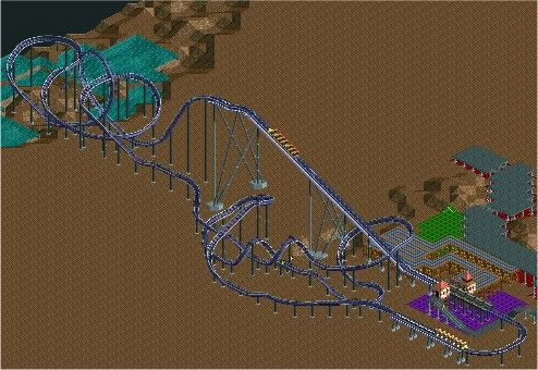
Layout help, pl0x? I like most of it, but I feel like something's missing.. help me out here!
-

 Casimir
Offline
turbine, zeig doch nicht immer die unfertigen screens xD die archy sieht selbstverständlich klasse aus und die blumentöpfe hab ich vorher so auch noch nicht gesehen.
aber wäre es nicht VIEL schöner, das alles in einem .kompletten. screen zu sehen, mit genau der athmosphäre, die du dir vorgestellt hast? fürs "hauptsache kommentare" bist du doch mittlerweile wirklich zu gut geworden! lass uns doch mal ein bisschen zappeln ^_^
luketh: depending on the train's speed, you could include a second interlocking corkscrew? like, just delete the breaks, add another right turn there (train perspective), interlocking corks and then a nice little turn, maybe a low, banked curve into the brakes.Edited by Casimir, 02 June 2010 - 05:47 PM.
-

 Themeparkmaster
Offline
^ 4 Corkscrews might be a bit much!
Maybe after the wraparound through the loop take a dive right and into a cobra roll or dive loop and then swoop right again back towards the first corkscrew. -

 Casimir
Offline
well, as it only has ONE other inversion, I thought it would be a nice and catchy detail, as it would be at least uncommon
-

 Dark_Horse
Offline
I think a cobra roll or immelman/dive loop right after the loop would fit best.
Dark_Horse
Offline
I think a cobra roll or immelman/dive loop right after the loop would fit best.Edited by Dark_Horse, 02 June 2010 - 06:10 PM.
-

 Luketh
Offline
Added a cobra roll, but the car gained like 6 miles per hour by the bottom of the roll and got too much speed for the first cork. I figured "who the hell actually enjoys seeing a million interlocked corkscrews, anyways?" and added a loop through the cork to give it some flare. I really like it and the pacing ended up GREAT! Thanks TPM, Casimir, and Dark_Horse, you guys helped a bunch.
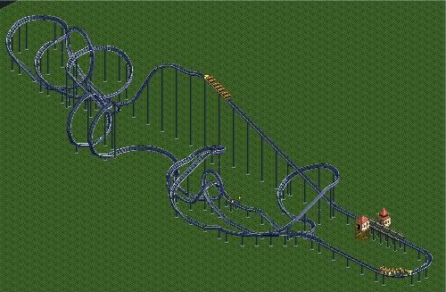
What do you think of it now? (just so you know, the section after the cobra roll won't be on flat land in the final version, no worries)Edited by Luketh, 02 June 2010 - 06:29 PM.
-

 Austin55
Offline
I liked the old one better :/ The placing of the cobra roll is awkward, maybe just a dive loop or immelman followed by a spiral type thing like Chang to because right now it has an hourglass shape around the lift hill (as in its bigger on the ends and skinny in the middle, another good way to prevent this is to use a turn in the drop, yours is completly straight) Personally I liked the interlocking corkscrews looked better awell.
Buuuuut thats just me...Edited by Austin55, 02 June 2010 - 06:50 PM.
-
 Jaguar
Offline
100% Fugly.
Hahaha, I have it for download too, I actually made it a long time ago, and it gave me a migrain all of the time. It was my least serious park, and it is rather interesting. Like I have said before, although it is extremely bright, it has a dark lonely feeling.
EDIT: Darkhorse, that looks great.Edited by jaguarkid140, 02 June 2010 - 07:00 PM.
-

 Cena
Offline
Here we go again, there is not much to see. Therefore I can't be so positive about this, but I will try to point out some negatives so maybe you can improve on that...
However, if you do the diagonal stuff do it good (roof!)
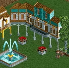
What is the yellow in the fountain supposed to be? Lighting or something? And I would make the support under the fountain thinner. And what are the crown moulding pieces doing above the windows? They seem to look awkward. Oh, and could try not to use deco pieces on every roof?turbine, zeig doch nicht immer die unfertigen screens xD die archy sieht selbstverständlich klasse aus und die blumentöpfe hab ich vorher so auch noch nicht gesehen.
aber wäre es nicht VIEL schöner, das alles in einem .kompletten. screen zu sehen, mit genau der athmosphäre, die du dir vorgestellt hast? fürs "hauptsache kommentare" bist du doch mittlerweile wirklich zu gut geworden! lass uns doch mal ein bisschen zappeln ^_^
Aber Yannik in einer verzweifelten Bedürfnis nach Aufmerksamkeit ist, stimme ich mit allen Punkten sagen Sie Casimir sind. Alle Details sind gut, aber es sieht Scheiße, weil es unfertig ist. Yannik, können Sie das nächste Mal als Erster durchs Ziel einer Fläche vor der Abfrage der Aufmerksamkeit? Fertige Bildschirmen machen den Park Schaufenster viel besser als diejenigen unvollendet. Suchen zum Beispiel bei Robbie, der die meiste Zeit ist Entsendung Bildschirmen fertig und immer gute Antworten mit Tipps. Wäre es nicht besser, wenn wir alle das tun?
 Tags
Tags
- No Tags
