(Archive) Advertising District / Dump-Place
-
 19-April 07
-

 Dark_Horse
Offline
k0ng, at least give me a reason WHY you don't like it. Its more detailed than before, so where is the problem? As for nin, you're right, the colors are chaotic, I will try to straighten them out.
Dark_Horse
Offline
k0ng, at least give me a reason WHY you don't like it. Its more detailed than before, so where is the problem? As for nin, you're right, the colors are chaotic, I will try to straighten them out.Edited by Dark_Horse, 31 May 2010 - 04:17 PM.
-

 geewhzz
Offline
Dark horse, please lose the tone when talking to others. this goes for everybody. i'm tired of the non-respectful behavior on this site. nobody better test me on this, either. if you have nothing nice to say, don't say it at all, if you have something to say, say it in a respectful way or don't say it.
 -

 trav
Offline
'if you have nothing nice to say, don't say it at all'
So what, you expect us to not give criticism if we don't like a park? -

 geewhzz
Offline
not at all, just be mindful of where to draw the line when talking to others. if you think what you are about to say is going to draw a bad reaction from whoever you're talking to, then you better think about re-wording it or not posting it. the number of beefs and personal attacks on others is far to high lately and it will stop.
common sense, really. -

 J K
Offline
Theres a difference between criticism and being a twat
Legend.
Common sense is all we need. The amount of stupid posts I have seen recently depresses the fuck out of all the forums. If people just learnt some respect things would be so much more enjoyable round here. -

 Cena
Offline
it ends to abruptly i think. i don't like the idea of a brake piece directly after the corkscrew.
This is the only problem I have with the layout, it looks pretty good. -

 Liampie
Offline
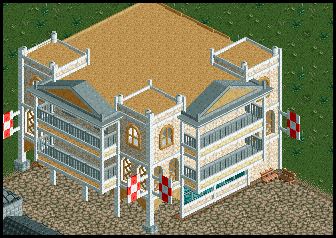
Look only at the building
Very nice, but don't forget to add doors on the balconies.Coaster layouts are usually my weakness so what do you guys think about this coaster named Firebird from my NCS project. It was introduced to Wheeler Amusement Park in 1985. It was the first coaster in the world to feature 6 inversions

Good layout, except for the ending. It's not just the corkscrew into the brakes, but I dislike how the corkscrew goes over the transfertracks too. Just doesn't look right.
@Dark Horse: I was about to give you some criticism, but it seems you removed the screen. As far as I can recall, the colours didn't work well. The purple-blue combo clashes badly with everything else. Also, I'd like to see something new from you. I've seen screens from this building or variations for months now!
-

 Dark_Horse
Offline
Sorry, Liampie but I really don't have plans for anything "new" at the moment. Thanks for at least considering give me criticism though. I'm having a hard time finding an accent/trim color that goes well with the rest of the colors.
Dark_Horse
Offline
Sorry, Liampie but I really don't have plans for anything "new" at the moment. Thanks for at least considering give me criticism though. I'm having a hard time finding an accent/trim color that goes well with the rest of the colors.Edited by Dark_Horse, 31 May 2010 - 05:01 PM.
-

 Splitvision
Offline
I don't know if this would compromise with how arrows usually look but if you change the orientation of the station so that it's 90 degrees from the lift hill, you'll have plenty of space to throw a helix or something before hitting the brakes, because I agree on that it's too abrupt to end it directly after the corkscrews.
EDIT: DH, I would have liked to try and figure out a suggestion for the accent/trim color, but that's not easy without having the screen to look at... -

 Dark_Horse
Offline
Split, eh....I'll try to figure it out on my own. If I can't figure it out, I will re-post the screen I guess.
 -

 J K
Offline
I thought your screen was good DH. Like nin suggested the colours very too much but I think thats only because purple and blue are so close in the colour wheel they just blend together too much. The structure you had seemed pretty solid.
 -

 Dark_Horse
Offline
My problem with trying to find colors for the resort is I want to stick with the Victorian design (including colors), but I also want to incorporate colors that symbolize royalty. Would gold work better than the purple? I have really bad contrast issues, so choosing colors is not a real strong suit of mine.
Dark_Horse
Offline
My problem with trying to find colors for the resort is I want to stick with the Victorian design (including colors), but I also want to incorporate colors that symbolize royalty. Would gold work better than the purple? I have really bad contrast issues, so choosing colors is not a real strong suit of mine.Edited by Dark_Horse, 31 May 2010 - 06:18 PM.
-

 Luketh
Offline
Yeah, gold would probably work better than purple, but really, just pick something that looks good, not something that is "royal".
Use the color wheel and pick something on the opposite side of the peach color of your walls. -

 nin
Offline
Wow, I love that. Not the most detailed, extravagent ncso work ever, but definitely some of the most fun.
 -

 Luketh
Offline
Yeah, I love it. Maybe make the water tower grey or something other than black, because it looks weird black for some reason.
 -

inVersed Offline
Nin, John, & inVersed = NCS Collabo. I say yes!
Seriously, very nice nice screen. I love the colors and the overall atmosphere
 Tags
Tags
- No Tags


