(Archive) Advertising District / Dump-Place
-
 19-April 07
-

 Milo
Offline
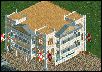
It's solid stuff no doubt but there are a few meh things for me. The bobsled I assume is supposed to be some kind of netting or something but it really screams "I'm trying to use something different for awnings!" a little too loudly. You could use a side friction, reverser or even chairlift track to better effect and maybe even stack some shrubs on them. You could also manage the support/railings on your path roofing a little better (or rather, get rid of them). The dirt roof is kinda iffy but it works. It's almost a little too clean as well, making it feel sterile. I think some more ladders and other details would add more atmosphere. I really like what you did with the canvas on the bottom left to add some depth, as well as the glass structure across from it. It pulls together really well.
 -

 robbie92
Offline
^The bobsled use is lifted directy from an old RCT2 park of mine and is meant to represent hanging canvas awnings, as if they're sagging. No other track would work for those.
Oh, and credit goes to Louis for the idea of the stacked canvas mini colf stations at the entry. -

 Milo
Offline
yeah I remember that but I still don't think it looks all that great, it's a cute idea but eh...
oh and it may seem redundant but it would be interesting to see an attempt at an interior on the glass buildingEdited by Milo, 30 May 2010 - 03:43 PM.
-

inVersed Offline

A little NCS work I have been doing. This is the ticket sales at the park entrance.
Unfinished. -

 Casimir
Offline
robbie: maybe make the hanging canvas a continuous one? that could take away some of the busy appealing.
inversed: looks quite solid. I don't really like the line of trees, though. looks way too repetitive. =/ maybe add some bushes? or is it not only NCS but also no-hacking? -

 Themeparkmaster
Offline
Thanks for the positive comments. Might find out where it's off to soon.
inVersed I think the corrugated iron roofs need to be slightly higher. -

inVersed Offline
Coaster layouts are usually my weakness so what do you guys think about this coaster named Firebird from my NCS project. It was introduced to Wheeler Amusement Park in 1985. It was the first coaster in the world to feature 6 inversions
-

RMM Offline
it ends to abruptly i think. i don't like the idea of a brake piece directly after the corkscrew. -

 Austin55
Offline
^That was my first thought. maybe just move the corkscrews back some, having huge bits of straight track or even a helix wouldnt be a bad idea for an Arrow coaster like that. While youre at it maybe try and place the Batwing/Boomerang type thing into a more prominent position.
 -

 SSSammy
Offline
i really like that, InV.
follow all above suggestions. add in some straight track to add to the authentic arrow feel.
 Tags
Tags
- No Tags


