(Archive) Advertising District / Dump-Place
-
 19-April 07
-

 Ripsaw
Offline
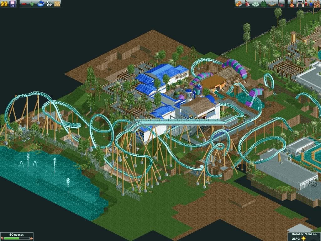
I Plan to release this intime to my trip to Florida on the 26thJune, Its the Journey To Atlantis(Upgraded a few years later) Its not being released as a design but its a fun side project to add too while doing Thorpe Point, Well here is is My interpritation of the awesome beast that is Kraken.....Beware disturb her not...
And here it is in relation to Journey To Atlantis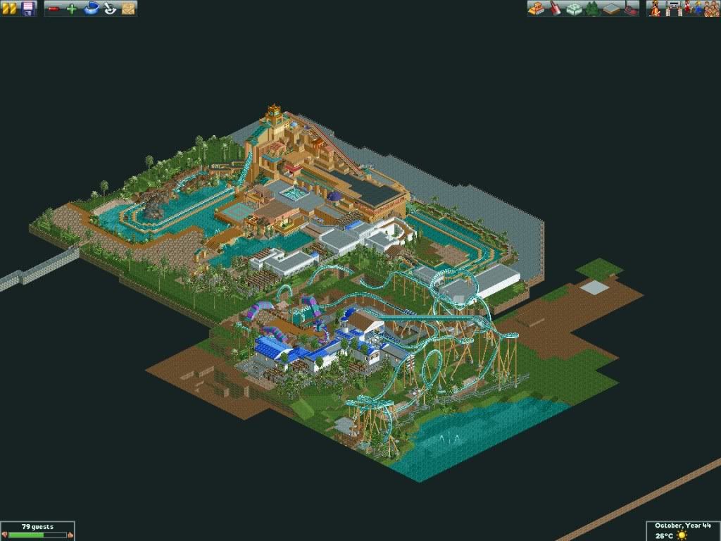
I have realised there is a lack of B&M Floorless coasters with the SeaSerpent Roll and being Kraken is a mythical sea serpent it seemed paramount such an inversion would take place.
Hope you all like what you see, comments appreciated
DanThorpe
aka
Ripsaw -

 h3r3stheKrak3n.
Offline
This has a really nice realistic athmosphere. I like the way you built that. But I honestly don't like the first drop from the angle in the first screen. It may be different from other perspectives, but that way it's just ugly. ;D
 -

 Themeparkmaster
Offline
Looks to me like you're going for a Krypton Coaster style drop:
Personally I am a massive fan of the layout, it's an excellent mix of the aforementioned floorless, Kraken and your own ideas. My only hope is you nail the landscaping around the submerged loop so it doesn't seem so buried, I think it needs to be slightly more visible.
I love the Kraken intertwined with the final portion and queue area also, great job. Journey to Atlantis also looks excellent. -

 Ripsaw
Offline
great comments already!=] actually i wanted a same sort of drop as featured on Alpengeist
 -

 tdub96
Offline
@Sulakke- if it is the french restraunt from epcot, i puked there, no joke i got real f'ed up after mission space and just lost it in front of these old ladies eating dinner haha
sorry if that ruined your apetites, but i thought i might add it....and it looks great btw
and ripsaw....niiiice dude i love all your stuff -

 Dark_Horse
Offline
I like that magmoormastr, but here are a few suggestions.
1) change the quarter tile roof overhangs to eaves (1/8-1/16 pieces) as I think it fits the scale of the buildings better.
2) I think thinner poles would look better on the yellow and grey building.
3) add vents to the top of the yellow and grey building. -

 magmoormaster
Offline
I didn't know there were such things as 1/8 tile roof pieces, lol.
I'll do the vents though. Thanks. -

 Dark_Horse
Offline
I'm actually not sure what size they are, but they are called eaves made by ToonTowner, and they are much smaller than the quarter tile pieces.
 -

 JDP
Offline
Ripsaw that is one of the best looking coasters I have seen here in a long time. God I hope the pacing is good.
-JDP -

 Austin55
Offline
I thought about a seaworld park with a JtA, but I felt it would be silly to do since you have what I consider to be the perfect example of it. Im soooo Excited to see you doing this. You should really go full scale.
 -

 Ripsaw
Offline
JDP-wow that comment really made my day=]trust me it has good pacing, it does go throught the loop a little fast but nothing dangerous g -wise.
Austin55-Its just an add on not a full blown park, and i think it will stay that way -

 J K
Offline
Nice work. No complaints from me except for a few little things. There is a texture on the left building which gets lost in the whole composition. It seems to blend into the path too much. Everything else looks really good, foliage superb as always, not too sure on the castle trim with the santa fee vibe. Love the hanging chillies.
 -

 Liampie
Offline
Somehow it reminds me of Rangda!
I agree with J K on the left building. Flawless, otherwise. -

 Splitvision
Offline
Nice. I agree with J K too, though I really like that wall object, so it wouldn't bother me too much if you leave it as it is.
 -

 Themeparkmaster
Offline
That's a lovely screen Robbie. I'm not always a fan of some of your stuff and feel it can be too minimalistic at times but that screen is full of detail and atmosphere. I especially like how your crossing between LL and RCT2 is having an impact on your RCT2 work and seems to make it more focussed.
I really like the pathing design too, I wish that was achievable in LL. -

 trav
Offline
I'm not feeling any atmosphere coming from it, which is a shame because it normally oozes from your screens :/ It's still good, I just think it's a bit dry compared to your other work.
 Tags
Tags
- No Tags


