(Archive) Advertising District / Dump-Place
-
 19-April 07
-

 K0NG
Offline
I really hope that it's not just me...but Cena's 'thing' is about as hideous as anything I've seen here lately. I don't know what the fuck people that called it a keeper were smoking beforehand...but, dude.............really?
 -

 Cena
Offline
^ Maybe you should stop smoking something to see it's not that ugly.
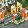
But I serious have no clue what to do with it, it isn't exactly correct according to the movie it's based on, but I do like the structure myself of the 'ferrari' aka 'lightning mcQueen' colors it has, the grand prix/formula 1 finishing vlag corporated into the tribune is something I enjoy myself too, but somehow I don't like it myself and therefore I posted it. I think I just need to sort out the elements I like from it and use those in a second version.
@ Pacificoaster, this is being built on that map yes, if it is being used, who knows? Wait for the release I think .
.
-

 Cena
Offline
calm down kittens
There was nothing wrong with KONG giving his opinion about my screen, and somehow I understand his point too, don't worry. You can't please them all. -
 JoeZia
Offline
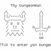
my best waterslide bowl attempt. it will be in flat animated ride format. not finnished. ill add a place for a waterslide to easily and accurately connect on the top left of image. an the riders will be riding it correctly, crossed legs n' arms. this ride will only look good when the waterslide connected is an enclosed tube. otherwise, the rides would pop out-of-nowhere at the bowl of the slide.
should i keep the stripes? -

 Cena
Offline
Looks pretty good so far Corey, you seem to understand the basics of the game (no grass under path for example).
I would raise the building slightly to have more of the walls visible (the overhang blocks a lot because of the isometric view) I also want to suggest to add some kind of tower to brake up the flatness of the roof and to get rid of the 2/3 of sign, if you use that 1/3 on the right to add the tower it would look better I think. (You could try to make a hat out of objects, perfect way to advertise the shop).
As for the foliage, you can add other ground types under the trees and have some bushes between path & high trees.
My last thing: I would remove the benches a bit I think that looks better.
All my opinion and you don't have to listen to it, but maybe you can use it. -

 In:Cities
Offline
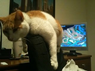
your cat looks a lot like mine austin:]
is that all water around that coaster in the screen?
looks interesting -

 Austin55
Offline
I remember seeing yours in the pet thread :D
No, there is only one small pond near the bottom. Its the roar look-alike from LSA, which I though made sense you know, cats and roaring, yeaa.
But I have been thinking about another name like after a famous movie or stuntman. Walker-Texas Ranger: The Ride? :P -

 Louis!
Offline
good to see you building again Gwazi. The offer still stands for a guest spot on clockworks if you want it
-

 Gwazi
Offline
i'm not building again actually; i just opened up an old park and took a screenshot of something you guys have never seen before.
what, i wanted to use the meme. XD
(p.s. i might start soon cuz opening RCT sparked my interest and summer will be here in 9 days although i'll still be busy)
 Tags
Tags
- No Tags

