(Archive) Advertising District / Dump-Place
-
 19-April 07
-

 Liampie
Offline
I love the atmosphere in your screens, SRF! Really great. However I admit this is not as good as some of your previous screens, but still; it's really good. Can you reveal some more about this project (size)? It's one of my most anticipated parks right now.
Robbie, great layout. I love the part before the MCBR. -

 Werner
Offline
The first hill/turnaround looks like something that B&M would never design because of the flow of a coaster. So for that i would make something like the first hill of Nitro ;)Simple but realistic... And to change if you are going to do that.
Everything else of the layout looks great
-

 Phatage
Offline
Why would a park want to pay more money for a slight knock-off of Intimidator when they could just buy a clone? Something like how Patriot differs from Talon is more understandable because of spacial concerns, but yours is nearly identical that it doesn't make sense not to make it a complete clone. If you're taking a cue out of how parks sometimes add another helix to the standard slc layout, it is really unlikely that a real park would apply that philosophy to a B&M hyper.
 -

 BRTeller
Offline
So much white, mix it up a bit. Also I wouldn't use that green either to add variety, the green that's there just doesn't blend well with the roman theme and the white. Try a burgundy or light redish pink color. Also the supports that are just hanging over the building up top are a bit sloppy. Try figuring out a cleaner way with mixing them with the building. I don't care for the green on the coaster either, but that just might be me. It has potential though.
BRTeller
Offline
So much white, mix it up a bit. Also I wouldn't use that green either to add variety, the green that's there just doesn't blend well with the roman theme and the white. Try a burgundy or light redish pink color. Also the supports that are just hanging over the building up top are a bit sloppy. Try figuring out a cleaner way with mixing them with the building. I don't care for the green on the coaster either, but that just might be me. It has potential though.Edited by BRTeller, 15 May 2010 - 01:51 PM.
-

 Liampie
Offline
I don't like this as much as Legend of Redwall (screens) or Pangaea, but I still like it. I don't think the amount of white is problem, but the fences do look bad like this.
 -

 Austin55
Offline
Robbie-Thats so cool, I wish people posted more pictures of just good solid layouts, there always very inspiring.
Jazz-whoah, thats huge, Awesome name BTW.
RCwhiz-I like that to, once you get more things into It I bet it will look really nice. I really like the staircase. -
 jusmith
Offline
ehh, I'm still building on it.
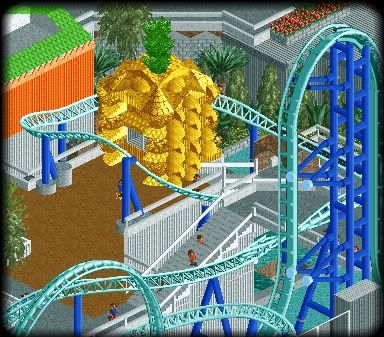
It's still a work in progress, so.....it's a bit messy/unfinished. -

 T.N.T.
Offline
Meh, still looks nice.
I like how you did the pineapple booth. But, I feel as though the flowers are abit misplaced. Is there going to be any sort of path up there? -
 JoeZia
Offline
imho, loopy landscapinc usually looks like downward shit when using scenery to build. even this small pineapple floating in space could top that
 and why that metal hole is in the middle of an oversised tropical fruit is beyond me.
object list oh you list, why don't more pay attention to you oh list?
 Tags
Tags
- No Tags
