(Archive) Advertising District / Dump-Place
-
 19-April 07
-

 Splitvision
Offline
I think there's a bit too much of everything. Windows, shutters, doors and awnings, there doesn't have to be one or more of these on every wall. Also I think you could add one or two more colours, a splash of aqua coloured details, in addition to the glass walls, here and there would look great I think. Oh and I still don't like the grey brick foundation, if it were half the height it'd be ok, I mean why build the entire first floor like a cellar?
 -

 turbin3
Offline
I don't like the roofs, maybe use scenery for them. And add custom supports please.
It's your turn, Tolsimir.
-

 Tolsimir
Offline
^^I think it's quite enjoyable. But still it's colorless imo.
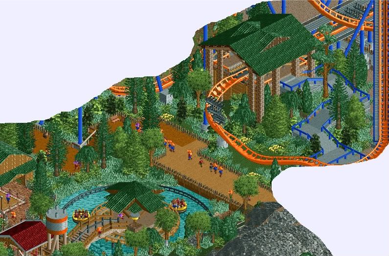
Add more small foliage and vary the ground texture
^

-

 Splitvision
Offline
Some 1/4 cliffs protruding from the vertical dirt walls would add to it, I think, right now all that dirt is just slightly too bare and plain for my tastes. The bridges are all awesome individually, but I don't really like them together as they're all so different in style. Very interesting stuff all in all though, keep it coming.
 -

 BelgianGuy
Offline
Thats some very bulky trackitecture Magmoor, nut in some way I do like it...
Tolsimir, the only thing I can think of is WOW... -

 Cornshot
Offline
I don't like the roofs, maybe use scenery for them. And add custom supports please.
It's your turn, Tolsimir.
It's supposed to be non-CS -

 magmoormaster
Offline
Indeed.
It looks good. I would have to agree with Splitvision; the cliffs look a little plain. -

 Cornshot
Offline
You might want to remove that quarter land block that's in the tree. Everything else looks fantastic.
 -

 nin
Offline
That's quite good SRF, but I feel like it's almost a step sown for you considering some of your previously shown work.
 -

 Splitvision
Offline
Fantastic. I love the second drop, well actually I love every part of the layout. I like the colours too.
 -

 BelgianGuy
Offline
WHY is everything you build SOOOOOOO awesome, you really don't leave anything left for us to do because we can't top that...
 Tags
Tags
- No Tags


